After learning about some design basics over the past two weeks (design conceptsandtypography), we have completed our first assignment: a business card. It was a difficult process that definitely had me frustrated at times, but it's done and I'm reasonably proud of how it came out.
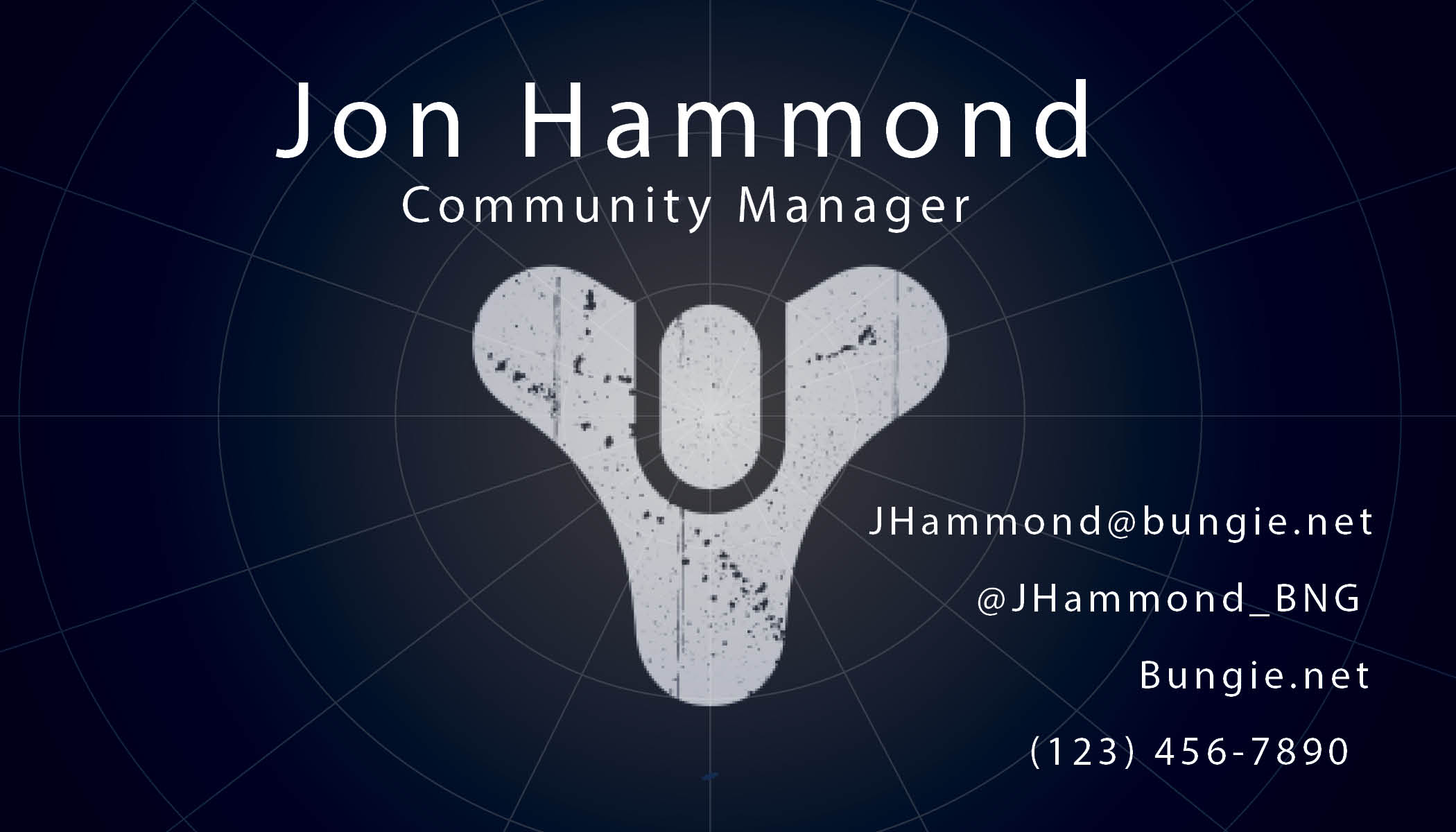

Bungie is a video game developer based out of Bellevue, Washington. Their most notable work is the unforgettableHaloseries, and their current project:Destiny. I've been a hug fan of their work since I first got into gaming, and Destiny has been a huge part of my love for gaming since it was released in 2014. I'll probably write a separate article about it so I can go into more depth.
The biggest lesson I learned from this is to just keep spit-balling ideas and don''t tell yourself it's bad until you see it. It helps to keep your ideas flowing I will likely come back to this design and create another variation or two.
I was lucky enough to pick an organization that hasa full style guidefor both brands, so picking the assets, font and colors was the easiest part. I only settled on this design after I looked through lots of destiny concept art and noticed the subtle globe lines across the background of the art.
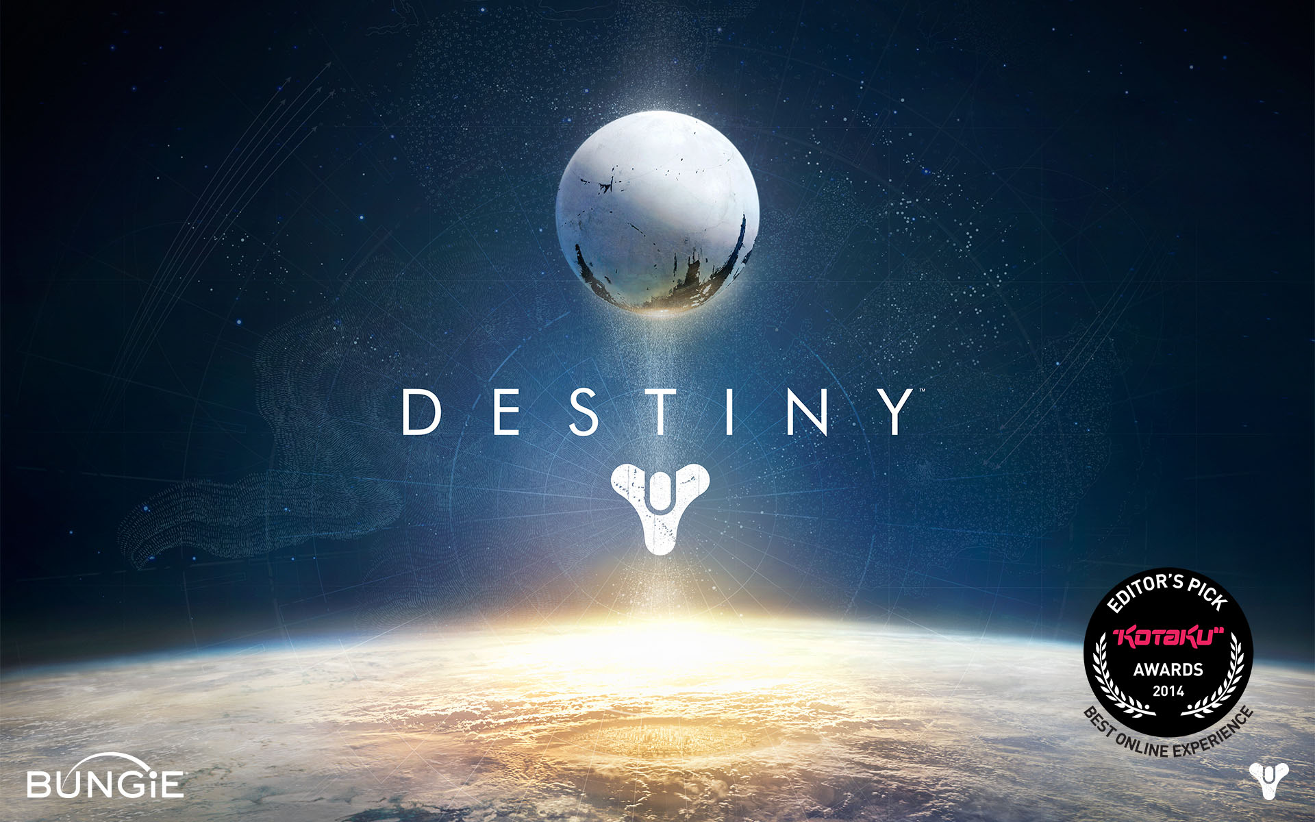
This is one of the most iconic images of the franchise, to me, so I figured it would be a great thing to base my design off of. I probably chose the most complicated way of getting it done, but I think I got pretty close for my first design.
If you have any tips or criticisms of this, please feel free to tell me about it. I'm still a student and have a long way to go, so any help you could offer would be greatly appreciated.
Thanks for taking the time to hear what I have to say, and I hope you have a great day!
