PR Publications has officially gotten into the material that is, currently, the crux of my existence: design and typography. It's a huge component of the current multimedia world we live in, it enables a whole new realm of communication and I love the current style of design.
The catch: I'm incredibly indecisive. Those who know me know how bad it can be, whether it's deciding on a place to eat, what to wear or if I want to be social enough. When it comes to designing and branding I'm terribly slow at making progress.
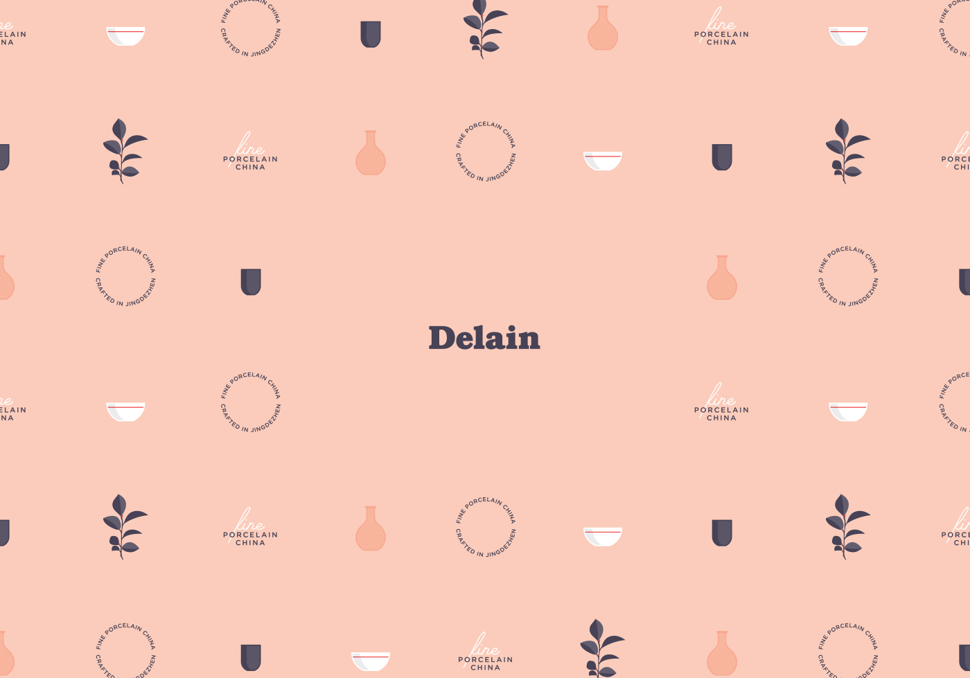
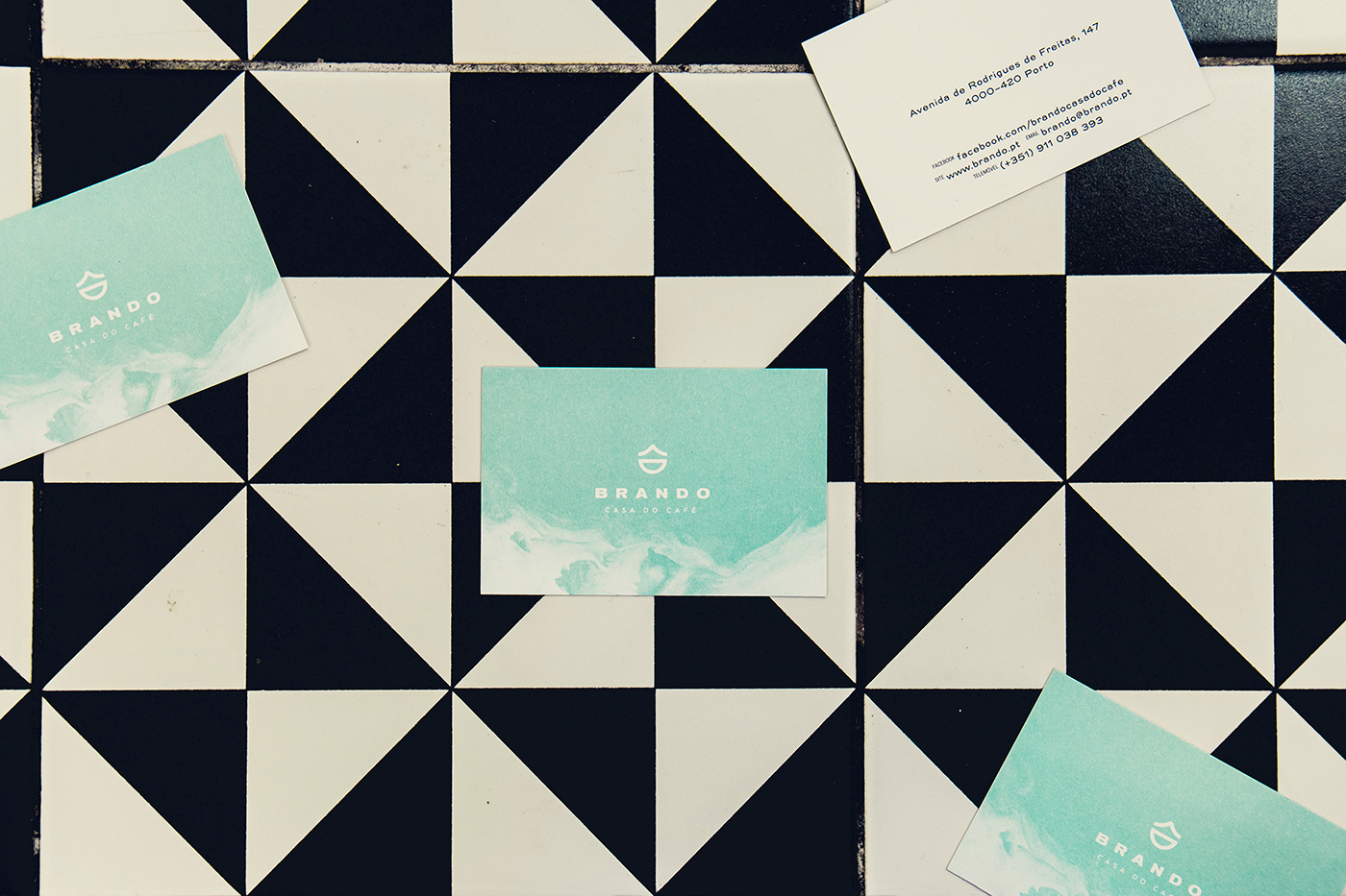
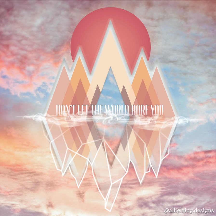
While looking through a couple of different designers work, it's easy to say that the go to right now is a retro/modern-minimalist style (seen in the same images above). I tend to like to go with the flow, especially when I have no idea what I'm doing, so I've taken a few notes from this style.
The goal is to use as few shapes as possible to either keep it straight & simple
or deceptively simple.
Allie Laing's design also showcases the power of contrasting colors to maintain a clear image. Even with using a narrow variety of colors, the piece still feels very vibrant and distinct.
I hope to be able to start posting pieces I'm working on in my classes, as well as on my own time. One of my big goals this year was to work on at least one piece of work a month. Not only so that I could practice making designs, but also making decisions on what I think looks good.
Thanks for taking the time to hear what I have to say, and I hope you have a great day!
