A Week in Review

Posted by & filed under JMC 3343-002.

This week was filled with the acquisition of a diverse range of information. I began to wrap my mind around the creative mammoth that is Photoshop and began to think about the logistics and planning that go into design. For this week in review, I feel it is best summarized by two major themes:
1.Photoshop, much like anything else in life, is not learned all at once; rather, it is learned in stages, over time, with experience.
27ba13_0b01e925fd384caaba48a117fb9f5988~

On Tuesday, I sat down to listen to an hour’s worth of videos about how to work within photoshop. To my surprise, the first 20 minutes weren’t news to me and I knew what was going on. (small victories, small victories)
Thanks to my previous dabbles in InDesign, I realized the basics of Photoshop are rather similar. However, after working through the final hours worth of videos, I discovered there was still much to learn.
And by “much to learn,” I believe “much” can be quantified in about..mmm…26 hours worth of videos. Which, arguably, would only still scratch the surface of the enigmatic Adobe Creative Suite application.
To my slight dismay, I don’t have 26 hours to dedicate to video watching. But even if I did, I’m not sure it is the most efficient way to learn my way around Photoshop. I think the best way to learn will be to experience and to allow time and practice to work their magic.
Practice makes progress, right?
2.Strategic design is the best kind of design
I’m going to be honest: I favor the strategy of design over actual design itself. Not that I don’t enjoy designing, but my brain truly enjoys the problem-solving, research and strategic planning element of PR publications.
27ba13_d28444d8b31b46d6b2909a524004f63b~

The inter-workings of how a publication will work and who the publication will reach are 90% of the battle. For instance, let’s say I designed an amazing postcard for my sorority. Let’s imagine the design of this sorority postcard is so stellar that it puts the designs of all design the world’s gurus to shame. This design is absolutely perfect. (I know there is no such a thing, but just for toots and giggles, suspend your disbelief with me for a minute)
If I sent this perfect postcard to, say, middle-aged, single fraternity alumnae, it would, at best, be admired for a few seconds before making its way to the bottom of trashcan to become friends with empty beer cans and greasy pizza boxes.
The only way to make design effective is to leverage its audience.
A person projects meaning onto a piece; and trust me, I know this from my years as a fine arts student, writer and generally artistically-inclined individual. It’s a basic truth in the art world. Shakespeare could write the most beautiful sonnet, but it is going to mean something entirely different to a child than it would to his lover. Audience is everything. Perception is everything. Reception is everything.
Such is design, such is life. As I said before, picking the target audience is 90% of the battle. The other 10% (designing with said audience in mind) will carry a publication to the finish line.
“Good things take time”:Pinterest
Design Quote:Pinterest

Introducing, Norma!

Posted by & filed under JMC 3343-002.

In PR Pubs, we were encouraged to channel our innerBeyoncé/Sasha Fierceduo and get in touch with our design alter-ego. At first, I struggled with the notion of creating an alternative-me…what would she look like? act like? think like?
Shortly after working myself into a mild panic, I realized I’ve actually been toting around my alter-ego for many years. I’ve been making jokes about her for as long as I can remember and she always makes an appearance around 10pm on Friday nights. She’s pretty darn cute with a dash of classic diva. Without further ado, let me introduce you to the lovely lady in waiting:

27ba13_202530de38cf413793c7c9ef0da0a47a~

Norma Nichols
She is, and has always been, my inner old lady. She adores classic movies and knitting, on occasion. She’s been collecting Vogue magazines and hoarding vintage couture since the late 50’s. She wears Chanel No. 5, calls everyone “darling” and lounges around her house in her pearls. Though she may be fabulous, she’s just a little behind the times.
Much like Benjamin Button, she gets younger as the years go on (and for design purposes, as I become more savvy with Adobe Creative Suite.) Currently, InDesign makes me feel like I am an 80 year-old with zero technological skill, so Norma is currently sitting at the ripe old age of 80.
Stay tuned for her anti-aging antics.
Letterhead Design Q & A with Madame Norma

27ba13_8596680b0afd47e1a6e2aaf6fca8f337~

Q: What is the inspiration behind your letterhead design?
A: Well darling, I have to say the greatest inspiration was my first design: the We Are Beautiful

followed closely by the mood board I created on,Pinterest. I focused on chic, clean lines with timeless blush accents. I want these designs to be as classic and beautiful as the women whose hands they pass through.

Q: What was your biggest obstacle when designing this letterhead?
A: I’d have to say white space. There is just so much of it in a letterhead. I have to admit, my original design looks nothing like the final product. The original design was far too simple (and dare I say a bit too mod) for this organization. Though I adore simplicity, it was hard to find the balance between chic and under-designed.

27ba13_b0eef845e3b2491292bb60c2576e94db~

Q: If you could describe the design in three words, what would they be?
A: I am so glad you asked, love: I’d have to go with classy, feminine and chic. All three things I strive to be..oh and things We Are Beautiful embodies perfectly.
Q: Do you have any theories about design and style?
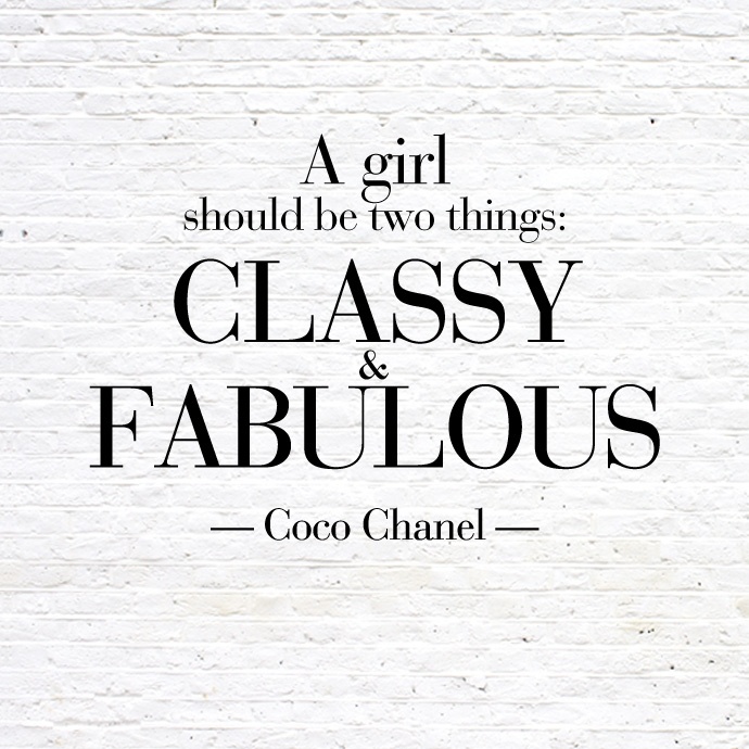
A: In the words of Madame Coco Chanel, “A girl should be two things: classy and fabulous,” I don’t think designs should be any different.
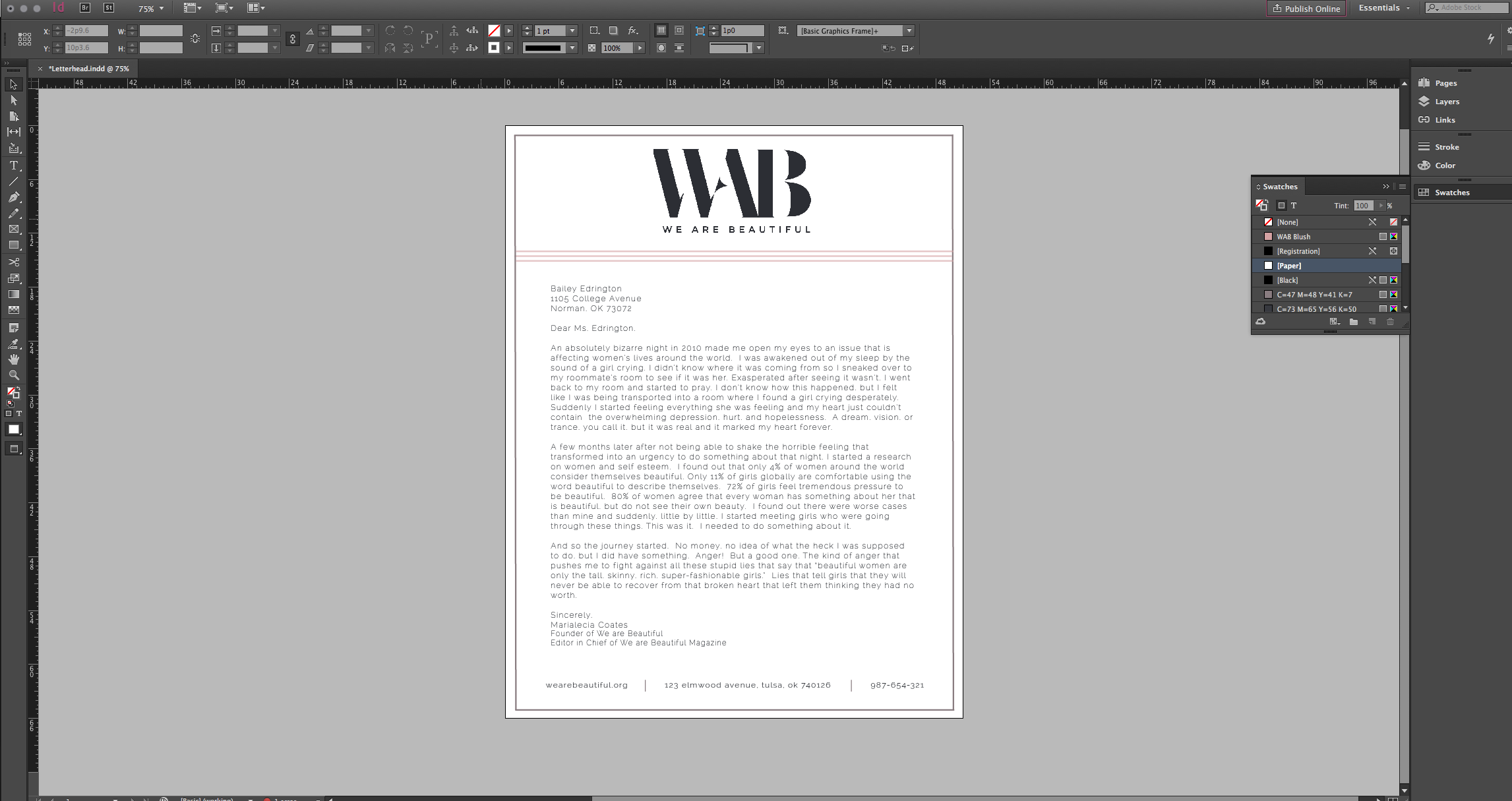
Q: What did you intend to be the focus of the design?
A: I wanted to draw the eye to the logo, which is my absolute favorite design element of all. WAB has a stellar logo. It’s simple, classic, distinct and draws the eye. I will always strive to draw the eye to the logo.
Q: What are your thoughts on your progress with InDesign?
A: Darling, I have to admit I am getting better. When I started this design process, I was 90 years old, so I’ve made some progress. I don’t need to ask for help nearly as often, but let’s just say, I’m still playing it safe. I’d hate to mentally break a hip whilst designing.
Chanel Quote:Good Housekeeping 

We are Beautiful, Even When the Process Isn’t

Posted by & filed under JMC 3343-002.

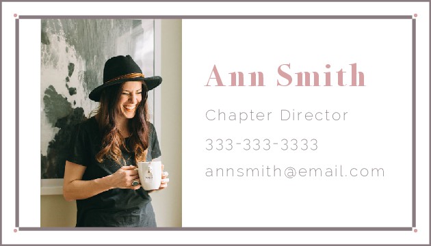
Not once in my life have I ever felt so relieved to hit the “Submit Assignment” button. Truth be told, designing a business card is a bit harder than one might think…especially when working with the enigmatic beast that is InDesign. In my PR Publications class, we were told to select an “imaginary” client (aka a real brand, but you don’t have to actually work for them) and design a business card with their brand in mind.
We Are Beautifulis a nonprofit organization whose mission is to be “a community of women inspiring one another to embrace and celebrate their true beauty.” I discovered We Are Beautiful through my lovely sorority G-Big, who does Bible studies and blogs for WAB. This organization is one I’m sincerely interested in working with (in real life) for a number of reasons, but the short and sweet version is this is an organization I believe in. That said, I eagerly jumped into designing for this “client” the moment the opportunity arose.
The Process
I wish I could say this process was an easy one. The design/visionary element didn’t trip me up as much as the actual process of creating this product did (side note: what an accurate metaphor for life, right?) I envisioned rather clearly what I wanted the card to look like, but the creation process had other ideas.

27ba13_1b9740f3254147b1ae0c68af9333b12e~

My first mock-up of the card had a blush background; however, the issue with a blush background is that it A) detracted from the content and B) didn’t mesh with the WAB brand all that well. While blush is an element of WAB’s color scheme, it is always the accent, never the focus. Thus, I shifted to a white background to stay on-brand.
The second issue I faced was with typography. I knew, based strictly upon the WAB logo, I needed a serif and a sans serif font for the content. I spent a majority of my class time on Tuesday searching through the font on InDesign before I realized I needed to bring in the big guns…1001 Free Fonts. Sure enough, I found the perfect fonts right away and uploaded them into the program.
The last issue I faced was detailing. Because a business card is so small, I tried not to over-design, but at the same time, I didn’t want my design to be lackluster. So I opted for simple lines and geometric shapes to keep the eye focused on the information in the center while also visually pleased. Believe it or not, I spent more time trying to align dots and lines than I did on just about anything else. Once everything was arranged where I needed it, I felt pretty confident about my final product.
The Product

27ba13_8f6f0d1e99d54720af9990b072e7fa97~

(Photo courtesy of the ever-faithful and true,Pinterest
27ba13_d138c03fce694ffda6e407d54865e935~

(Logo courtesy ofWe Are Beautiful)
Though the final product may be simple, I am quite fond of it. And though the process was a bit more work and a little messier than I anticipated, I am thrilled I walked out of it with a finished product.
A Little Philosophy, Free of Charge
As I sit here and write this, I cannot help but giggle at how design continues to be a metaphor for life. In a literal sense, designs will morph and adapt for various reasons as a designer walks through the creative process. Metaphorically, isn’t that just about how everything else in life works?
When we start something, be it a new job or a leadership opportunity, we have an idea of what something will look like. We make plans of how our days will play out and what we will accomplish, but after walking through the refining fires of “process” we end up with an entirely different something than the thing we originally planned. And isn’t it funny how 9 times out of 10 we are satisfied with our final product despite how different it is from our original? Dare I say, there are times we are even more satisfied with the current scenario than we would’ve been if we’d seen our original “design” through to the end. Even when it seems messy and at times frustrating, I think there is something beautiful about trusting life’s process.

Building Bo’s Brand

Posted by & filed under JMC 3343-002.

27ba13_ca0586b10ec549b49099ad022eec5e16~
First off, I love that I can call this homework. My first task in my social media marketing class was to create a social media profile for a person, place or thing that would otherwise not have one; thus, I have (quite eagerly) embarked upon the journey to createFacebookandInstagramaccounts for my stunningly adorable English Bulldog, Bo.
I have to say, Bo’s Instagram is my favorite. This (not-so) little guy’s personality is best portrayed via picture or video. However, this assignment focused mostly on the portrayal of a brand through Facebook. That said, I wanted to give a little background to my thought-process for “Branding Bo.”
Bo’s Background
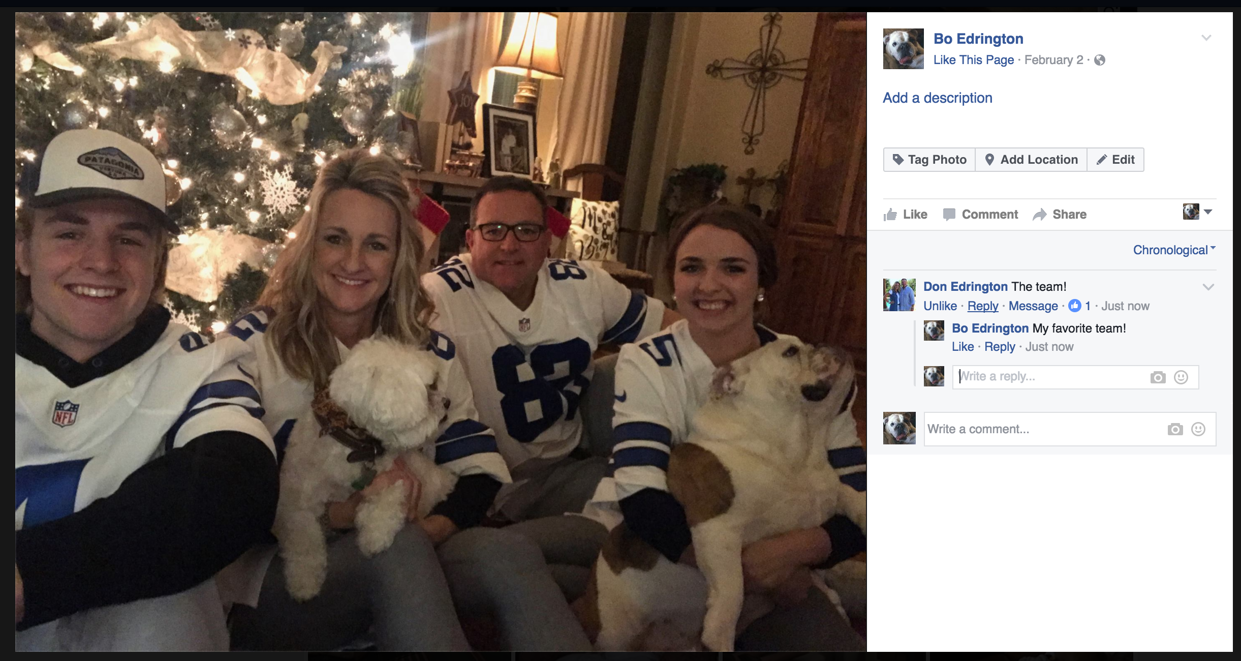
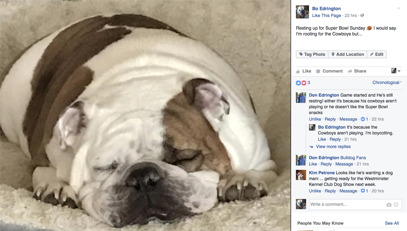
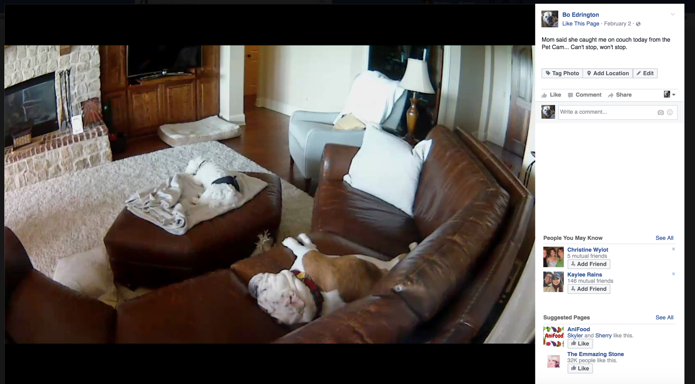
-The dog loves football. No, seriously. We put the TV on ESPN when we leave the house. Call us crazy pet owners (because we most definitely are) but we know our dog loves football. He actually watches the games. It’s crazy.
– Bo is a major homebody. While he has never met a stranger, he doesn’t like to leave home. He loves his family and he loves his bed, that much is for sure.
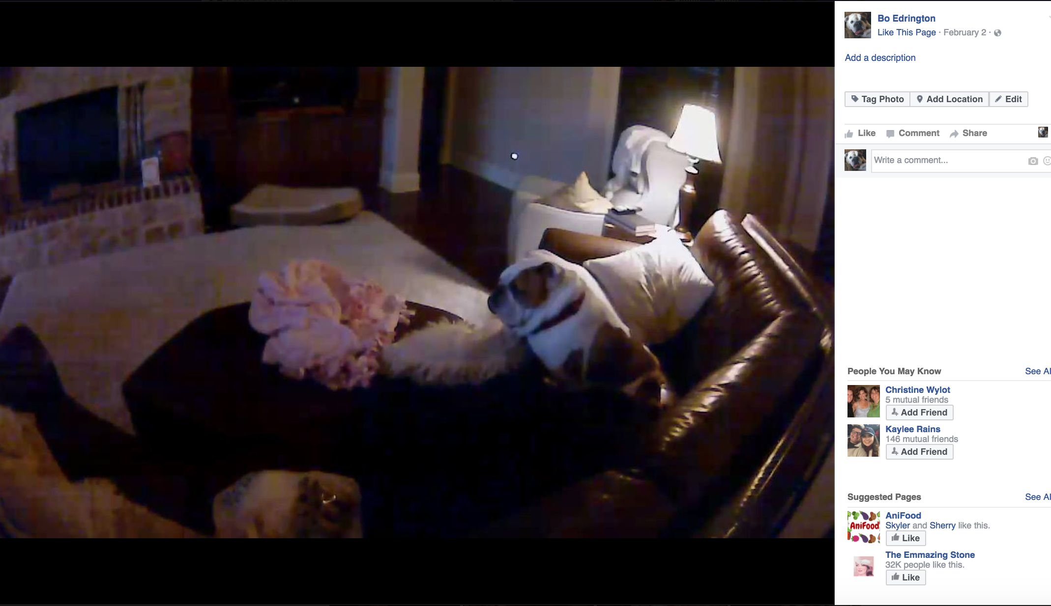
– Naps. I really don’t need to elaborate much on this one, other than to note that this dog spends about 90% of his existence in REM sleep.
– He is a stereotypical English Bulldog. He doesn’t run, he walks. Distance is never his preference. He is the epitome of gassy. He snores. Loudly. He is extremely loyal and loving.
– Lastly, this is one happy-go-lucky dog. He is just happy to have people around him, in his home, scratching his back.
Background to Branding
After thinking about those major facts, I realized they most likely would not translate well into a brand. If I had to personify this dog, he would be a jolly, overweight middle-aged man. Now, since my dog is not Santa Claus nor is he particularly well-known outside of my family and circle of friends, this presents a problem on the branding side.
As a PR professional, I ALWAYS air on the side of the authentic. I don’t want to stray too far from the authenticity of Bo’s personality, but I do want to add emphasis to its really relatable aspects. Thus, I introspected a bit and realized:
– I have grown to greatly appreciate naps in college.
– And free food.
-And light-hearted and (at times) self-deprecating humor.
I have also come to assume an appreciation of such things is almost universal. So I tried to hone in on these fundamentally relatable high points.
Brand Basics
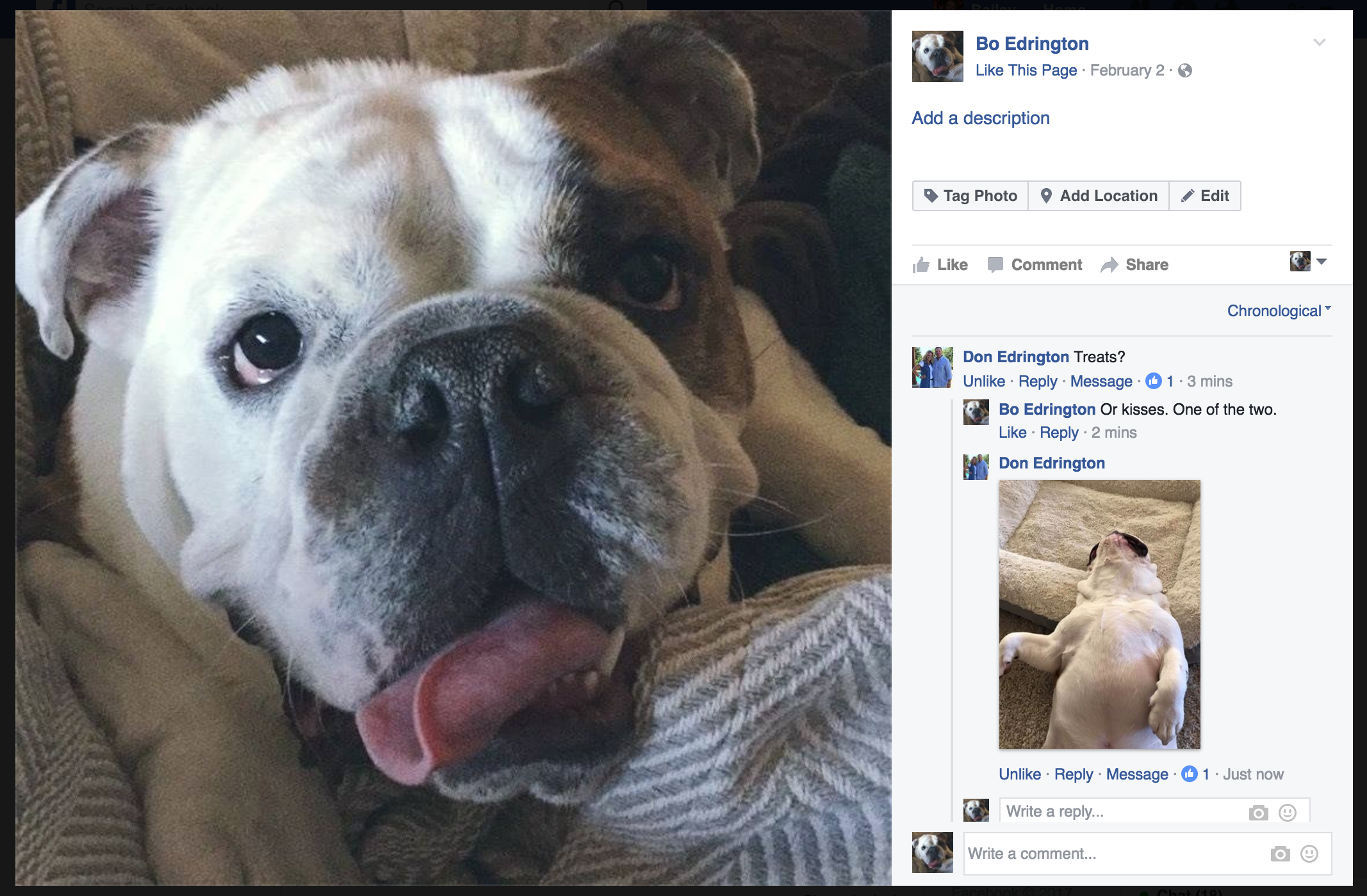
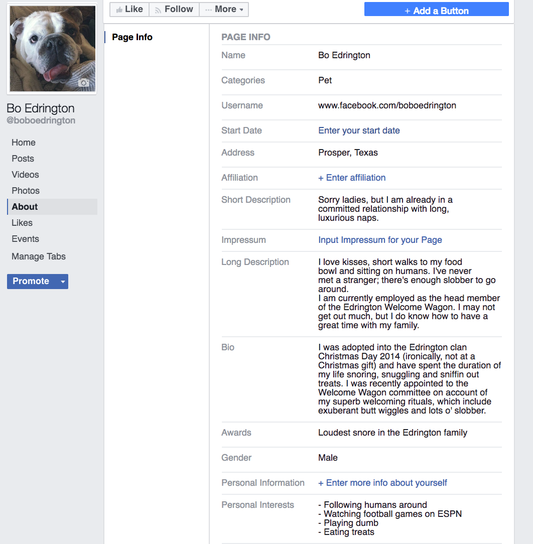
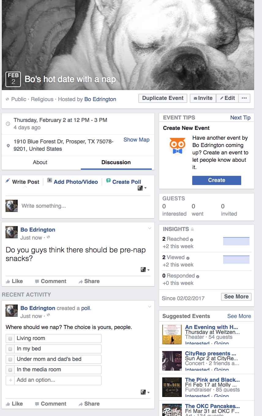
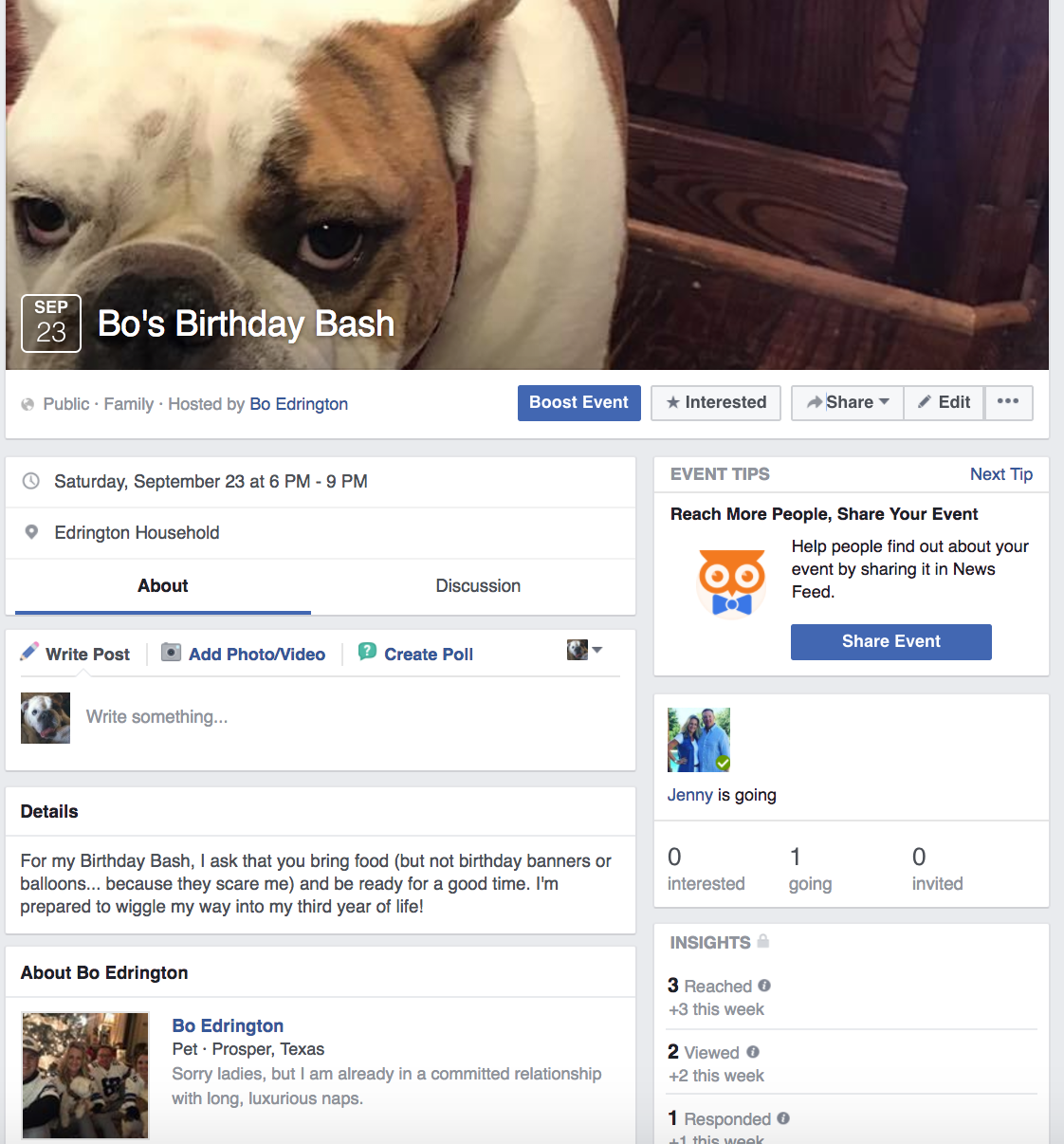
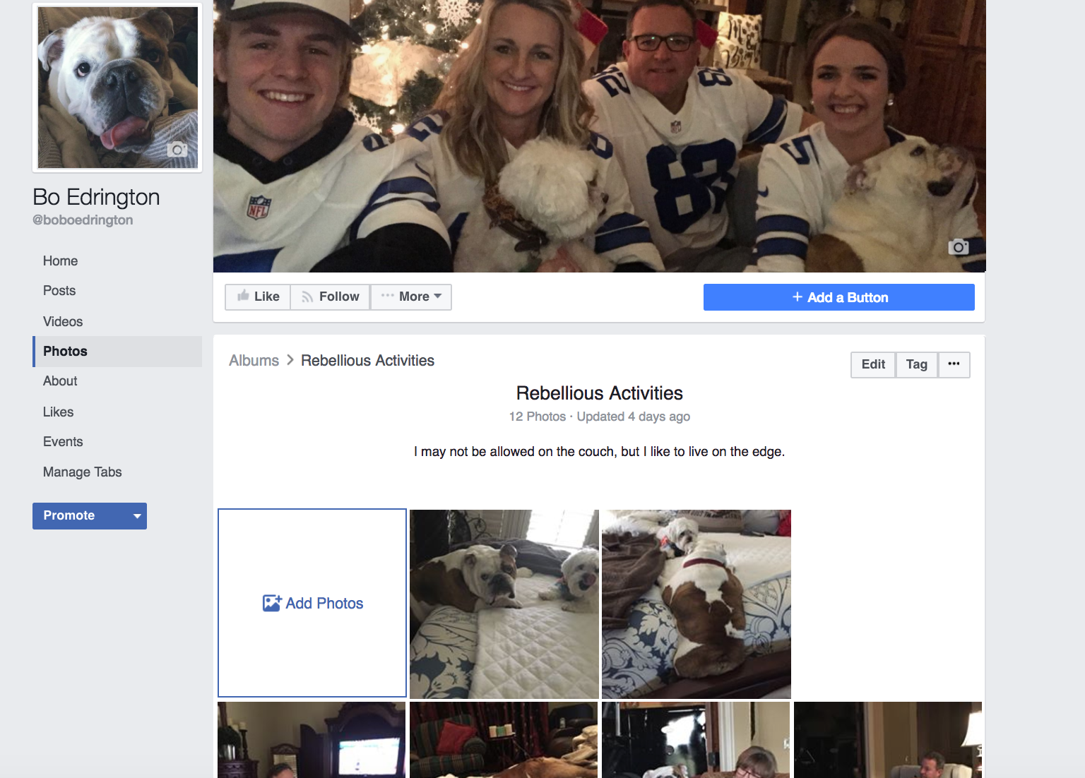
Profile picture, cover photo and Bo’s very own community napping event– all of these cover the basics of Bo’s brand.
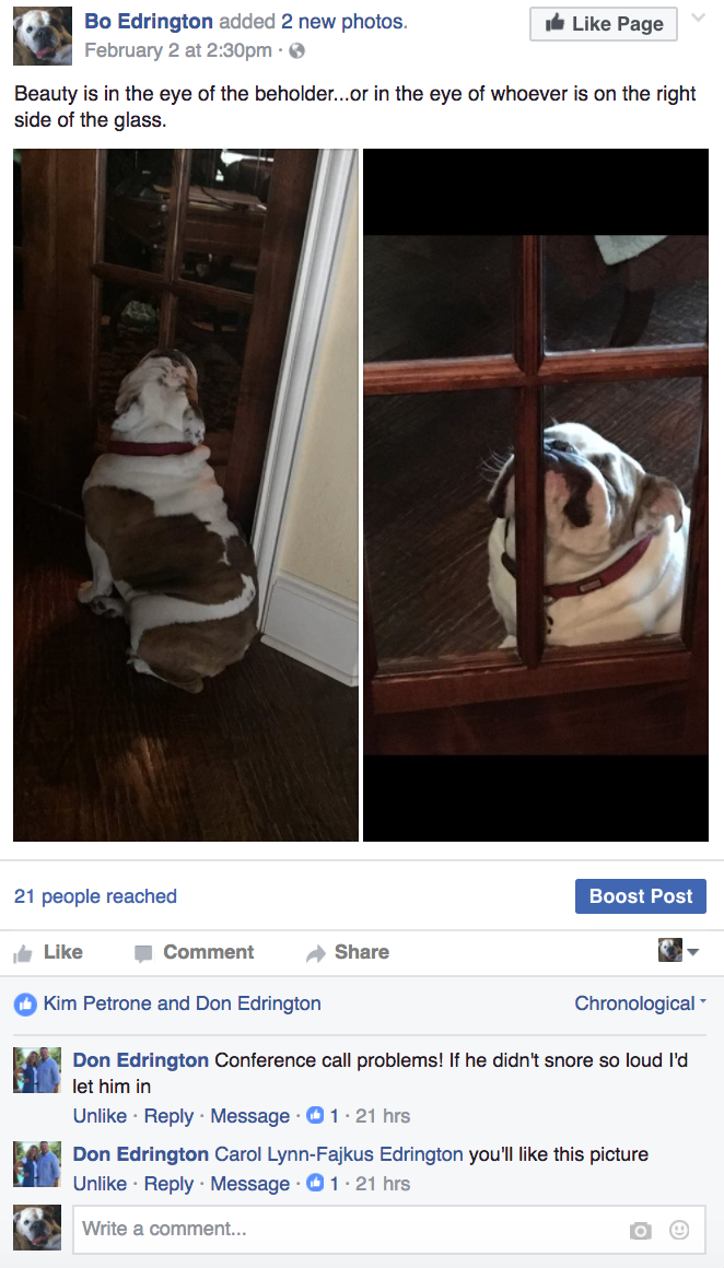
27ba13_464a62f818884b02b96600c19dca294a~27ba13_eea34fab3dda4e5da85d0d8e1e777fe2~27ba13_dcb746ec7c4d443faaefd005a870ff5a~27ba13_ef92b70f7c3f4d25846f4d7b56cdb51d~27ba13_0b806f1f255844bb90cc9e0af1326c68~27ba13_660b735bcb1d4907b4f0df12630cab85~
(Profile Basics)
Boosting the Brand: Content
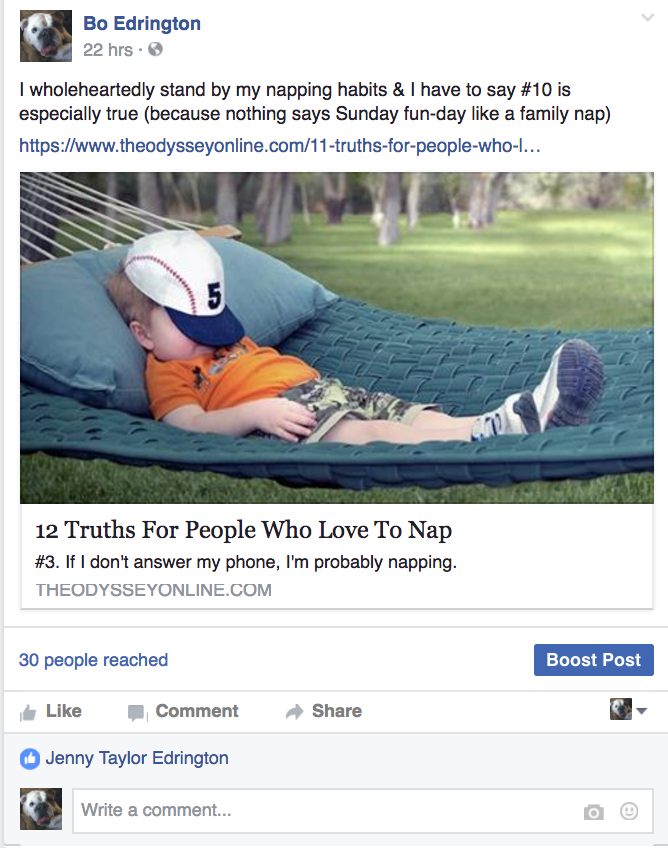
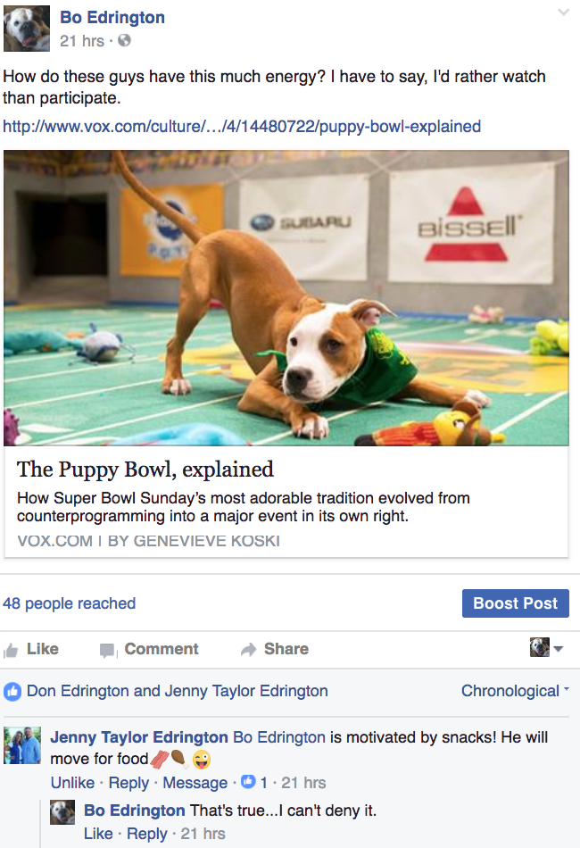
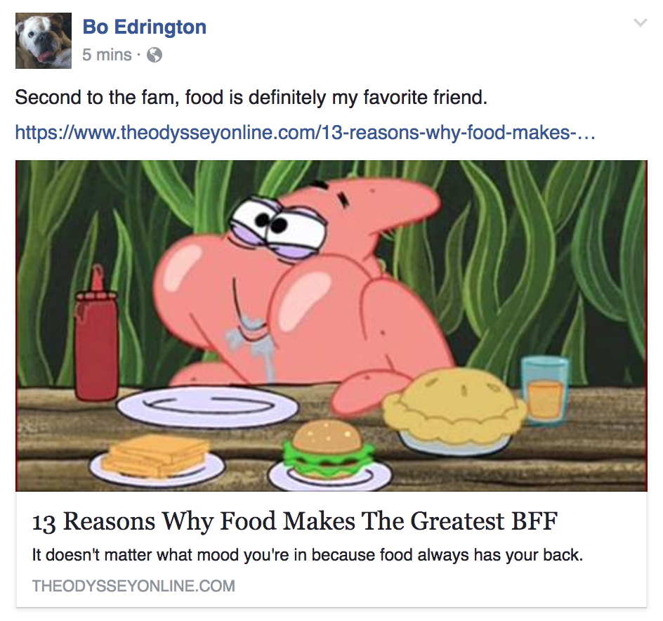
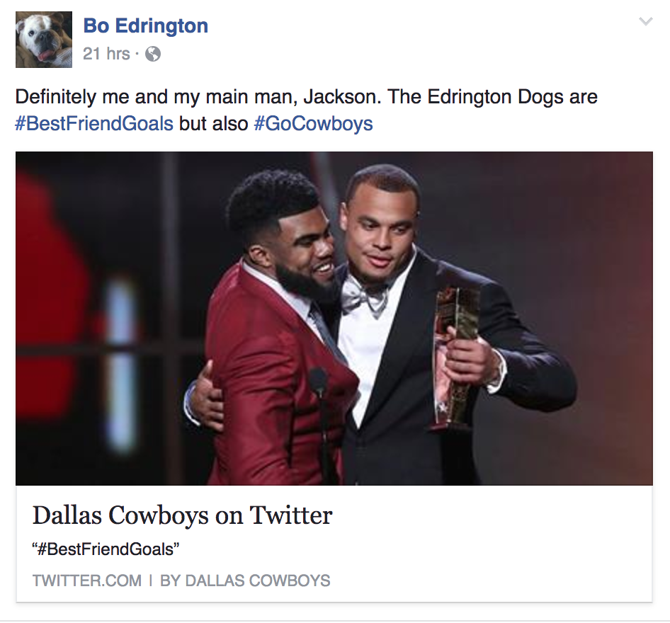
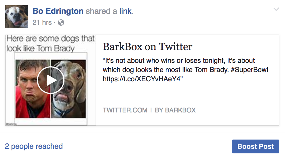
Bo’s brand includes articles about his favorite things: food, naps and football (seriously, he’s such a middle-aged man at heart…)
Also, Bo would be a man of few words. Thus, his text posts are short and sweet and generally accompanied with a multimedia element.
27ba13_385b7b0dee3c4f0ba3e4717ce1c44f54~27ba13_47e0c6d41e984ddaa9fcf311dafe8d4a~27ba13_1dd01233c79e49e38dc89ae2f3c0fc20~27ba13_0b2bf1444614471bae6edd48d027f11f~27ba13_e1691a887d38402ba5d15aa355e852e9~27ba13_9529fb699988425190430a4509e70d66~27ba13_2d6460ecf9cb4269ae58e33ead836577~
Boosting the Brand: Photo Album
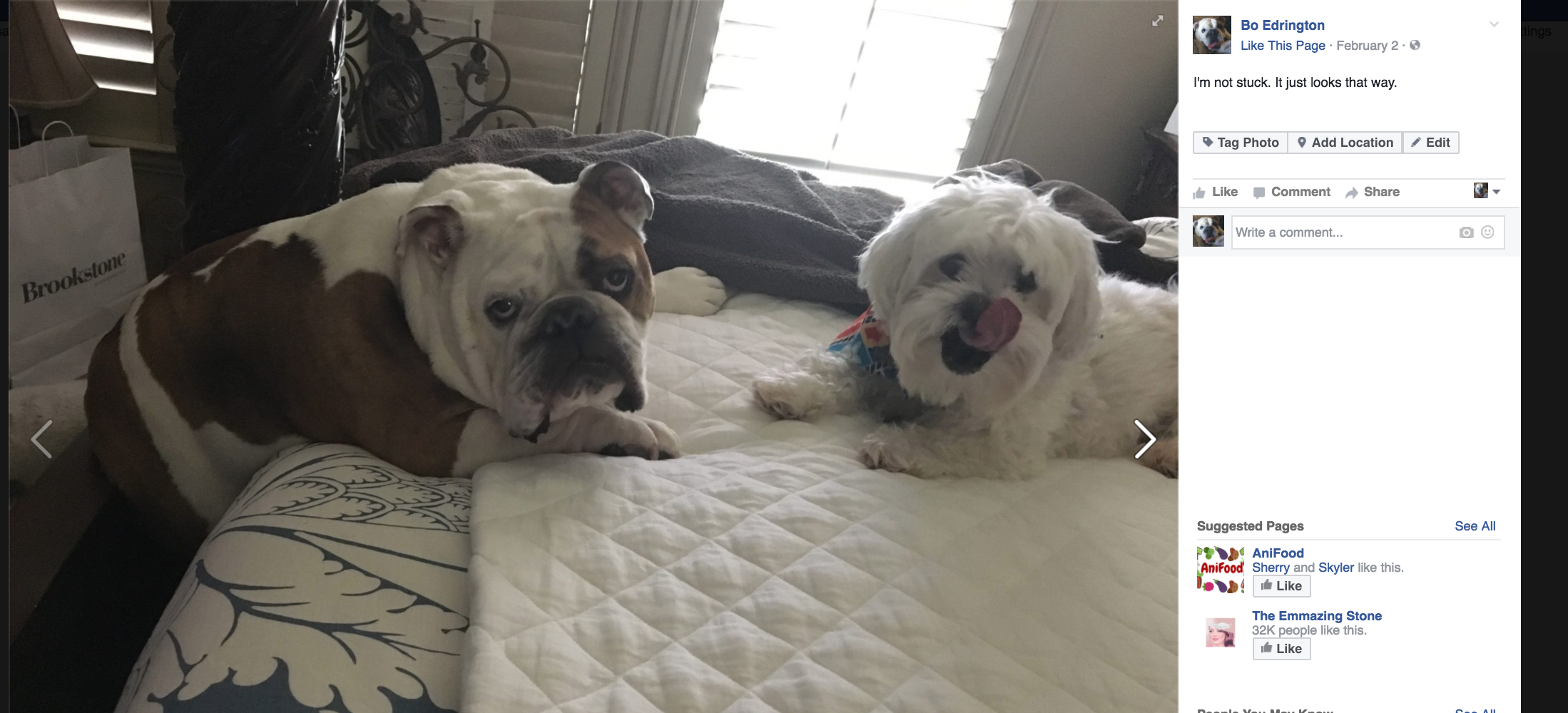
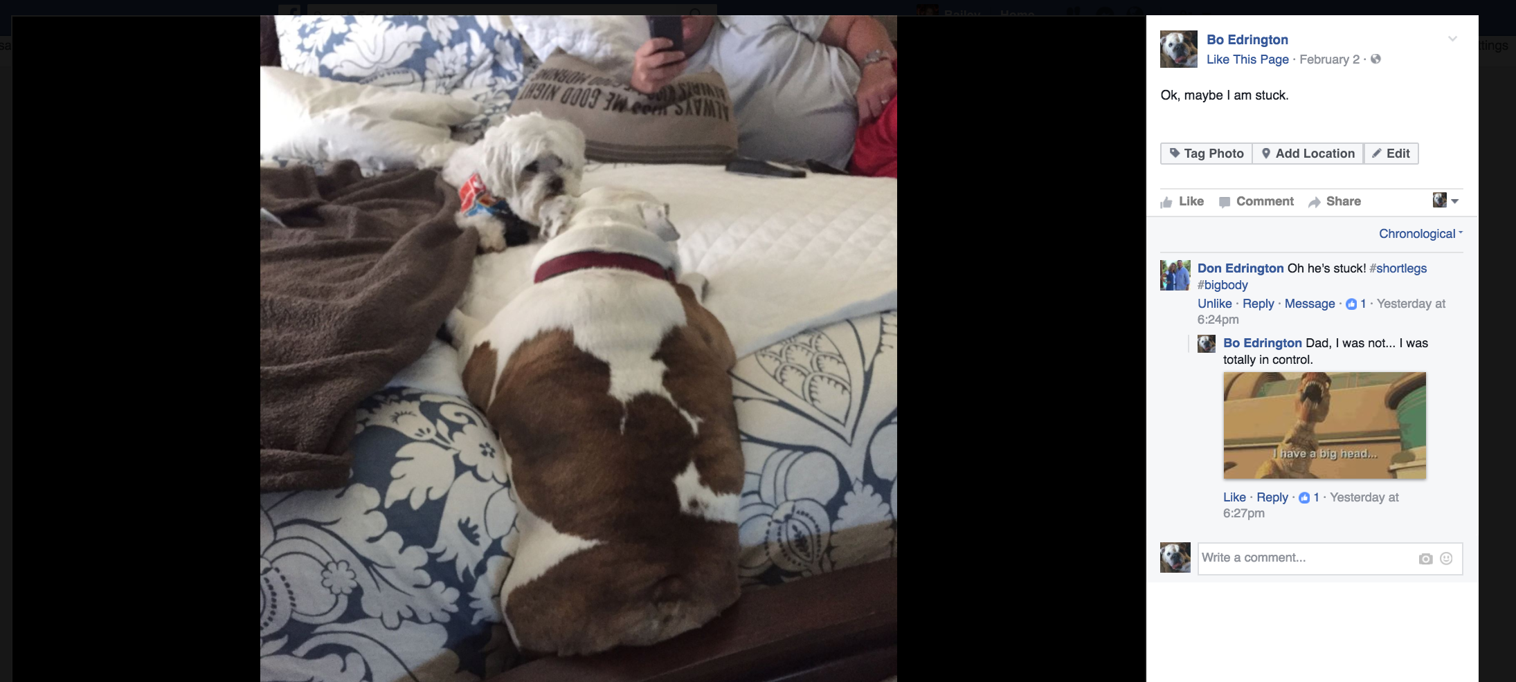
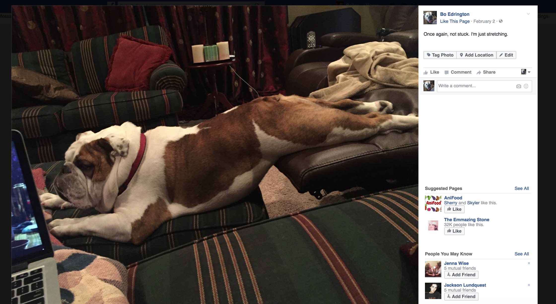
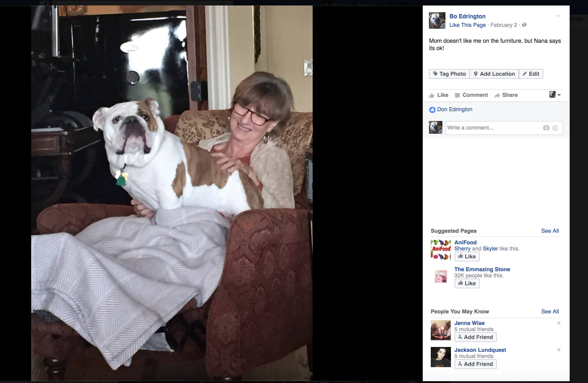
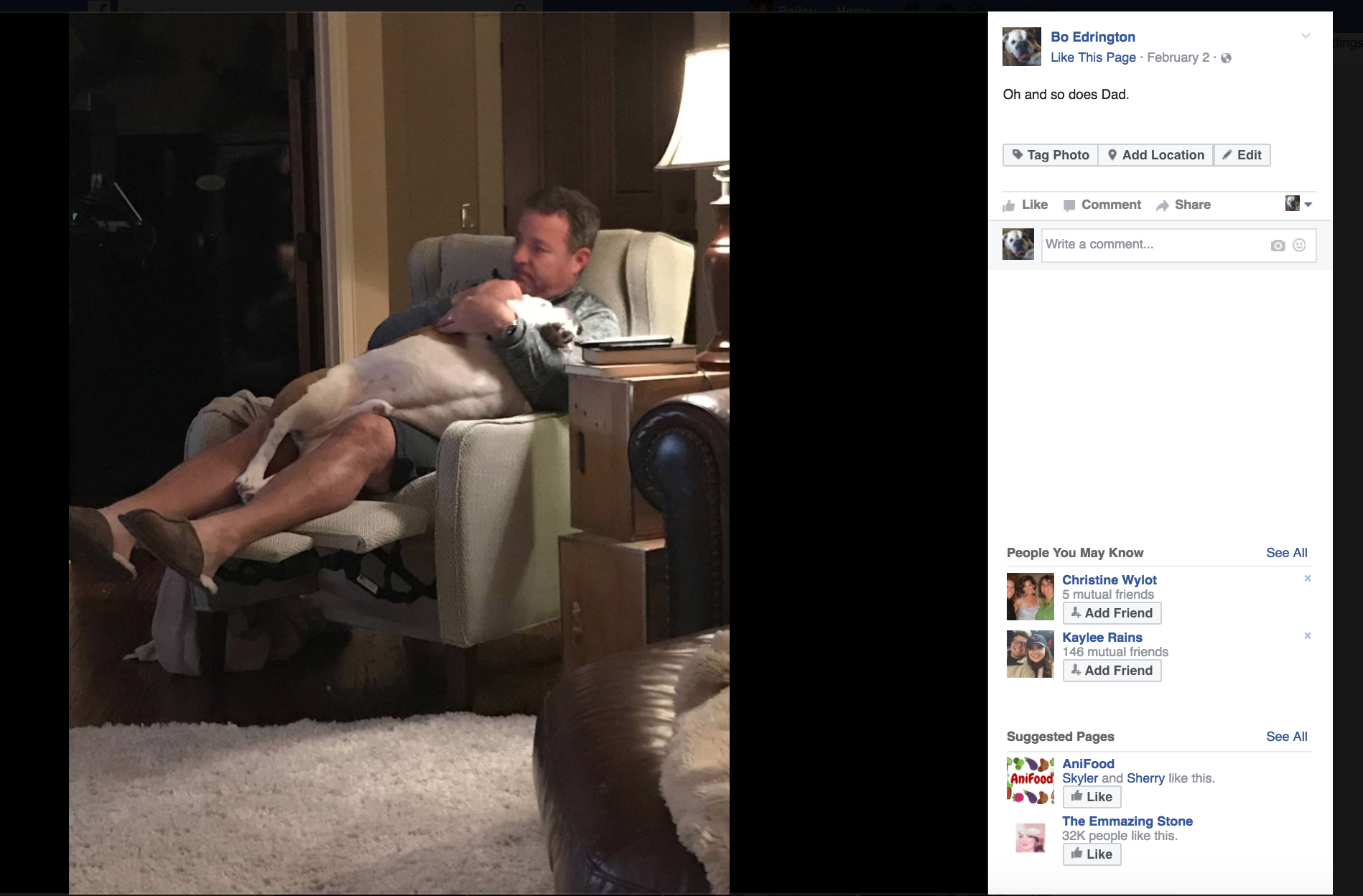
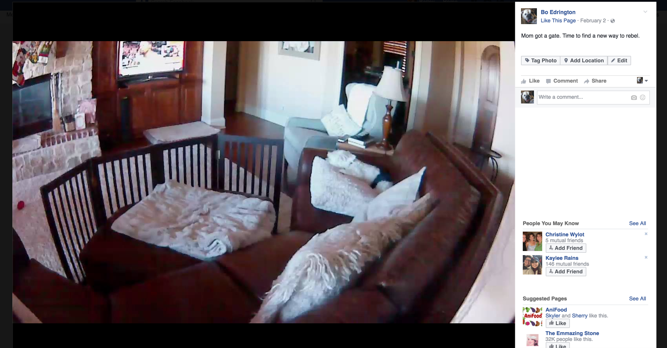
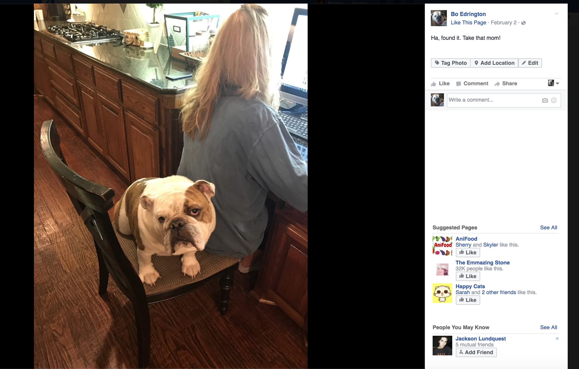
Like I mentioned earlier, I think Bo’s personality is best portrayed through pictures. Bo has a bit of a rebellious streak (one I think he’s slightly proud of), so I decided to make it a “thing,” so to speak.
27ba13_a195ca9e20ea4ac586a3ffcbc33f91b6~27ba13_c99b4e663d9a47039bdccdce5ec66fe9~27ba13_4211c3bcf0e14675b3c204b9f124f0d4~27ba13_78f39589751b45a2a717640a2b7c8087~27ba13_52528bb4fe8147099ff758f558a2b2bf~27ba13_fbe41071533d464eb7bbe98a02eb42bb~27ba13_092e4d5a6de144c9a8af843b27ef9e6d~27ba13_85dbae667eff40e38c5cb953de0c6b16~27ba13_5081f02b1d6b4492827af6125b84bbe9~27ba13_fc9e4bc4edb9433096939ddc9645dfa7~
Brand Hypotheticals
Because I opted to do a Facebook page over a Facebook profile, there are a few facts missing on his page:
1. Favorite Quote: “Home is wherever I’m with you.”
2. Favorite Music: Songs about home and family, with a little pop-country thrown in there (courtesy of my dad’s influence)
3. Favorite Movies: Unbroken (the dog legitimately watched the entire movie with me and my brother) and the Notebook (because you have to admit, the dog is a softie at heart)
4. Facebook Group: Cowboy’s Fan Group. I think due to our family’s love for the Dallas Cowboys, our dogs have inherited a love for the Dallas Cowboys. Bo actually watches the games, so I am going to go out on a limb and assume Facebook him would be an active participant in their fan club.
5. Relationship status: “Sorry ladies, but I am already in a committed relationship with long, luxurious naps.” AKA single.
Conclusion
Bo’s brand was one I greatly enjoyed building. It helps that he is a genuinely simple guy and I had a lot of photos to beef up his profile. Overall, his brand was fairly easy to build, which I can partially attribute to how obsessed I am with my Bully.
If anything, this showed me just how important it is to know your brand. I know my dog like the back of my hand, so it made this assignment quite enjoyable to complete. All in all, having a cohesive understanding of a brand is essential to building an effective social media profile.

Vision vs. Reality

Posted by & filed under JMC 3343-002.

I love taking personality quizzes. I know it’s kind of weird, but I sincerely enjoy learning about different personalities as well as my own, especially when it comes to leadership.
(Fun fact for any other obsessive-quiz takers: I am anISFJ in the Myers-Briggs personality test, which is by far my favorite online personality quiz.)
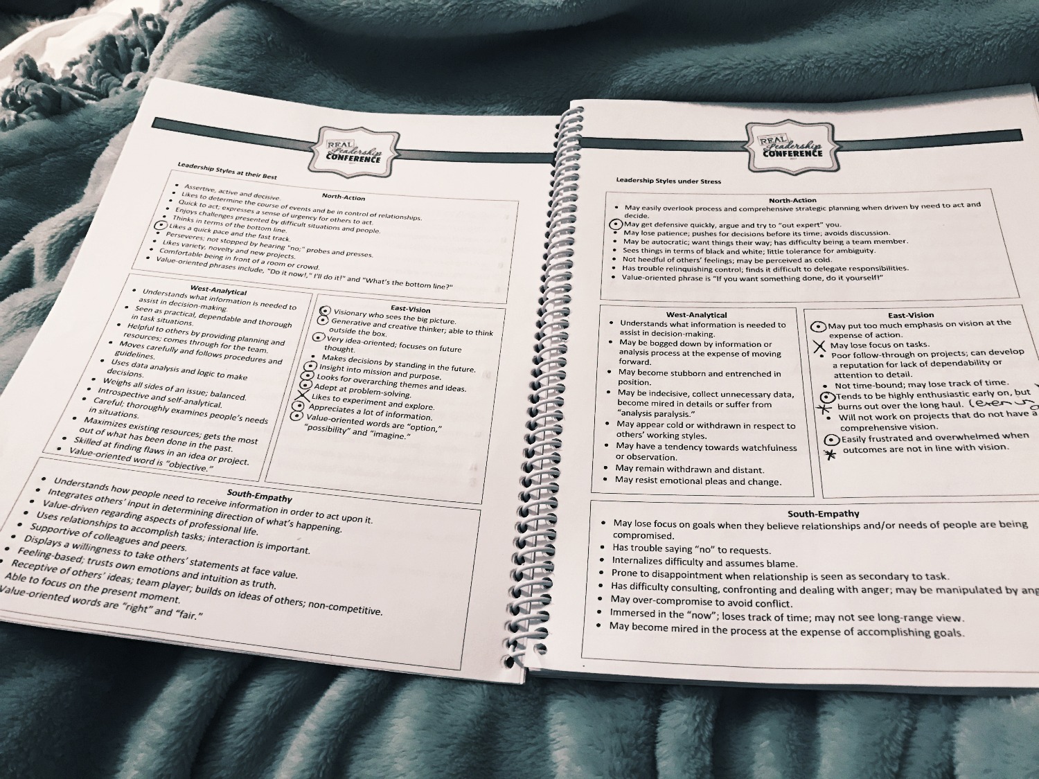
This past weekend I attended a leadership conference in Chicago with my sorority’s executive council. In one of our sessions, we took a quiz to identify our leadership personality. The leadership styles were divided into cardinal directions: North denoted action, East represented vision, West stood for analytical and South was empathy.

27ba13_a1b62e3ec4ea4d209e3cbfa52a85d212~

I fall into the East category, which means I am vision-oriented. I love to dream big and brainstorm and create a vision for the future. I definitely experienced the “this is so me”moment after I got my results. I mean, it is getting a bit ridiculous how many times I say, “We just need our members to catch the vision of…” or “I’m envisioning…” in my executive council meetings. I can’t deny my obsession with vision.
I truly believe in the power of believing in something greater, striving towards a vision, pushing on towards bigger and better things.
One of the drawbacks of my personality type is dealing with reality when it falls short of my vision. Another is becoming easily frustrated when things don’t pan out they way I envisioned them to…and let me tell you, I have a vision for many things. I have a vision for how conflict should be handled, how people should treat one another, how leaders should lead, how events should be planned, etcetera etcetera.
And oh my lanta, did I run into this issue head-on when working with InDesign this week.
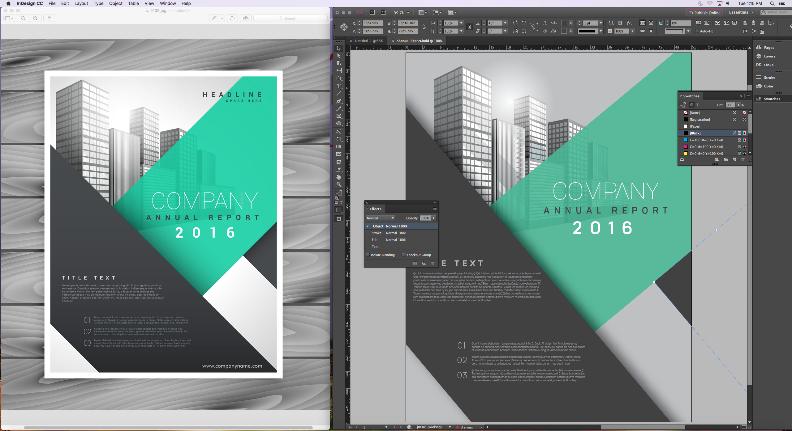
There was a perfect vision for what my design should look like provided to me in the form of an annual report cover I had the task of mimicking. I didn’t even have to create the design, I just had to copy it.
I started clicking away in InDesign, trying to match my work to the model. I couldn’t seem to match colors or angles or font sizes just right, now matter how much I tried. Being the perfectionist I am, it started to bother me more and more as I went along.

27ba13_260ed45429c346ee8310ba2518396380~

The computer mouse caught the brunt of my anger. I clicked more aggressively as the minutes melted away and my laser-focus grew stronger. The closer I got to having a finished product, the more I realized how many mistakes I’d made. My background was too grey and my shapes weren’t the right size, my text wasn’t aligned correctly… needless to say, this visionary greatly missed her vision.
I sat back in my chair, frustrated, as my professor congratulated us on finishing our first-ever date with InDesign. “It’s like going to the gym, it’s going to take some practice,” he said.
I pushed from my desk and took one more look at my assignment. Yes, it fell short of the expectations I set for myself, but then it hit me: what if I set the wrong expectation?
Instead of expecting my assignment to look perfect after my first ever rendezvous with InDesign, maybe I should have focused on eagerly learning my way around the program. Maybe the assignment had very little to do with the aesthetic, and more to do with the process.
All of this to say, while I was quite frustrated with my “failed” vision, the reality of the situation had very little to do with my original vision at all. It had everything to do with learning the program. And if this is the standard by which my vision should be set, I have to say, I left the class period with a better understanding of the program than when I entered.
For now, it may be ok for this visionary to focus on learning the program rather than perfecting the product. Baby steps. And just a little refocusing of the vision.

Simply Simplicity

Posted by & filed under JMC 3343-002.

27ba13_dd8f374eacd54080b51b3668c9848649~
“Don’t over-design.” Easy enough, right?
In an effort to be completely and utterly honest, I have to admit: simplicity is something I am inherently drawn to, but truly struggle with putting into practice. I tend to get swept up in the clutter of life, be it busyness or in hoarding little mementos throughout the years.
It’s pretty safe to say that a touch of minimalism would go a long way in my life… and quite honestly, my closet.
For whatever reason, I have been toying with the idea of simplicity this week. Naturally, I took to my favorite place on the inter-web (*cough*Pinterest) to find simple designs and inspiration for my future dream home.
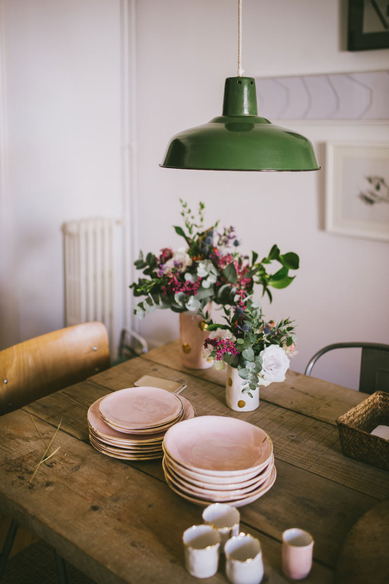
The designs I’m drawn to are quite classic. The more I got to thinking about it, the more I began to realize there is a reason a rustic wooden table with flowers and dishes appeals to our eye: simplicity. There is a quaintness about it, something that says, “I may not be anything fancy, but I am beautiful.” It’s not pretentious, nor is it dull. It is just simple and pure.

27ba13_cbaae1d1b9034f9db500e8d3ca17fce9~

I love dreaming up and designing spaces. I have learned that when designing rooms, especially smaller ones like my dorm room or my current three-girl room in the sorority house, less is most definitely more.
Funnily enough, my roommates and I set out to keep it simple when we designed Room 9. “Less is more” was our mantra, our war cry against clutter, our rally to be minimalistic.
But as you would expect, here we are in January, our closets bursting at the seams, newly built storage units are tucked into the already cramped corners of our little room and we are wondering how on earth we got here– to this god-forsaken land of meaningless clutter.
We lost touch with simplicity.
This all got me to thinking about how easy it is to lose sight of the simple things in life. For example, I trade simple socialization for sophisticated screens and I sacrifice a clutter-free week for a rigid schedule filled with meetings and busyness and deadlines.  Simplicity slips through my fingertips and out of my sight like sand through an hourglass.

27ba13_572ebe3800714707962298fd0f61f248~

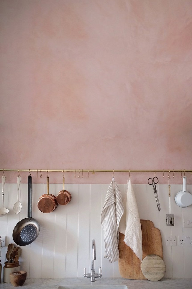
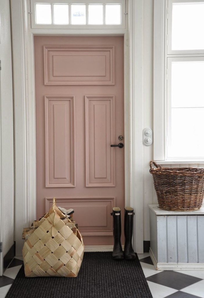
On the other hand, simplicity, as an aesthetic, seems to be as easy as subway tile and a pale pastel wall or a blush doorway in an ivory mudroom.These images are easy for me to wrap my brain around and fawn over. They are visually pleasing despite their inherent lack of excess.
But why is it so hard for me to translate this concept from my Pinterest board into practice?
For me, I am a natural “add-er”; I may start in a place of simplicity, but things (both literal and figurative) will eventually creep in and crowd the once “white space” of minimalism. It may be a slow fade from simplicity to chaos, but nevertheless, I tend to exchange simplicity for disorder.
With hopes to continue to grow and learn and draw ever closer to ideals of simplicity, I want to make an addendum to my New Year’s Resolutions (which I think is still fair game, given it’s still January) and my addendum would be this:
Declutter. Figuratively and literally. Let go of the messiness and embrace the “less” in design and in life. If I can somehow manage to make it once step closer to embracing simplicity, the design of life (and otherwise) will perhaps be more beautiful.
But mostly, I should probably practice what I pin.
Image Sources
Table Image:Spanish Vogue 
Kitchen Image:French by Design Blog