Thursday we learning about what types of fonts they are and appropriateness to those fonts. You wouldn’t want to put a circus font on the page of a funeral post. Come to think of it, I probably have used plenty of fonts that were totally inappropriate for the situation. This image is a fantastic example of appropriateness, The left side is super goofy looking and it looks like someone might have forged the certificate. The right side has the font of a more appropriate certificate.
Posts Categorized: JMC 3343-002
The Start of Food
My parents weren’t being cruel or mean, to them it was just common sense. They never had anything handed to them so why should I? I had to take care of myself. My whole family knew how to cook so it was actually very enjoyable for me to learn to cook.
I loved to beat my brother at any challenge (because everything was a challenge) including who could cook the best. As we grew older we both became extremely good at cooking but we became good at cooking different things and the challenge switched from my brother to getting others approval. The look on peoples faces when they tasted something I cooked was something I strove towards and still drives me to continue to learn and grow in my culinary talent.
This Is Me
When I was in 10th grade, my Bible teacher said that if we did the
Daniel Diet for ten days then we would receive a three percent raise on our overall grade. Of course I can never turn down a challenge so I did the full ten days without cheating (we were allowed three cheat meals) and loved the whole experience and actually ended up doing it for three months. This diet started out just as a challenge but during those ten days I came to realize exactly how unhealthy and unhappy my body was. Within the ten days I lost ten pounds and the difference was amazing. I also learned how to cook foods that I thought I couldn’t live without (i.e. cheese, bread, meat, sugar, processed food) healthy. While learning all these new eating habits, I also learned how to workout. After about three months of doing this diet I ended up losing about thirty pounds and gaining some much needed muscle and became a testimony to people who wanted to lose weight, eat healthy, and enjoy doing so.
Even before the 10th grade I was very good at cooking along with the rest of my family when I turned sixteen the first place I applied to was a restaurant called Bellini’s. It was at this restaurant that I learned what real life was like outside of having small kid-like businesses. I learned an unbelievable amount of character qualities that are crucial if you ever want to survive in the real world.
This is my story of how my adult life got started. It was a rude awakening.
Lessons InDesign, Featuring Fonts!
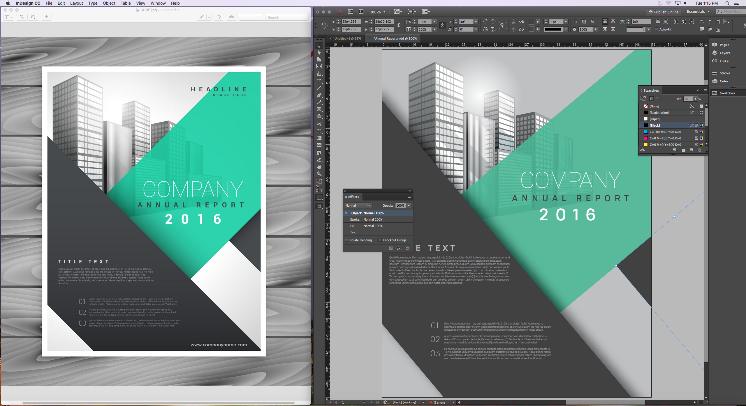
Our first day was a catch-all for fundamentals. We learned everything from drawing shapes to inserting and transforming images as part of our efforts to recreate an annual report. Croom worked quickly, but the people around me were kind enough to explain whatever I missed. The most confusing part was honestly just opening the page. I wasn’t at all familiar with the dimensions in the way they were displayed. Oddly, the way those options look on the Creative Cloud I bought look completely different.
Day two was all fonts. We were tasked with recreating a newsletter page using both the final image and a cheat sheet with each font’s details on it (i.e. type, size, leading). It got me thinking about setting up my own computer’s font selection by using one of the font downloading websites Croom promoted during our first week. I’ve frequently used dafont in the past, but it could be time to branch out.
Graphic Design
My first time working with graphic design gave me slight anxiety and a major headache. During our entire lesson I felt like I was one step behind and constantly trying to catch up. Everything my professor said seemed like a foreign language, and I’m sure I kept a confused look on my face for the entire hour. During my public relation publications class, our assignment was simple; take an image, break it down, and construct a replicate version. This seems like a piece of cake, until you actually try it. Very basic graphic design pieces begin with just plain rectangles and columns. An example of this is placed directly to the right. The rectangles are moved, resized, and colored to make each design unique to fit the client’s expectations. Titles, images, and other information is added to give the design character and create something truly original. There are so many small details that can be added to make each piece perfect. Font sizes and styles are two that can impact the overall quality of the design. When choosing font styles, always be sure that is it readable and that it all matches. When choosing font sizes, make sure the title is the largest piece and the subtitle, or following information, is the second largest. If the design contains any type of quote, putting it in a different size font, with a skinnier or bolder style will allow it to stand out and create some dimension on the page. All of these aspects are some that make graphic design so incredible, as well as difficult.
I am eager to gain more knowledge and experience in the graphic design world. Clearly I am not a professional, but I can learn. In fact, I’ve only been in class for two days and I have already come so far. Graphic design is important, and it is such an avid tool in public relations. Having the skills to create an idea and design it to become something extravagant is something that I am confident in accomplishing, even though it is challenging.
More examples of awesome graphic design pieces are in the link below.
GEtting into design
Copying the candy newsletter on Thursday was a lot of fun for me because I love spacing. Some people hate it and aren’t very good at it but I like to think that I’m pretty good at it. Putting together all the different pieces is cool to see it all come together. I know that I still have a lot to learn but I’m really excited to keep learning and to get better. InDesign is challenging and kind of scary but I’m excited to continue learning and working with it.
Vision vs. Reality
Indesign
Before |
After |
Stay tuned for more PR Pubs blogs and keep up to date with what we are doing in class by following my website!
Always with Love,
Heather Gilbert
The Struggles of Learning Adobe In Design
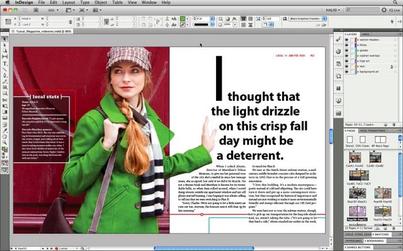
An example of what you can do in Adobe In Design. From: http://getintopc.com/softwares/graphic-design/adobe-indesign-cc-9-2-free-download/
On Thursday I came back hoping the day would be a little easier. Thankfully, it was and on the agenda for the day was to learn to work with columns in Adobe In Design. Croom showed us on the big screen how columns worked and how to create a layout for a newsletter or something similar to that. Then for the remainder of class, I was supposed to mimic a newsletter design given to me. There was a guide to what type of font to use and what size font but the rest was up to us. Thursday went by much smoother since I had finally begun to grasp how to use the Adobe program. Within 30 minutes my design was coming together and looking like it belonged with the rest of the newsletter. I had a few hiccups with how to properly align everything, but by the end of class, I finally started feeling comfortable with Adobe In Design. Croom instructed us at the end of class with some homework for the upcoming weekend. First, find a brand or company and do some research on it. Second, create a Pinterest board for competitor analysis and then a mood board for the brand/company. This information is going to be used for our first ever solo design project, creating a business card. I am excited to jump in next week on my own and see if I can create a business card worth using!
Till next week,
Amanda
Writing effectively
Bad: She drove back to Tulsa in her car from Norman.
Good: She drove back to Tulsa from Norman in her car.
Reducing clutter means there are no unnecessary words or phrases in the sentences.
Bad: All four of the students turned in their papers late.
Good: All of the students turned in their papers late.
Sentence variety means the sentence isn’t monotonous and using a variety of sentence structure.
Bad: Dr. Thompson will sit on the board of directors for American Airlines. The professor is a former American Airlines employee.
Good: Dr. Thompson, a former American Airlines employee, will sit on the company’s board of directors.
Sentence emphasis means stressing certain words or phrases based on the importance of them.
Bad: Attorney General Michael Thompson said the serial killer was apprehended after a long police chase Tuesday night.
Good: The serial killer was apprehended after a police chase Tuesday night, the attorney general said.