Posted by .

This week I am interviewing Terry Quinn. A fellow student in my PR Publications class. I will be asking her questions about what our most recent design project (business card and letterhead) was like and her thoughts during this project.
Amanda: Hi, Terry how are you doing today?
Terry: Pretty good especially with this warmer weather today.
A: I know it is lovely. So, for our most recent design project, a joint business card and letterhead tell me about what organization you chose and why?
T: I chose the nonprofit Family Legacy based in the Dallas area. I chose this organization because it is very near and dear to my heart and I go over to Zambia, Africa every summer to do mission work with them.
A: Wow, that is amazing. When researching about the Nonprofit what information did you find out about them and their overall theme/ design of the company.
T: Family Legacy has a very simplistic clean design. They are an organization that focuses more on what they do and are about then rather having a bold and loud design.
A: Very Interesting. When starting to design the business card, what were your initial thoughts? 
T: My initial thought was wow designing a business card was harder than I thought it’d be. With such a small space you don’t want to over design but you still want to keep things interesting. 
A: I completely agree with you it was much more difficult than anticipated. What were your thoughts on designing the letterhead?
​T: I think designing on a much bigger canvas is easier and I knew the feel I was going for since it was coinciding with my business card.
A: Very true I agree with you. Thanks so much for your time and have a great weekend!
T: Thanks! You too!

Posted by .

In PR Pubs, we were encouraged to channel our innerBeyoncé/Sasha Fierceduo and get in touch with our design alter-ego. At first, I struggled with the notion of creating an alternative-me…what would she look like? act like? think like?
Shortly after working myself into a mild panic, I realized I’ve actually been toting around my alter-ego for many years. I’ve been making jokes about her for as long as I can remember and she always makes an appearance around 10pm on Friday nights. She’s pretty darn cute with a dash of classic diva. Without further ado, let me introduce you to the lovely lady in waiting:

27ba13_202530de38cf413793c7c9ef0da0a47a~

Norma Nichols
She is, and has always been, my inner old lady. She adores classic movies and knitting, on occasion. She’s been collecting Vogue magazines and hoarding vintage couture since the late 50’s. She wears Chanel No. 5, calls everyone “darling” and lounges around her house in her pearls. Though she may be fabulous, she’s just a little behind the times.
Much like Benjamin Button, she gets younger as the years go on (and for design purposes, as I become more savvy with Adobe Creative Suite.) Currently, InDesign makes me feel like I am an 80 year-old with zero technological skill, so Norma is currently sitting at the ripe old age of 80.
Stay tuned for her anti-aging antics.
Letterhead Design Q & A with Madame Norma

27ba13_8596680b0afd47e1a6e2aaf6fca8f337~

Q: What is the inspiration behind your letterhead design?
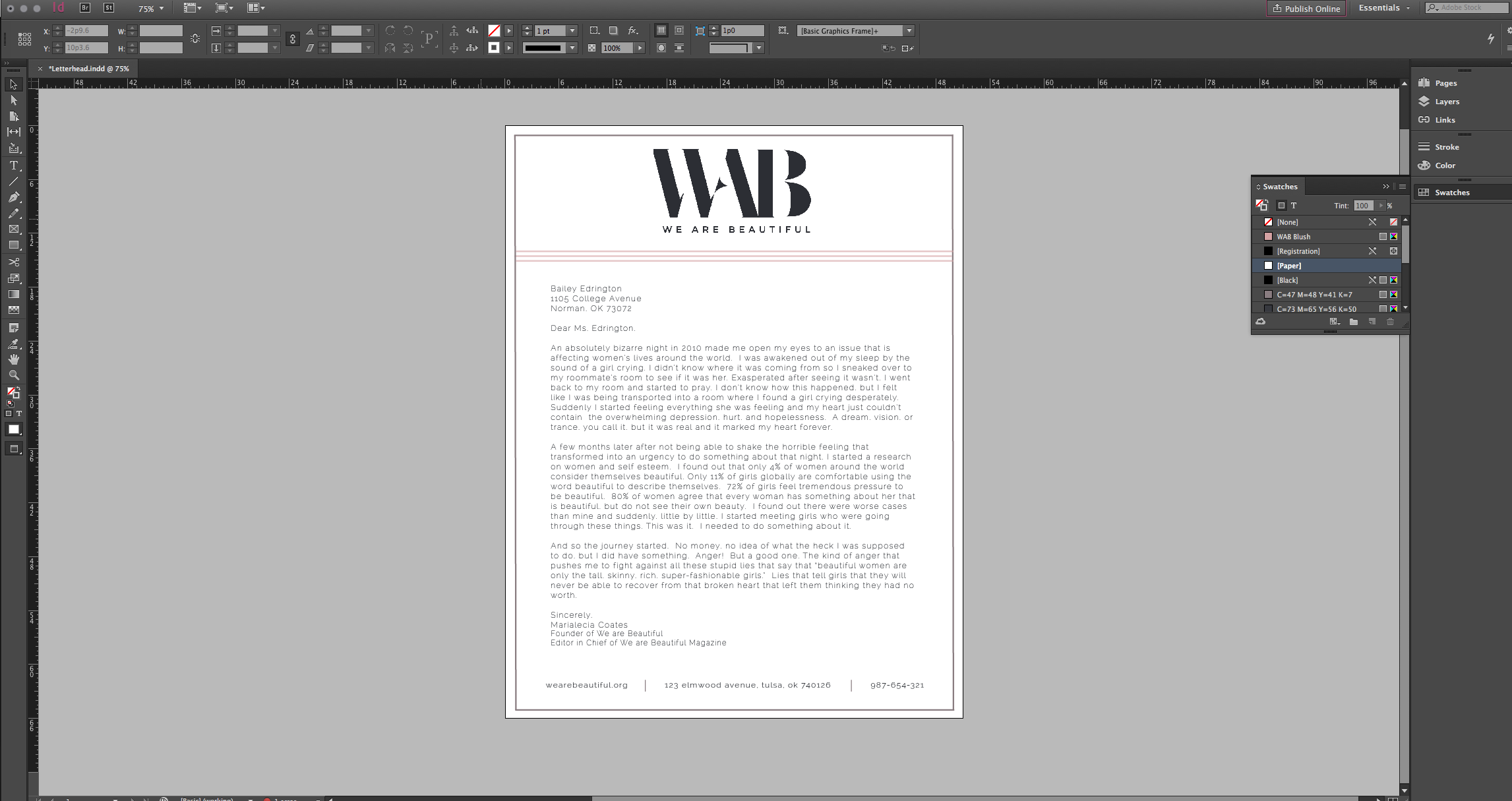
A: Well darling, I have to say the greatest inspiration was my first design: the We Are Beautiful

followed closely by the mood board I created on,Pinterest. I focused on chic, clean lines with timeless blush accents. I want these designs to be as classic and beautiful as the women whose hands they pass through.

Q: What was your biggest obstacle when designing this letterhead?
A: I’d have to say white space. There is just so much of it in a letterhead. I have to admit, my original design looks nothing like the final product. The original design was far too simple (and dare I say a bit too mod) for this organization. Though I adore simplicity, it was hard to find the balance between chic and under-designed.

27ba13_b0eef845e3b2491292bb60c2576e94db~

Q: If you could describe the design in three words, what would they be?
A: I am so glad you asked, love: I’d have to go with classy, feminine and chic. All three things I strive to be..oh and things We Are Beautiful embodies perfectly.
Q: Do you have any theories about design and style?
A: In the words of Madame Coco Chanel, “A girl should be two things: classy and fabulous,” I don’t think designs should be any different.
Q: What did you intend to be the focus of the design?
A: I wanted to draw the eye to the logo, which is my absolute favorite design element of all. WAB has a stellar logo. It’s simple, classic, distinct and draws the eye. I will always strive to draw the eye to the logo.
Q: What are your thoughts on your progress with InDesign?
A: Darling, I have to admit I am getting better. When I started this design process, I was 90 years old, so I’ve made some progress. I don’t need to ask for help nearly as often, but let’s just say, I’m still playing it safe. I’d hate to mentally break a hip whilst designing.
Chanel Quote:Good Housekeeping 

Posted by .

Earlier this week, I realized that I unintentionally created an alter-ego for myself. In the last business card design, I created Jon Hammond as a filler name. Looking back on it, he is actually an embodiment of one of my life goals: to work as a community manager for Bungie [likely under the guidance of DeeJ (David Dague), the current community manager].He seems like enough of an interesting character for me to interview, just to see how he’s gotten to where he is and how I can get there. I sat

Posted by .

This week has been full of learning about news releases and all thing related. Some important factors that were taught include understanding the importance of things like titles, slugs, inverted triangles, and bridge, and how they are crucial in writing press releases. We also learned about putting the right information in the right places in order to create the most efficient news release. After learning and reviewing the lesson, we were asked to create our own news releases based off of the Tipton Children’s home. One news release covered general information about the motives and purpose of the home, while the other focused on the bikeathon the organization was hosting.
Before this lesson, I was slightly unfamiliar with the boilerplate concepts and the bridge concepts. I was taught this information in the past, but it still was a little foggy. Having the practice of creating write up and actually writing these press releases ourselves helped create more clarity in the purpose of the ideas. 
I would be interested in knowing a little more about the importances of certain aspects of the news release. For example, is the ending mark always used? There were several news release documents I found that did not contain as many items as the sample that was given. Gaining more information on the specifics of each release is important when entering the field and beginning your own work. 
This skill set is so important in so many ways. Having the ability to write for news media is a technique that only a journalist contains, and it requires special practice and particular teaching. Public relations is a field that forces all members to write, and write well. Almost every aspect of PR involves some kind of writing, and the press releases are just one of the many. I can use this skill set for two reasons that I will explain. Number one, like I said before, writing is important, and being able to know how to write for media will always be of use, no matter the career. Number two, now that I have this skill of writing, formatting, and understanding news releases, I can better examine them when I see them, and I will know exactly where to look for contact information, the most important pieces, and other related parts. 

Posted by .

What were you asked to do?

I was asked to mark up one news release – which could have been about anything and written by any organization – and to write two news releases myself about a prescribed topic, the Tipton Children’s Home in Tipton, Oklahoma.

What can you pick up on now that you couldn’t before?

I now know the names and purposes of the required parts of a news release, as well as how to write one using the inverted pyramid structure I used to most often associate with journalism.

What else would you like to know about this skill set?

The only thing I was unsure of throughout this process was how much information to use in each of my news releases. For the first, I took note from my lessons in Writing for the Mass Media last spring and cut information that seemed like it would be less useful to the news outlet or other reader than the rest. For the second, I believe I used nearly everything because most of the given information was essential. I wasn’t sure if cutting less relevant information was a good idea, but I called upon my limited past experience and went with my gut.

How does this particular skill set jive with your expectations of the responsibilities held by a public relations professional?

This exercise centered on the precise and considered treatment of information which public relations professionals would follow a code of ethics in handling. I tried to do just that; I held the intent of honestly and accurately representing my “client,” the Tipton Children’s Home, and its mission while presenting the information in as objective a manner as possible.

How do you see this particular skill set helping you in your career?

​I’m sure that, no matter what organization I work for – especially if it’s a nonprofit – I will be asked to write a news release. Knowing how to write one is a necessary skill that all public relations professionals should know and be able to utilize at any given time, and I genuinely enjoyed making my attempt at the exercise.

Posted by .

This week in class Pritch assigned us to write 2 news release and do a news release markup. For the news release markup we basically had to mark the elements in a news release of our choosing. Learning the format and elements of a news release this week and the week before helped make this assignment easy to spot out the elements such as boiler plate, dateline, slug and end of story symbol. After completing that assignment I felt better equipped to tackle on the actual writing of a news release. The first news release was harder to write than the second one because it was basic information on an organization not just something specific to cover such as an event. I would still like to learn more about what to include in news releases that is just about a organization/company. All in all I think the news releases went well and I included all key elements into my news releases. Learning how to write a news release will help me be a public relations professional because a news release is an essential and a foundational tool of PR. This skill set will better equip me in my future career by helping my write news release with efficiency and ease. 

Posted by .

This week in class, I met my design alter ego. Her name is COCO B and she loves attention, so today I took the liberty of asking her a few questions relating to our PR publications class.
(P.S., the B stands for Beatrice, but she doesn’t like Beatrice, she just likes B.) 

Gracie: So, Coco, why are you taking this class? What about graphic design do you find interesting?

COCO B: Well, Gracie, I am taking this class to sharpen my skills in all things graphic design. I’m not experienced in the slightest way, and hopefully this class will change that. Graphic design allows me to really show my creative side and I think that’s why I enjoy it so much. I can really express myself through my work, which is always a great thing. 

Gracie: Coco, that is just fantastic! Now, what have you been learning right now in the class?

COCO B: Oh just loads and loads of stuff. We started with tutorials on InDesign to get a feel for the program, but now we are creating business cards and design letterheads and I would basically consider myself a professional. I mean, maybe not a full professional, but at least half of one. 

Gracie: Sounds like you are just taking over! What is your design for the business card and letterhead?

COCO B:  Grace- Can I call you Grace? Grace, I decided to base my project from Nike’s perspective. I included their logo, their motto, “Just Do It” and other factors that really appeal to the athletic eye. It was really a struggle finding the right colors and shapes to match the idea in my head. I actually tried about nine different design techniques before settling with the outcome. Sometimes you just can’t put perfect on paper, yah know?

Gracie: I hear yah, COCO B. Well I appreciate your time here today and I look forward to seeing all of the unique designs you come up with throughout the semester. It was really a pleasure having you out and about today.

COCO B: Why thank you, doll face, I’ll be seeing you soon.  
​

Posted by .

Read title to the tune “Dancing with myself“

Picture

Erin Tabberer: What was your assignment for this week?

Taren Evans: The assignment was to create a letterhead that matches and inspired by the business card I created last week. 

Erin:  Where did you get the inspiration for this design?

Taren: Well Erin that’s a great question, Kate Spade’s motto is “live colorfully” so I wanted to include a lot of colors and fun design. They have a lot of polka dot patterns in their clothes and purses so I wanted the background to look like confetti which is why I went with the circles. 

Erin: How did you keep the design professional looking and not overwhelming?

Taren: I wanted to design to be as whimsical as possible without looking like a rainbow crying. I kept all the confetti in the margins of the letterhead to keep it from overwhelming the body copy. I tried not to over due it so it still felt like confetti or polka dots and not an invasive pattern that would distract from what is actually important on the page. 

Erin: What were some challenges in designing this piece?

Taren: With letterheads the design needs to be fun but not invasive to the point of the letter. Making something that’s interesting but not too much was definitely a challenge. I wanted it to be fun but not something that the reader would rather look at then read the letter written on it. 

Erin: Is there anything that you would do differently?

Taren: I don’t think so, Erin. I’m really happy with what I designed. If I could do one thing differently it would be add some sparkles to it because I’m a shining star. 

Erin: What was your favorite part of this design?

Taren: I really enjoyed being about to create something fun but professional at the same time. I love Kate Spade as a brand and I think they have a really fun brand identity and there’s a lot that you can do with it. I really enjoyed working on this project but I’m also really happy it’s over.