Hot or Not Designs

Posted by & filed under JMC 3343-002.

Picture

Okay guys…lets be honest. We have all had those uncomfortable moments where we think, “What were they really thinking when they designed that?” There is a reason there are millions of memes, gifs and jokes about the poor architecture of what we thought could be the simplest things. Some designers really just needed a second opinion. Therefore, questions enter our head such as, why did they choose to put all of the bathrooms on the perimeter of the mall? Why do most T.V. remotes, that aren’t Smart T.V.’s consistent of 20 buttons I will never know how to use or avoid like the plague because I am convinced clicking them will crash my T.V? Or why is the Nike swoosh, the one label a sorority can’t be caught dead without, be so simple and yet we’re seriously just paying for an over priced design?

All of this relates back to design and how creators have used or failed to use the four basic principles of design: Contrast, Repetition, Alignment and Proximity. When creating a design people have to be aware of the values their design will offer, which needs to have simplicity, minimalism, clarity and unclutteredness. We have all at one time or another picked up an interesting book or newspaper and saw the tiny cluttered text and immediately got a headache and put it away.


Picture
I mean come on… fonts matter just as much as all of the other elements of design.

Or maybe that’s just me… Designers have to decide if using all of the blank space is necessary or not. They have to be aware of their color wheel and spatial décor so the average person does not have the outraging question of, “But why?” This goes for fonts too. Just like the picture above. The spacing between letters, font, kerning, etc. all matter. No designer wants someone to not understand a logo, text or art because of the creator’s lack of knowledge of these concepts. Let’s take a look at some “Hot and Not Designs!”

NOT

Clearly there is some major design flaws going on here. Then again, some people can get it right. Here are some known designs, text and logos that utilize proximity, the four design principles and were made for us to remember positively. 

HOT

Alright Alright, yes I learned about all of this design stuff in class, but I have some real world examples of font and design “Hots” that I found walking around campus today.
And that’s my design and font recap of the week guys!

Always with Love,
             Heather Gilbert
The Magic Of Design

Posted by & filed under graphic design, JMC 3433.

Have you ever seen a poster that immediately grabbed your attention? You probably did not realize this at the time, but everything on that poster was intentionally created to grab your attention by using specific graphic design elements from using cool and warm colors to bold fonts. There are simple things that creators can do […]

Less is more

Posted by & filed under JMC 3343-002.

Contrast, repetition, and alignment, oh my!

There are many aspects that go into creating a design. Leading the eye, utilizing blank space and CRAP, to name a few. The most interesting lesson I learned this week is that less is more. Though you can use fonts, alignment, repetition, proximity, contrast, etc. in a design, utilizing all of these is not always the answer. Simplicity is key.
Picture
Picture courtesy of http://design-elements-blog.com/2012/07/.

This week we had a crash course of the basics of graphic design. All of what we learned, to me, meant learning to be a minimalist. I tend to overdo things, so I’m interested to see how this principle will challenge me as we start “using our machines” next week. At the beginning of designing I will keep in mind contrast, repetition, alignment and proximity, or “CRAP…” Which will be easy, because this is how I feel heading into creating our first design.
Picture
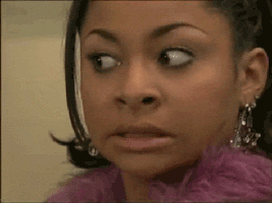
Accurate depiction of my face thinking about learning Adobe programs. Photo from GIPHY.

I’ve always envied the people that know how to make graphic designs, but I’ve never pursued knowing how to do it myself. I’m glad this course will somewhat force me to learn. CRAP, the acronym describing important design elements, stands for certain words in design. The first, contrast, requires knowing how colors work together. I know the color wheel; blue is the opposite of orange, purple of yellow, red of green, you get the point. Next is repetition, which is easy enough:
  • See, I can do repetition. Bullet points are a form of repetition.
  • I just did it again.
  • And again.
Next comes alignment. Alignment is knowing that this paragraph looks odd when comparing it to the rest. The majority of this blog is aligned left, and this paragraph is aligned right, which just throws everything off. Got it.
Lastly is proximity. Proximity is space, how close and how far things are from each other. In some instances, proximity can help orphans, or widowed writing. Thankfully, the Weebly site changes the proximity of my writing automatically so I’m not having to worry about the alignment of this blog. Thanks, Weebly!
Picture
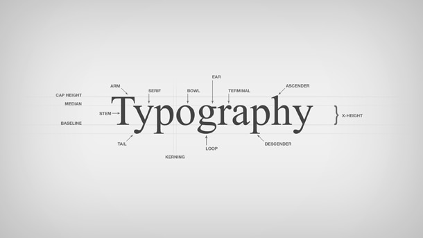
Photo from https://www.pmg.com/blog/typography-101/.

We also went over the elements of typography. The main principle I learned about typography is that in a design, you should normally stick with 2-3 font families. I also learned the difference between serif and san-Serif fonts. I know that this font I’m using is a san-serif, because it doesn’t have “feet.” Typography can either help or hurt a design, so it’s important to make sure fonts don’t detract from a design’s message.

I’m excited to use all that I’ve learned thus far from PR Publications and begin designing. But, for now, I’ll stick with watching Lynda tutorials.

Nice to Meet Ya!

Posted by & filed under Uncategorized.

Just in case I haven’t met you yet: Hi, my name is Clay Bradshaw and I am currently a sophomore public relations major at the University ofOklahoma. Born and raised in Plano, Texas by a die-hard Longhorn dad, I ended up on the other side of the Red River because my sister, Annie, was better at brainwashing.There’s a long-winded story about how I ended up wearing the crimson and cream (and what piqued my interest in PR), but I will save that for another time. I have enjoyed my short time as a PR

Emoji and Bitmoji

Posted by & filed under Blog Post.

Week 2 The second week of spring semester is done. Yahoo!! Only 14 more weeks to go, but whose counting. In PR pubs we’ve been challenged to find images in our everyday life that have design characteristics. Such as: visual[…]

Professional Portrait

Posted by & filed under JMC 3343-002.

Picture

Hi, my name is Amanda, and I am from right outside of Houston, Texas. I have lived in a suburb called Cypress my whole life. I am a sophomore, and I am majoring in PR (obviously) and minoring in Nonprofit.

What excites and interests me about Public Relations is there are so many different elements to it. It isn’t just writing PR releases, but it’s also designing business cards and so much more. I like that not every day will be the same and that I have the opportunity to interact with many different types of people. I think my favorite things about PR is the many options I can choose from for what field I would like to go into or, even work at a PR firm and deal with different types of clients all the time.
​
​What motivates me is my love for writing and making people happy from it. Writing is in my everyday life whether it’s for a class or even journaling. Writing is a way I can help relieve stress and reflect on my day. I am so excited to improve my writing skills and learn more about PR in this class!


Minimalist

Posted by & filed under JMC 3343-002.

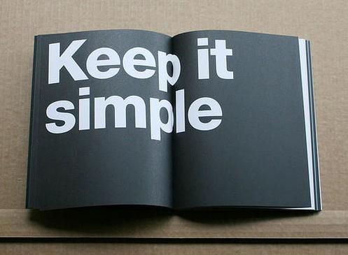
The class lesson that stood out most to me this week was the topic of minimalism. You don’t always have to fill the entire space.
Picture
Sometimes, less is more. Especially in graphic design. (Photo via Becoming Minimalist)

January 26th, 2017

Posted by & filed under JMC 3343-002.

Breaking down Design 

Picture

 I have never really put much thought into the details and descriptions of design. I would look at a cool poster and think, “wow, cool poster.” I guess never having experience in those types of creations limits my ability to analyze exactly how they are made. So many different aspects go into these designs that are plastered all over the world, and once you take a moment to breakdown each piece of the picture, it all makes a little more sense on how it was done. 

Design values like simplicity, clarity, and decluttering helps to focus the eye one the main idea, eliminating the stuff that is less important. Creating a clean and less confusing design will make the viewer feel relaxed while looking at it instead of overwhelmed. I, for example, am not a fan of busy, crazy, and packed-full designs. I look at it and immediately think, “there is a lot going on here.” I will always choose the design that is unique, creative, and of course, simple. These design values are not the only pieces that are incorporated when coming up with these intricate designs. There are for basic principles to think about before starting your graphic design piece: contrast, repetition, alignment, and proximity. Now, everyone always suggests that in order to retain information, you should create an acronym for the words you are needing to know. These four principles might just be my favorite because their acronym spells crap. This might come off as a little immature, but hey, if you’re learning the material then who cares? Each of these principles makes a huge difference in the quality and compatibility of the designs. Contrast will create an interest on the page and aid organization. Contrast is one that doesn’t require much experience to figure out. I mean it’s pretty simple, don’t put red words on an orange background; Don’t put a white title over a very bright picture. Contrast can make a really big impact on how easy of a read something may be. Repetition is one of my favorites of the four. I love neatness and order and all things organization, and repetition allows those elements to happen. It includes equal formatting and spacing, bullets, and bold fonts to identify which items are most important. Alignment can be tricky at times, but can make all the difference between “good” and “great.” I can’t tell you how many times I have been working on some type of project and finding the right alignment stalls my progress because I can’t get the words to line up perfectly.

Above, you will see a picture example of the proper alignment (right) versus the not proper alignment (left). I am indeed a perfectionist, this can be a good thing, or a bad thing. As far as design is concerned, I believe it’s a pretty good thing. I want things to look even and right, if they are not, I must fix it until there are, no matter the amount of time or effort it will take. I spend a great amount of energy working with alignment, because it is so important and it makes a big effect on the structure. Lastly is proximity, in other words, the space. Proximity can turn something that is tight and squished into something that is spread out and so much easier to read. I catch myself using proximity in everyday things, like note taking. My notes are usually spaced out so much that I end up using twice the amount of paper as everyone else. It’s okay though, because I can actually read my notes, unlike many whose efforts to record information are useless because the writing is practically one big hieroglyphic. 

When examining a design, all of these factors and principles work to make a creation something unforgettable. These are not all the elements added to the mix of perfect designing, but in my opinion, they are a good place to start. Full blood images, aspect ratio, and the rule of thirds are a few more that contribute. For some examples of different types of creative graphic design, visit the link placed below listed “examples.” These specific examples really emphasize the typographic style of design, which mostly focuses on the fonts, letter, shapes, and certain imagery that relates. Having proper contrast, visual colorful interests, creative metaphoric ideas, and trendy or eye-catching fonts is what makes these designs stand out in comparison to something with less personality. In addition to the examples I have given below, there is also a picture I found on campus that holds many of the characteristics that a proper typography design contains. In this poster, there are a variety of fonts that provide uniqueness and creativity, while still keeping all parts readable. There are colors present, contrasting pictures that allow for certain parts to stand out, and there is also proper alignment and structure, so the eye naturally follows the words. 

After studying these attributes of quality design, I can better appreciate the time and thought that goes into everything graphic design. Now, when I walk past that cool poster, my thought won’t just be that it’s a cool poster, I can examine the shapes, fonts, patterns, and really begin to breakdown each piece to find the beauty in how it all fits together.


Simply Simplicity

Posted by & filed under JMC 3343-002.

27ba13_dd8f374eacd54080b51b3668c9848649~
“Don’t over-design.” Easy enough, right?
In an effort to be completely and utterly honest, I have to admit: simplicity is something I am inherently drawn to, but truly struggle with putting into practice. I tend to get swept up in the clutter of life, be it busyness or in hoarding little mementos throughout the years.
It’s pretty safe to say that a touch of minimalism would go a long way in my life… and quite honestly, my closet.
For whatever reason, I have been toying with the idea of simplicity this week. Naturally, I took to my favorite place on the inter-web (*cough*Pinterest) to find simple designs and inspiration for my future dream home.
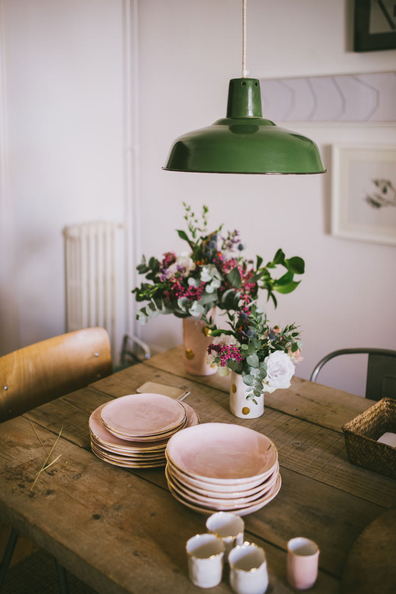
The designs I’m drawn to are quite classic. The more I got to thinking about it, the more I began to realize there is a reason a rustic wooden table with flowers and dishes appeals to our eye: simplicity. There is a quaintness about it, something that says, “I may not be anything fancy, but I am beautiful.” It’s not pretentious, nor is it dull. It is just simple and pure.

27ba13_cbaae1d1b9034f9db500e8d3ca17fce9~

I love dreaming up and designing spaces. I have learned that when designing rooms, especially smaller ones like my dorm room or my current three-girl room in the sorority house, less is most definitely more.
Funnily enough, my roommates and I set out to keep it simple when we designed Room 9. “Less is more” was our mantra, our war cry against clutter, our rally to be minimalistic.
But as you would expect, here we are in January, our closets bursting at the seams, newly built storage units are tucked into the already cramped corners of our little room and we are wondering how on earth we got here– to this god-forsaken land of meaningless clutter.
We lost touch with simplicity.
This all got me to thinking about how easy it is to lose sight of the simple things in life. For example, I trade simple socialization for sophisticated screens and I sacrifice a clutter-free week for a rigid schedule filled with meetings and busyness and deadlines.  Simplicity slips through my fingertips and out of my sight like sand through an hourglass.

27ba13_572ebe3800714707962298fd0f61f248~

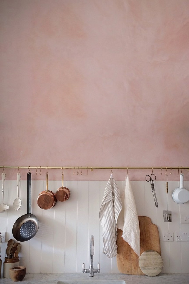
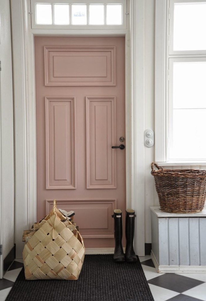
On the other hand, simplicity, as an aesthetic, seems to be as easy as subway tile and a pale pastel wall or a blush doorway in an ivory mudroom.These images are easy for me to wrap my brain around and fawn over. They are visually pleasing despite their inherent lack of excess.
But why is it so hard for me to translate this concept from my Pinterest board into practice?
For me, I am a natural “add-er”; I may start in a place of simplicity, but things (both literal and figurative) will eventually creep in and crowd the once “white space” of minimalism. It may be a slow fade from simplicity to chaos, but nevertheless, I tend to exchange simplicity for disorder.
With hopes to continue to grow and learn and draw ever closer to ideals of simplicity, I want to make an addendum to my New Year’s Resolutions (which I think is still fair game, given it’s still January) and my addendum would be this:
Declutter. Figuratively and literally. Let go of the messiness and embrace the “less” in design and in life. If I can somehow manage to make it once step closer to embracing simplicity, the design of life (and otherwise) will perhaps be more beautiful.
But mostly, I should probably practice what I pin.
Image Sources
Table Image:Spanish Vogue 
Kitchen Image:French by Design Blog