This week in Public Relations Publications, we started the week off by learning about how to navigate through photoshop. I barely jut learned how to use InDesign, so when I heard we were learning how to use a whole other software I was a little nervous. I know it is necessary to learn multiple ways […]
Monthly Archives: February 2017
Learning Photoshop & Learning from Tiffany
This week we watched Photoshop tutorial videos on Lynda. I’ve never really used Lynda until this semester and I’ve learned to really like it. The instructions are clear and I appreciate that there is a transcript to go along with the videos. Here are some new things I learned about Photoshop:
1. If you simply press “B” on the keyboard while using Photoshop, the brush tool becomes selected.
2. I liked the analogy that the layers on Photoshop are similar to a stack of papers. You can only see the top paper (or layer), but there can still be other papers (or layers) beneath.
3. I finally learned what the lasso tool does!
On Thursday, Tiffany Haendel from OU’s Recruitment Services lectured our class. She was really insightful. Here are some of her tips and pointers that stood out to me:
1. Utilizing leading with a smaller font is more easily readable than using less leading with a larger font. The leading allows areas of lots of text to not look as cluttered.
2. OU now sends an acceptance BOX (instead of just an envelope) to admitted students. This is a way to make the recruitment experience more exciting and personable.
3. The point of sending mass communication emails, text messages, postcards and other mailed items is to communicate a call to action. Printing is especially expensive, so if a piece of mail does not serve a purpose or encompass a call to action, it could possibly be a waste of money.
These are some of the biggest takeaways I got from Tiffany’s lecture. Thank you for visiting us, Tiffany! You were very insightful.
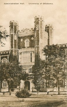
This old image on this University of Oklahoma postcard makes me think how far we have come with technology and graphic design. (Photo from The Postman Loves Me)
The adventure continues
And the adventure continues, on to the next adobe suite application to master (by master I mean attempt to act like I understand what is going on for a few weeks and then move on)… More
Starting Photoshop
Photo from PexelsLast week in public relations publications, we finished our letterhead based on our business card. This wrapped up our section on InDesign. Now, we are transitioning into Photoshop.Tuesday’s class was about learning the basics from Lin…
Starting Photoshop
Photo from PexelsLast week in public relations publications, we finished our letterhead based on our business card. This wrapped up our section on InDesign. Now, we are transitioning into Photoshop.Tuesday’s class was about learning the basics from Lin…
Unit 3.2 Reflection

This week we began learning about media advisories and media pitches. The goal for both of these pieces are to communicate with journalists about events and organizations that are happening and encouraging them to write a story about the topic.
Before this unit I didn’t know how to write an advisory or a pitch. I knew what they were but didn’t have any experience with them. It’s really interesting to learn the most effective ways to communicate with journalists to encourage them to write a story about the event or organization.
I would like to learn more about how journalists use this information to write stories and what else journalists would like to see in the advisory or pitch and topics that they wouldn’t ever want to cover personally or things they are interested in.
I already knew that becoming a public relations professional would mean communicating with journalists but I didn’t realize how many different tools were used to communicate the message to them. Pitches and advisories are both very effective tools used for different things.
This skill set will help me in my career because it will help me to communicate better with journalists which will then help get the word out more about my organization or event. Getting journalists interested in something that I’m doing will get the public more interested as well and will overall help my company.
SONIC Target Market Personas
Media Advisories and Pitches
This week we were asked to write a small assortment of media releases for the Tipton Children’s Home. I honestly wasn’t aware that media advisories existed, and had only written one media pitch before that was sub-par at best. As I worked through these assignments, I realized how personal journalists and their connections are with each other. I figured it would be a business-as-usual type of encounter, but it takes media contacts a reasonable amount of time to research, relate to and reach out
February 22nd, 2017
Photoshop and guest speakers, oh what fun!
Photoshop is crucial in every aspect of graphic design, and it is a large part of my publications class. This week we have learned some basic fundamentals, as well as a small amount of practice with the program. The majority of the week has consisted of tutorials, however we have big plans in store. For the next few weeks, we will be completing assignments using our newly learned photoshop skills (hopefully we will have developed some by then.)
Like graphic design, photoshop takes patience, practice, and persistence. Without these three, you might as well give up now because it’s not happening. I know that it is slightly frustrating and little bit difficult, but I also know that it is a useful skill that I will be so thankful for in the future.
This week was also full of a fun surprise: a guest speaker. Guest speakers are exciting because it allows for a change up in the normal, every day routine. This week’s speaker was named Tiffany and she worked with OU recruiting. She talked to us about a wide variety of things, including some of the important aspects that graphic design and photoshop has in her job. She brought two different OU recruiting pamphlets, one that contained small font and large spacing, the other has large font and small spacing. You would think the design that contained the larger font would look the best, right? Wrong. The large font, small spacing duo was actually pretty overwhelming and hard to read. The one that had the large spacing was much more organized and it made me want to read it, apposed to the first one which made me want to say “yeah, that’s a lot of words, I’m not even going to bother.” The skill sets and concepts that I’m learning now can benefit my future and our guest speaker today is just one example of how often these techniques are used in the real world. I am so excited to gain more experience so I, too can put my knowledge to work to create a design piece that is sure to amaze.
A look into Free People
Free People is a well known store across the United States and is building an international following as well. They have a variety of bohemian type clothing, but they still appeal to many different style types… More
