Today’s blog post is a little different than usual because I am interviewing a pretty cool person (just kidding it is just me). This will give you a little insight into the time I spent creating this weeks Public Relations Publications assignment. I, Sierra Abbott, will be asking the creator of this project, my alter […]
Monthly Archives: February 2017
An interview by me, with me
This week’s blog post is an exclusive interview with the one and only, Tiffany Winter. Tiffany Winter is the design genius, AKA my alter-ego (Beyonce has one so of course I do too), behind the lovely… More
Interview with Stella Mae
This week, I got the opportunity to interview Stella Mae, my designer alter ego whose most beautiful masterpieces are created in Gaylord’s PR Publications class. I got to sit down with Stella this afternoon and discuss her latest project: a letterhead for the infamous brand lululemon. Kate: So, Stella, for your latest project, where did […]
All The Way

Singleness is an amazing opportunity for young people to get the most out of their relationship with the Lord. God uses our singleness to help others and to care for those around us. It’s also the time for us to grow with Christ and love him fully. If you aren’t content with God’s love while you’re single then going into a relationship isn’t going to make you feel whole. People often describe an emptiness they feel that they don’t know how to fill but the hole is Christ that you’ve been trying to fill with earthly things. No matter how godly the other person is they will never be able to fill the hole meant for Jesus.
Sometimes being single can feel like a chain weighing you down from opportunities and you might feel like you’re lagging behind your other friends but take this time to develop an undying devotion to God. Develop who God is in your life and who he isn’t. You realize the truths he has for you and the love that will never leave you. You have to be faithful where you are. Be present in your conversations and let Christ’s love shine through you. Don’t waste your singleness by looking for a partner, when you’re ready the Lord will provide you a spouse.
Being single is the time for you to lay the foundation for the rest of your life. It’s a time to live for God and not yourself. Develop your prayer life, talk to Jesus like he’s your best friend, and find friends who will hold you accountable. Gain a drive and direction that will lead you to the feet of Jesus. Care more about other people’s eternity rather then your temporary life. Take the time during your singleness to change yourself for the better. Live for Christ everyday and with his purpose in mind. If you’re not willing to make God number one now you won’t after college. Go all in for the Lord.
Living for Christ is something I’ve personally been struggling with a lot. I focused on school and my other relationships rather then the only one that would truly sustain me. No matter the season you’re in, you have to continue to seek the Lord or you other relationships will fall apart. My goal is to live for the plan that the Lord has for me and trust that he knows best even though things are hard right now.
“I am the daughter of a king who is not moved by the world for my God is with me and goes before me. I do not fear because I am His.”
Letterhead Woes
I was assigned to work on a letterhead for PR pubs today. It was soo much easier than the business card because most of my research was already done on brand identity. Plus, I already had a good understanding of what I wanted my letterhead to look like. I believe my progress on it… Continue reading Letterhead Woes
Let’s Get Down To Business
This week, our assignment was to create a business card for a company of our choice. I chose Epic Pops on Campus Corner since I’ve been researching the company lately with Lindsey + Asp.
To get our minds in the right place for this assignment, Croom assigned us to create two Pinterest boards over the weekend: a business card mood board and a competitor mood board. For my business card mood board, I pinned a bunch of colorful business cards to get me in the bright, popsicle mindset. For the competitor mood board, I pinned a lot of photos of Steel City Pops – a popular gourmet popsicle shop in Alabama, Texas and Kentucky.
My business card was inspired by the menu chalkboards at Epic Pops. I decided to make my business card resemble a chalkboard. I chose to use one font (chalkduster).
I worked on my business card for approximately three hours total. It’s crazy how much work goes into a 3.5 x 2 inch piece of paper!
Throw Confetti

|

|
This week we began designing business cards for our chosen clients. I chose Kate Spade, a luxury purse and clothing brand. Their motto is “live colorfully” which was part of the reason that I chose this brand because I knew that there wouldn’t be a lot of creative boundaries with it. I really enjoy the colors and various patterns that they use in their designs.
On Tuesday I began my design with the polka dots in the corner to resemble confetti. A lot of their designs or quotes they use talk about parties or confetti so I thought that would be a good choice. I decided to do different colors because of their motto and it gave it a fun feel. The goal was to make it look like it was fading from the corner and into the rest of the card. I added the few dots around the other edges so there wasn’t as much dead space. I used the same font for my name and the rest of the information as the Kate Spade logo but made the name bolded.
The back was definitely more challenging then I thought it would be. I began by putting polka dots all over the back and then adding white space behind the logo but that looked entirely too cluttered. I knew I wanted to add their slogan but I couldn’t think of i way to make it stand out without looking like a ball pit. Once I began increasing the leading on the slogan, I thought of the idea to put the letters in the bubbles. It took a lot of patience and focus to getting the spacing between the bubbles and the letters just right.
In the end I am very happy with my design and I think it has a lot of character and would easily catch someone’s eye. If I would do anything differently I wouldn’t have started the back by putting hundreds of circles on it.
Darn Right I Can!!
Have you ever been so mad one second and then happy and proud of yourself the next? That’s what happened to me this week. So I started a new business at the beginning of the year called Haven of Homes. What I do is clean apartments, houses and remodel homes. Remodeling homes has been going great but thats a very slow and small part of my business, the real money maker is cleaning and that wasn’t going so fantastic. I have been calling and driving around the entire Oklahoma City metro asking apartments for cleaning contracts, handing out business cards, going to business meetings etc. in hopes of soliciting business. Turns out, no one seems to be hiring and as I have no other job than my business I have been on the brink of breakdown.
I was in my car Monday driving around looking for business. As I neared the end of my day I literally just sat in my car and screamed my head off in frustration. I also started screaming at God for all my failures as this seemed like another one. Yes, I said screaming, not praying, I tend to be an ungrateful brat at times. Anyway, I saw one more apartment and decided I would go in and put in my price sheet for cleaning and hope they were hiring. Of course, the front lady said no they were not looking for a housekeeper for make-ready apartments and I walked out very depressed. About an hour later the lady called back and asked me to meet her on Wednesday morning.
This is where is gets slightly funny. So the next day I walk into my PR Publications class and turns out, we are making business cards. I can’t lie, I had a very “whatever” attitude about the project but I decided to design a business card for my business. It literally was the most frustrating project I have ever done. The professor walked by to see how I was doing with his cheerful self and of course I had an attitude. “So how are we doing over here?” the professor said. “I am so done with this project!” was my response. I felt really bad but InDesign is so complicated and I was still frustrated with my own business. At the end of the class I literally went no where with my business card. I had no design plan or information on the card yet and it was due by this past Thursday.
Wednesday comes around and I go to the meeting with the apartment and turns out they want to hire me! When the property manager told this to me I did a slight happy dance in my head. That isn’t the end of the story though. The manager kept talking and when I asked her about how many apartments I’d be cleaning a week she said that I’ll be cleaning for all five of the properties her company owns! My mouth dropped and I said “Darn right!”.
The next day in class I was much more appreciative of my professor and I’m pretty sure he was appreciative of the attitude change too.
So I know all of you are wondering how hard it is and for those of you who downloaded the free trial of InDesign here is a quick tutorial of how to make your own business card!
https://www.youtube.com/watch?v=9gje1Q6j_WI


Getting Down to Business
After learning about some design basics over the past two weeks (design concepts and typography), we have completed our first assignment: a business card. It was a difficult process that definitely had me frustrated at times, but it’s done and I’m reasonably proud of how it came out. Bungie is a video game developer based out of Bellevue, Washington. Their most notable work is the unforgettable Halo series, and their current project: Destiny. I’ve been a hug fan of their work since I first got
We are Beautiful, Even When the Process Isn’t
Not once in my life have I ever felt so relieved to hit the “Submit Assignment” button. Truth be told, designing a business card is a bit harder than one might think…especially when working with the enigmatic beast that is InDesign. In my PR Publications class, we were told to select an “imaginary” client (aka a real brand, but you don’t have to actually work for them) and design a business card with their brand in mind.
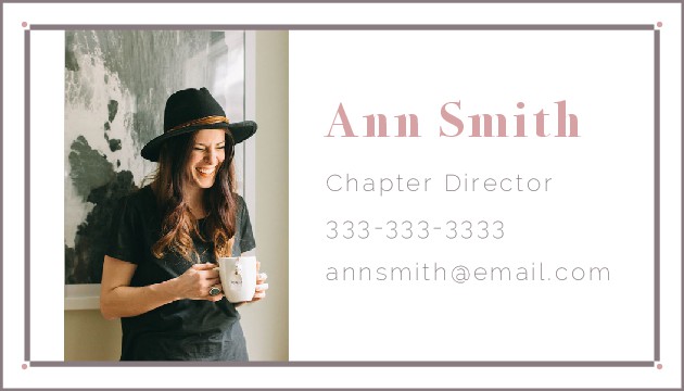
We Are Beautifulis a nonprofit organization whose mission is to be “a community of women inspiring one another to embrace and celebrate their true beauty.” I discovered We Are Beautiful through my lovely sorority G-Big, who does Bible studies and blogs for WAB. This organization is one I’m sincerely interested in working with (in real life) for a number of reasons, but the short and sweet version is this is an organization I believe in. That said, I eagerly jumped into designing for this “client” the moment the opportunity arose.
The Process
I wish I could say this process was an easy one. The design/visionary element didn’t trip me up as much as the actual process of creating this product did (side note: what an accurate metaphor for life, right?) I envisioned rather clearly what I wanted the card to look like, but the creation process had other ideas.

My first mock-up of the card had a blush background; however, the issue with a blush background is that it A) detracted from the content and B) didn’t mesh with the WAB brand all that well. While blush is an element of WAB’s color scheme, it is always the accent, never the focus. Thus, I shifted to a white background to stay on-brand.
The second issue I faced was with typography. I knew, based strictly upon the WAB logo, I needed a serif and a sans serif font for the content. I spent a majority of my class time on Tuesday searching through the font on InDesign before I realized I needed to bring in the big guns…1001 Free Fonts. Sure enough, I found the perfect fonts right away and uploaded them into the program.
The last issue I faced was detailing. Because a business card is so small, I tried not to over-design, but at the same time, I didn’t want my design to be lackluster. So I opted for simple lines and geometric shapes to keep the eye focused on the information in the center while also visually pleased. Believe it or not, I spent more time trying to align dots and lines than I did on just about anything else. Once everything was arranged where I needed it, I felt pretty confident about my final product.
The Product
(Photo courtesy of the ever-faithful and true,Pinterest

(Logo courtesy ofWe Are Beautiful)
Though the final product may be simple, I am quite fond of it. And though the process was a bit more work and a little messier than I anticipated, I am thrilled I walked out of it with a finished product.
A Little Philosophy, Free of Charge
As I sit here and write this, I cannot help but giggle at how design continues to be a metaphor for life. In a literal sense, designs will morph and adapt for various reasons as a designer walks through the creative process. Metaphorically, isn’t that just about how everything else in life works?
When we start something, be it a new job or a leadership opportunity, we have an idea of what something will look like. We make plans of how our days will play out and what we will accomplish, but after walking through the refining fires of “process” we end up with an entirely different something than the thing we originally planned. And isn’t it funny how 9 times out of 10 we are satisfied with our final product despite how different it is from our original? Dare I say, there are times we are even more satisfied with the current scenario than we would’ve been if we’d seen our original “design” through to the end. Even when it seems messy and at times frustrating, I think there is something beautiful about trusting life’s process.
