Sometimes Simplicity is a Good Thing

Posted by & filed under JMC 3343-002.

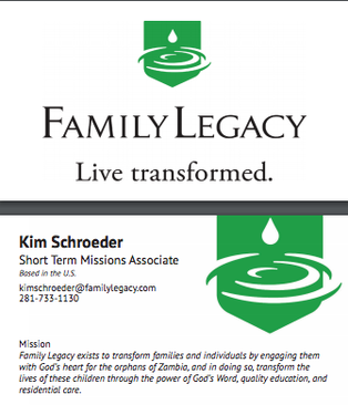
PictureThe business card I designed in class.

As I mentioned in my blog post from last week this week in class, our assignment was to design a business card.  Before class, we had to pick a brand and do some research on it. I chose the nonprofit Family Legacy which helps the orphans of Zambia learn about the Lord and equip them with a quality education. I knew Family Legacy was the brand I wanted my business card to be designed after because I have worked closely with them in the past and I have been personally impacted by this organization as I have mentioned in a previous blog post.
Going into class I thought this assignment would be easy but, the whole time I was designing, I felt as though my design was too simple. Every time I would look at other people’s computer screens I would see such intricate designs. When I looked at the brand, I was designing for though their logo was so simple and I knew from experience that Family Legacy wouldn’t want something over the top. So, I kept the design clean, sleek and simple which is something I believe Family Legacy embodies. I think that was the purpose of the assignment, though, to learn to not over design something in such a small space and know what feel and look the brand you’re working for wants. I learned that simplicity in a business card is essential and to only put the most relevant information on a card from this assignment. Along the way, I forgot how to do certain things in InDesign, but with the help of a fellow classmate and Croom I figured it out. I also realized how important it was to keep in mind all the elements of typography l because that can make or break a business card design.  I feel proud of what I created, and I am excited to keep improving my skills. I can’t wait to see what is in store for next week!
Picture
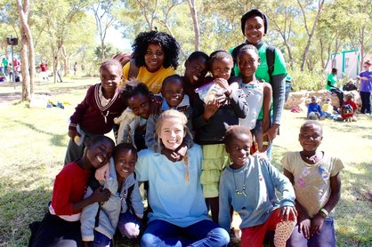
Picture of me with my 10 girls in Zambia at Camp LIFE a Family Legacy ministry.

business casual

Posted by & filed under JMC 3343-002.

This week, we began our first design: a business card.
Over the weekend, we were to look up competitors, aspirations, logos, color schemes, etc. for a company of our choice, so that we could understand the brand before making the design. For this project, I chose Carnival Corporation (Carnival Cruise Line).
Picture
Photo from CruiseLnd.

Going in to Tuesday’s class, I was confident in my understanding of Carnival Corporation’s corporate culture, colors, themes, wants, needs, competitors and more. However, I quickly realized that although I knew all of these details, I did not brainstorm the layout of my business card before actually beginning to do it in class. This caused me to spend a lot of time thinking and a lot less doing. To be honest, I expected Croom to walk us through the process, giving us tips and suggestions as we go. This was wishful thinking. The business card was the first opportunity for us to independently work on InDesign and discover different tools, which quickly made it feel like a free for all.
Picture
How I felt when beginning to make my business card. Photo from Long Beach Real Estate.

The first 20 minutes of class, I had to remind myself to be patient and keep trying. After a couple of minutes, though, I actually found that I knew more than I thought I did. On Tuesday, I only got to finish the front of my business card, but I was very proud of how it looked. Shout out to Croom for teaching me the Clipping Path and gradient feather tools, because those two seemed to be the reason the front of my design came together.

Between Tuesday and Thursday, I brainstormed for awhile about the back of my business card. I put my ideas to life, and here is my final creation:

I feel that I’ve accurately used Carnival Corporation’s color schemes, logos, simplicity and typography, and I’m happy with the way my business card turned out. My creativity is nowhere near its peak, but the business card design project forced me to put my foot in the door. I can’t wait for our next project!

OOPS I did it AGAIN

Posted by & filed under JMC 3343-002.

Picture

     I had to get a Brittney Spears lyrics in there….. Just kidding. Seriously though, I messed up with class AGAIN! Especially with PR Publications. This class is probably the easiest class to pass and I messed up! All we have to do is show and do our homework and work hard. How hard is it to do your best? It shouldn’t be very hard, but I’m human so all will be righted and okay I suppose. So this past week I totally forgot to write my blog (this blog I am writing now is that blog). I also apparently didn’t turn in my first week’s blog, which I totally did, but in result my professor didn’t count the assignment. I hope he makes an exception but if he doesn’t, I suppose I understand; it is my fault after all. 
   Let’s move on to what I learned this past week. Publications was really pretty fun. We have started to get into the new program InDesign which is extremely complicated and had me wanting to pull my hair out. I also discovered my laptop will not download InDesign. I discovered this while in class with everyone around me already working on their assignment. Needless to say, I had a mini panic-attack. Luckily for me, a student wasn’t there so I hopped on her computer and worked on it.  I actually ended up having to sell my old laptop and buy a new one. Anyways, InDesign is super cool other than not being compatible with my laptop. It is honestly very similar to photoshop but for designing stuff like advertisements and business cards.  

Do you see how many buttons there are? We definitely didn’t even learn a fraction of what those buttons mean. However, we did learn a lot of shortcuts which I don’t remember whatsoever. 
          If you would like to try out InDesign for yourself they do have a trial! Heres the link 

​https://helpx.adobe.com/mobile-apps/how-to/comp-to-magazine-cover.html?sdid=KKQLP&kw=semgeneric&mv=search&s_kwcid=AL!3085!3!155829415335!e!!g!!indesign&ef_id=VxbXKQAABIxvmJs@:20170207173617:s

Learning Things in College About Not College Stuff

Posted by & filed under JMC 3343-002.

Picture

​ I came into PR Publications completely late and totally freaking out because I had no idea if I would be able to join the class or not. We were learning about the thinking process of making movies and categorizing them into different stages. Personally, I still don’t get it but I did take note of a few things so that maybe I’ll be able to understand later and not lose that knowledge. The Professor had us write down on sticky notes the methods of what the people in the video clip we watched about the creation of Inside-Out. Then he had us go put the sticky notes under each category: empathize,  define, ideate, prototype, test. I think that he was trying to establish a thinking process of how to write a publication in the future to aid in it being successful. This method is used also in advertisement. However the difference between advertisement and publications is  advertisement is paid for and not controlled. Publications is paid for but is controlled. I was supposed to post about what we learned on tuesday however I was not there on tuesday. I did, however, learn that school in fact did start on tuesday and that I should double and triple check when school starts next semester.

Here is a link to what we learned. I’m not sure if it’s the exact link we watched but I read the post and it’s essentially what we learned, I think.
 ​http://www.hollywoodreporter.com/features/making-inside-emotions-didnt-make-848249


The Start of Food

Posted by & filed under JMC 3343-002.

                  Growing up was slightly different than most kids because my parents did not hide anything and taught me to be independent at a young age. I remember going to school one day in first or second grade and I was starving. Not literally starving but extremely hungry because I didn’t get breakfast that day and I didn’t want what the cafeteria was serving that day. When I got home I was really mad that not one of my parents made breakfast for me but I knew better than to say anything about it. I knew that my parents would laugh and ask why they had to make my breakfast when I was perfectly capable. So from that day on, it was an unspoken rule that if I wanted to eat that day I needed to make my own food. 
                    My parents weren’t being cruel or mean, to them it was just common sense. They never had anything handed to them so why should I? I had to take care of myself. My whole family knew how to cook so it was actually very enjoyable for me to learn to cook.
           I loved to beat my brother at any challenge (because everything was a challenge) including who could cook the best. As we grew older we both became extremely good at cooking but we became good at cooking different things and the challenge switched from my brother to getting others approval. The look on peoples faces when they tasted something I cooked was something I strove towards and still drives me to continue to learn and grow in my culinary talent.   

This Is Me

Posted by & filed under JMC 3343-002.

             As a child I was also very curious and apparently self absorbed if you dare to look at the pictures I took as a young child (they were all close ups of my face). As I got older I became quite good at taking pictures and very artistic with painting as well. I eventually took my brothers senior pictures and pictures that were auctioned off at my mothers store for people to buy. 

            When I was in 10th grade, my Bible teacher said that if we did the Daniel Diet for ten days then we would receive a three percent raise on our overall grade. Of course I can never turn down a challenge so I did the full ten days without cheating (we were allowed three cheat meals) and loved the whole experience and actually ended up doing it for three months. This diet started out just as a challenge but during those ten days I came to realize exactly how unhealthy and unhappy my body was. Within the ten days I lost ten pounds and the difference was amazing. I also learned how to cook foods that I thought I couldn’t live without (i.e. cheese, bread, meat, sugar, processed food) healthy. While learning all these new eating habits, I also learned how to workout. After about three months of doing this diet I ended up losing about thirty pounds and gaining some much needed muscle and became a testimony to people who wanted to lose weight, eat healthy, and enjoy doing so.
​
            Even before the 10th grade I was very good at cooking along with the rest of my family when I turned sixteen the first place I applied to was a restaurant called Bellini’s. It was at this restaurant that I learned what real life was like outside of having small kid-like businesses. I learned an unbelievable amount of character qualities that are crucial if you ever want to survive in the real world.

This is my story of how my adult life got started. It was a rude awakening.  

Is This Real Life?

Posted by & filed under JMC 3343-002.

           Were you ever told when you were a kid, “Just wait until you get into the real world”? As I go through my second week of college I have mixed feelings about wether or not I am in the real world. My professors are actually really nice this semester and it seems like I might catch a break and make decent grades. On the other hand, I am starting my new business and it has stressed me out I am pretty shocked I don’t have a full head of gray hairs. 

Picture

              As far as my major’s class this semester, PR Publications, I can honestly say it was fairly interesting. Tuesday the Professor went about explaining how cool images are created.  This image, for example, looks like it was created starting with a white background, and then they added some circles that are bleeding off the page. They use color contrast and different types of fonts and font sizes to guide the eye to what they are wanting you to look at.  To be honest, I’ve seen hundreds of business cards and advertisements like this and never once thought there was a reason for the design or how the design was created. 

             Thursday we learning about what types of fonts they are and appropriateness to those fonts. You wouldn’t want to put a circus font on the page of a funeral post. Come to think of it, I probably have used plenty of fonts that were totally inappropriate for the situation. This image is a fantastic example of appropriateness, The left side is super goofy looking and it looks like someone might have forged the certificate. The right side has the font of a more appropriate certificate.  


Anyways, that’s pretty much the highlight of my week! Have a great weekend!

First Business

Posted by & filed under JMC 3343-002.

    As soon as I was able to drive I wanted a job so I could do the adult thing and do whatever I wanted with the money I earned. It seemed that no matter where I went I needed more experience. But, wait, how is a sixteen year old who has never had a job supposed to get experience if no one will hire them? You open a business and become a good interviewer.
     My mother, being the business making machine that she is, helped me create a small business of my own. It had no name but it was about selling ice cream. In the summer I would go to Crest, buy dry ice (which of course I lied about my age to get it), buy novelty ice cream and put it in a cooler to sell. I made different routes for the car dealerships that I would sell to door to door. I did this for two summers before I actually got my first job. 
       I learned that no matter what your situation is, only you can fix it. I needed/wanted money and the only person that was going to get it was me whether I got hired somewhere or not I was still responsible.

Lessons InDesign, Featuring Fonts!

Posted by & filed under JMC 3343-002.

    This week in PR publications, we went through a veritable InDesign boot camp. It turned out to be the best way I could have learned the basics of InDesign, and I was relieved by how familiar so many of the tools felt to those in Photoshop.
   Our first day was a catch-all for fundamentals. We learned everything from drawing shapes to inserting and transforming images as part of our efforts to recreate an annual report. Croom worked quickly, but the people around me were kind enough to explain whatever I missed. The most confusing part was honestly just opening the page. I wasn’t at all familiar with the dimensions in the way they were displayed. Oddly, the way those options look on the Creative Cloud I bought look completely different.
​    I’m glad Croom taught us what most of them mean in the class version of InDesign since I won’t get the chance to experiment with the exact same platform at home.
   Day two was all fonts. We were tasked with recreating a newsletter page using both the final image and a cheat sheet with each font’s details on it (i.e. type, size, leading). It got me thinking about setting up my own computer’s font selection by using one of the font downloading websites Croom promoted during our first week. I’ve frequently used dafont in the past, but it could be time to branch out.
​I love this website. It’s going to be difficult to restrain myself from downloading more than I’ll ever use!