I have never really put much thought into the details and descriptions of design. I would look at a cool poster and think, “wow, cool poster.” I guess never having experience in those types of creations limits my ability to analyze exactly how they are made. So many different aspects go into these designs that are plastered all over the world, and once you take a moment to breakdown each piece of the picture, it all makes a little more sense on how it was done.
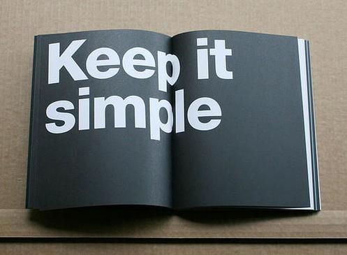
Design values like simplicity, clarity, and decluttering helps to focus the eye one the main idea, eliminating the stuff that is less important. Creating a clean and less confusing design will make the viewer feel relaxed while looking at it instead of overwhelmed. I, for example, am not a fan of busy, crazy, and packed-full designs. I look at it and immediately think, “there is a lot going on here.” I will always choose the design that is unique, creative, and of course, simple. These design values are not the only pieces that are incorporated when coming up with these intricate designs. There are for basic principles to think about before starting your graphic design piece: contrast, repetition, alignment, and proximity. Now, everyone always suggests that in order to retain information, you should create an acronym for the words you are needing to know. These four principles might just be my favorite because their acronym spells crap. This might come off as a little immature, but hey, if you’re learning the material then who cares? Each of these principles makes a huge difference in the quality and compatibility of the designs. Contrast will create an interest on the page and aid organization. Contrast is one that doesn’t require much experience to figure out. I mean it’s pretty simple, don’t put red words on an orange background; Don’t put a white title over a very bright picture. Contrast can make a really big impact on how easy of a read something may be. Repetition is one of my favorites of the four. I love neatness and order and all things organization, and repetition allows those elements to happen. It includes equal formatting and spacing, bullets, and bold fonts to identify which items are most important. Alignment can be tricky at times, but can make all the difference between “good” and “great.” I can’t tell you how many times I have been working on some type of project and finding the right alignment stalls my progress because I can’t get the words to line up perfectly.
Above, you will see a picture example of the proper alignment (right) versus the not proper alignment (left). I am indeed a perfectionist, this can be a good thing, or a bad thing. As far as design is concerned, I believe it’s a pretty good thing. I want things to look even and right, if they are not, I must fix it until there are, no matter the amount of time or effort it will take. I spend a great amount of energy working with alignment, because it is so important and it makes a big effect on the structure. Lastly is proximity, in other words, the space. Proximity can turn something that is tight and squished into something that is spread out and so much easier to read. I catch myself using proximity in everyday things, like note taking. My notes are usually spaced out so much that I end up using twice the amount of paper as everyone else. It’s okay though, because I can actually read my notes, unlike many whose efforts to record information are useless because the writing is practically one big hieroglyphic.
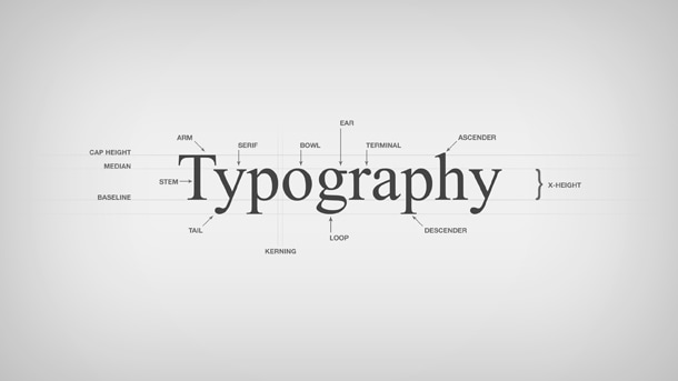
When examining a design, all of these factors and principles work to make a creation something unforgettable. These are not all the elements added to the mix of perfect designing, but in my opinion, they are a good place to start. Full blood images, aspect ratio, and the rule of thirds are a few more that contribute. For some examples of different types of creative graphic design, visit the link placed below listed “examples.” These specific examples really emphasize the typographic style of design, which mostly focuses on the fonts, letter, shapes, and certain imagery that relates. Having proper contrast, visual colorful interests, creative metaphoric ideas, and trendy or eye-catching fonts is what makes these designs stand out in comparison to something with less personality. In addition to the examples I have given below, there is also a picture I found on campus that holds many of the characteristics that a proper typography design contains. In this poster, there are a variety of fonts that provide uniqueness and creativity, while still keeping all parts readable. There are colors present, contrasting pictures that allow for certain parts to stand out, and there is also proper alignment and structure, so the eye naturally follows the words.
After studying these attributes of quality design, I can better appreciate the time and thought that goes into everything graphic design. Now, when I walk past that cool poster, my thought won’t just be that it’s a cool poster, I can examine the shapes, fonts, patterns, and really begin to breakdown each piece to find the beauty in how it all fits together.