Adobe InDesign. What a simple name for such a complicated program. InDesign is undoubtedly useful for web designers, but certainly difficult for beginners. From figuring out how to change the background color, to realizing a window and frame aren’t th…
Writing with Clarity
Poor: The ring was found upon a counter with a diamond missing.
Better: The ring with a diamond missing was found upon the counter.
Reducing Clutter
Poor: Nobody in the entire class knew how to do simple algebra.
Better: No one in the class knew how to do algebra.
Sentence variety
Poor: The teacher was very lonely. She had no friends.
Better: Since, the teacher had no friends she was lonely.
Sentence emphasis
Poor: Rosie Farley spoke to 1,000 students and gave the valedictorian speech at graduation.
Better: At graduation, Rosie Farley gave the valedictorian speech.
 The Adobe InDesign logo. (Image from LogoGulf)
This week we learned the basics of using Adobe InDesign. On Tuesday, we mimicked Croom’s actions as we created an annual report cover. Croom walked us through the steps and we did our best to keep up. I’m not going to lie, this was an overwhelming class period. Every student had about 30 questions (including myself), but by the end, the room was silent as we became more confident in our abilities. Also, my version looked very similar to the original when I finished up. So, yay!
On Thursday, we learned how to create columns (or, newspaper style documents) with InDesign. Croom showed us the basics of column design at the beginning of class and then we were assigned to copy a preexisting document on our own.
Croom advised us that the best way to begin a layout is to first create placeholders for the content – which can include headlines, subtitles, bylines, photos, captions and more. After you figure out where the placeholders work best, you can fill in your content.
I have caught on to the basics of InDesign faster than I anticipated. I thought Photoshop had my heart, but the tables might be turning!
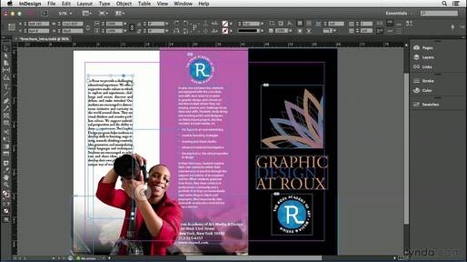
This screenshot of an InDesign project is a good example of how column design can be utilized to create a brochure. (Image from YouTube)
Photo: PexelIn this unit of Public Relations Writing, we learned about writing effectively. There are four ways to clean up our writing: – Writing with clarity: making sure our sentences have a word order that doesn’t create confusion or ambiguity…
Photo: PexelIn this unit of Public Relations Writing, we learned about writing effectively. There are four ways to clean up our writing: – Writing with clarity: making sure our sentences have a word order that doesn’t create confusion or ambiguity…
There are many different forms and styles of writing. Some people may feel like less is more, while others say that detail is everything. For the majority of the time, it is best to keep writing simple and clean. Below are some examples that give a better understanding of effective writing.
Writing with clarity:
Poor Example: We looked for the tools on the floor in the shop and we couldn’t find them.
Better Example: We looked for the tools on the shop floor and could not find them.
Reducing Clutter
Poor Example: Due to the fact that I have a test tomorrow, I will make sure that I study and I will also make sure that I complete all of my homework assignments tonight.
Better Example: Because I have a test tomorrow, I will study and complete my homework assignments tonight.
Sentence Variety
Poor Example: My mother is a teacher at an elementary school. Last year, she won the teacher of the year award. We were very proud.
Better Example: We were very proud of my mother, an elementary school teacher, for winning the teacher of the year award last year.
Sentence Emphasis:
Poor Example: The police officer said that the car crash was very serious and the driver is lucky to be alive
Better Example: The driver is lucky to be alive after a very serious car crash, the police officer said.
Today at PR Pubs was a total disaster for me and I could feel the heat. All of the class was to follow the instructor’s example using InDesign and keep up. It was incredibly difficult for me to catch up for mainly two reasons. At first, I have to admit I am a total greenhorn… Continue reading A Wake Up Call
My second week in class was was exciting. We learned about basic graphic design elements on Tuesday. I enjoyed learning the basic elements that would be included in many of our projects throughout the rest of the semester. I never knew there was so many things to consider when doing graphic design. I think learning about the basics will help me keep in mind what to do when designing.
On Thursday Croom taught us the ins and outs of typographty. We learned how choosing the right font can effect the mood and overall goal of a graphic design piece. Learning about the history of typography was fascinating. Learning all the key terms that go with typography I think will be helpful when considering what font to use and how to properly space words/letters. At the end of class we played different typography games. These games were fun and helped me improve my attention to detail and the difference between serif and sans serif. This week interesting and I think will be very helpful for my future designs!

image from https://www.instagram.com/p/xp1wn9BR4l/
This week in my PR Publications class, what caught my attention most wasn’t the addicting typography online games or learning how to deconstruct designs. No, what intrigued me most was that the most important rules of graphic design are CRAP. Literally. They are literally CRAP: Clarity, Repetition, Alignment and Proximity. It definitely says something about […]
PR Publications has officially gotten into the material that is, currently, the crux of my existence: design and typography. It’s a huge component of the current multimedia world we live in, it enables a whole new realm of communication and I love the current style of design. The catch: I’m incredibly indecisive. Those who know me know how bad it can be, whether it’s deciding on a place to eat, what to wear or if I want to be social enough. When it comes to designing and branding I’m terribly
