Posted by .

   This week in PR Pubs, we focused on the basic values and principles of design and typography. Our assignment was to find designs and fonts on campus and discuss how said values and principles were applied to them.
      To start, I visited my girlfriend at an OU IT service center and found one of their training posters.
      As you can see, there are more than the two to three font types we’re advised to use in a single design; however, considering this particular page is meant to promote better memory of the listed steps, that flaw might be considered a strategy here.
       Despite its lack of visual interest, it does boast legible fonts. Its most important point is in red and, if my seventh grade obsession with the font is any indicator, Papyrus.
      This is another design from the same center. I actually like this one, because it’s both cohesive as a piece and in consideration against other posters and messages across campus. Most of them, as seen here, tend to use sans serif fonts. The fact that this one also includes its specific logo within OU along with OU’s crimson ties the whole piece together.
         I also appreciate the simple design above the check-in station that clearly depicts an OU ID card. It’s always a help to those who don’t speak English as their first language or who have learning disabilities to include a widely understood visual aid that helps get the point across.
       These pieces from a student-focused, client-oriented group on campus have provided what-not-to-do versus what-to-do examples, and I hope I’m able to create works more like the latter.

Posted by .

This week we started to learn about the design elements and I’m very excited. Graphic design was something that I really enjoyed and always wanted to get better at but never had the chance, and now I do. Learning about where typography came from and all the different aspect of it was really cool because having a deeper knowledge of what I’m doing also make me feel better at it. I always knew that there was space between lines of text but I didn’t know that was called leading until now. There’s a lot that goes into design text and choosing the right font or size for a design. There’s so many different fonts and typestyles that I didn’t know about before. 
The Chocolate Festival poster is really eye catching in my opinion because it uses a script font in a very large size to draw the audience’s eye toward it. The banner underneath also draws focus by having the background stand out from the white paper. The rest of the font on the page is the same but the designed used bold and alignments to break things apart. 
While all of the font is the same on this yoga poster it is very difficult to read. The white text on a red and yellow background is very straining. There’s also way too much text for a poster this size and a font that size. The yellow words at the bottom are also very hard to read because of the yellow on red again but the font size is a little bigger so it’s not as straining. 
This designer used two different fonts but I don’t think they’re different enough to really stand out from each other. The meeting font is more commanding in my opinion then the title of the club so it’s kind of distracting. Everything is center aligned but there’s not enough copy on the page that that’s a problem. 
Design is a way that the designer can express themselves but you can only go so far before it’s illegible or too clutter or too sparse. It’s a perfect balance that’s difficult to master and that takes time. I hope during my time in this class I will become better at balancing my designs with the hope that people will want to look at them. The design principles are there as a guide for a designer so the audience will be interested in the design. Legibility is one of the most important elements because if it isn’t legible, why did you make it? That’s why I think typography is the most important aspect of design and one of the best parts the process.

Posted by .

My name is Erin Tabberer and I go by Erin. I am from Broken Arrow, Oklahoma which is a suburb of Tulsa and roughly the same size as Norman. I love my hometown because sometimes it can feel like a big city and other times it has that small town charm. Also we have QuikTrip there which is super important to me and I believe it’s better than most restaurants in town. I’m a sophomore public relations major (duh) and I’m also getting a minor in enterprise studies. If I could have any job in the world I want to be the FEMA Director. Natural disasters are very close to my heart and I want to help people in any way possible. 
What gets me *jazzed* about public relations is that the field is always growing and shaping new possibilities. I’m also really bad at math and there’s not a lot of that in PR. ​I’ve noticed that public relations professionals hold themselves to a higher standard and strive for excellence in everything they do which is something I try to do everyday and I want to get better at doing. What motivates me to be the best I can be is my family because they have supported me through numerous major changes and crazy life decisions. No matter what I do or decide they’ve always been by my side cheering me on and I don’t want to disappoint them.

Writing fits into everything I do in life. From tweeting to writing papers in class I have to write all of that. I will definitely say that I’m not super confident in my writing ability and I think I can get a little crazy sometimes with fancy words and it gets really cluttered or it sounds rantesque like it does right now. I want to grow and become a much better writer than I am right now and I know that I have a long way to go. I’m determined and excited to begin this class and to succeed. I never back down from a challenge and a challenge this class will be. 

Posted by .

A cute, little handwritten sign I saw when I went storm chasing at the end of last spring.I’m not sure why I took a picture of it. I would have missed it, but it caught my eye.This photo was taken just outside of Laverne, Oklahoma. Photo by Wyatt Stanf…

Posted by .

A cute, little handwritten sign I saw when I went storm chasing at the end of last spring.I’m not sure why I took a picture of it. I would have missed it, but it caught my eye.This photo was taken just outside of Laverne, Oklahoma. Photo by Wyatt Stanf…

Posted by .

Picture

Okay guys…lets be honest. We have all had those uncomfortable moments where we think, “What were they really thinking when they designed that?” There is a reason there are millions of memes, gifs and jokes about the poor architecture of what we thought could be the simplest things. Some designers really just needed a second opinion. Therefore, questions enter our head such as, why did they choose to put all of the bathrooms on the perimeter of the mall? Why do most T.V. remotes, that aren’t Smart T.V.’s consistent of 20 buttons I will never know how to use or avoid like the plague because I am convinced clicking them will crash my T.V? Or why is the Nike swoosh, the one label a sorority can’t be caught dead without, be so simple and yet we’re seriously just paying for an over priced design?

All of this relates back to design and how creators have used or failed to use the four basic principles of design: Contrast, Repetition, Alignment and Proximity. When creating a design people have to be aware of the values their design will offer, which needs to have simplicity, minimalism, clarity and unclutteredness. We have all at one time or another picked up an interesting book or newspaper and saw the tiny cluttered text and immediately got a headache and put it away.


Picture
I mean come on… fonts matter just as much as all of the other elements of design.

Or maybe that’s just me… Designers have to decide if using all of the blank space is necessary or not. They have to be aware of their color wheel and spatial décor so the average person does not have the outraging question of, “But why?” This goes for fonts too. Just like the picture above. The spacing between letters, font, kerning, etc. all matter. No designer wants someone to not understand a logo, text or art because of the creator’s lack of knowledge of these concepts. Let’s take a look at some “Hot and Not Designs!”

NOT

Clearly there is some major design flaws going on here. Then again, some people can get it right. Here are some known designs, text and logos that utilize proximity, the four design principles and were made for us to remember positively. 

HOT

Alright Alright, yes I learned about all of this design stuff in class, but I have some real world examples of font and design “Hots” that I found walking around campus today.
And that’s my design and font recap of the week guys!

Always with Love,
             Heather Gilbert

Posted by .

Have you ever seen a poster that immediately grabbed your attention? You probably did not realize this at the time, but everything on that poster was intentionally created to grab your attention by using specific graphic design elements from using cool and warm colors to bold fonts. There are simple things that creators can do […]

Posted by .

Contrast, repetition, and alignment, oh my!

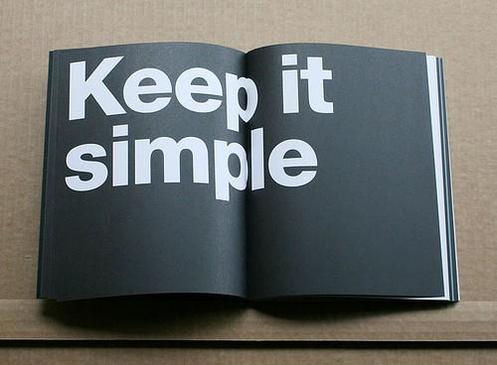
There are many aspects that go into creating a design. Leading the eye, utilizing blank space and CRAP, to name a few. The most interesting lesson I learned this week is that less is more. Though you can use fonts, alignment, repetition, proximity, contrast, etc. in a design, utilizing all of these is not always the answer. Simplicity is key.
Picture
Picture courtesy of http://design-elements-blog.com/2012/07/.

This week we had a crash course of the basics of graphic design. All of what we learned, to me, meant learning to be a minimalist. I tend to overdo things, so I’m interested to see how this principle will challenge me as we start “using our machines” next week. At the beginning of designing I will keep in mind contrast, repetition, alignment and proximity, or “CRAP…” Which will be easy, because this is how I feel heading into creating our first design.
Picture
Accurate depiction of my face thinking about learning Adobe programs. Photo from GIPHY.

I’ve always envied the people that know how to make graphic designs, but I’ve never pursued knowing how to do it myself. I’m glad this course will somewhat force me to learn. CRAP, the acronym describing important design elements, stands for certain words in design. The first, contrast, requires knowing how colors work together. I know the color wheel; blue is the opposite of orange, purple of yellow, red of green, you get the point. Next is repetition, which is easy enough:
  • See, I can do repetition. Bullet points are a form of repetition.
  • I just did it again.
  • And again.
Next comes alignment. Alignment is knowing that this paragraph looks odd when comparing it to the rest. The majority of this blog is aligned left, and this paragraph is aligned right, which just throws everything off. Got it.
Lastly is proximity. Proximity is space, how close and how far things are from each other. In some instances, proximity can help orphans, or widowed writing. Thankfully, the Weebly site changes the proximity of my writing automatically so I’m not having to worry about the alignment of this blog. Thanks, Weebly!
Picture
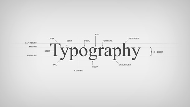
Photo from https://www.pmg.com/blog/typography-101/.

We also went over the elements of typography. The main principle I learned about typography is that in a design, you should normally stick with 2-3 font families. I also learned the difference between serif and san-Serif fonts. I know that this font I’m using is a san-serif, because it doesn’t have “feet.” Typography can either help or hurt a design, so it’s important to make sure fonts don’t detract from a design’s message.

I’m excited to use all that I’ve learned thus far from PR Publications and begin designing. But, for now, I’ll stick with watching Lynda tutorials.

Posted by .

Just in case I haven’t met you yet: Hi, my name is Clay Bradshaw and I am currently a sophomore public relations major at the University ofOklahoma. Born and raised in Plano, Texas by a die-hard Longhorn dad, I ended up on the other side of the Red River because my sister, Annie, was better at brainwashing.There’s a long-winded story about how I ended up wearing the crimson and cream (and what piqued my interest in PR), but I will save that for another time. I have enjoyed my short time as a PR