1. What were you asked to do? In this unit, we reviewed feedback from our peers and finalized our business cards with matching letterhead. 2. How did you respond to what you were asked to do? I reviewed the feedback from my peers and professor multiple times to make sure that I was producing materials …
Monthly Archives: February 2017
Reflection: Unit 2.2
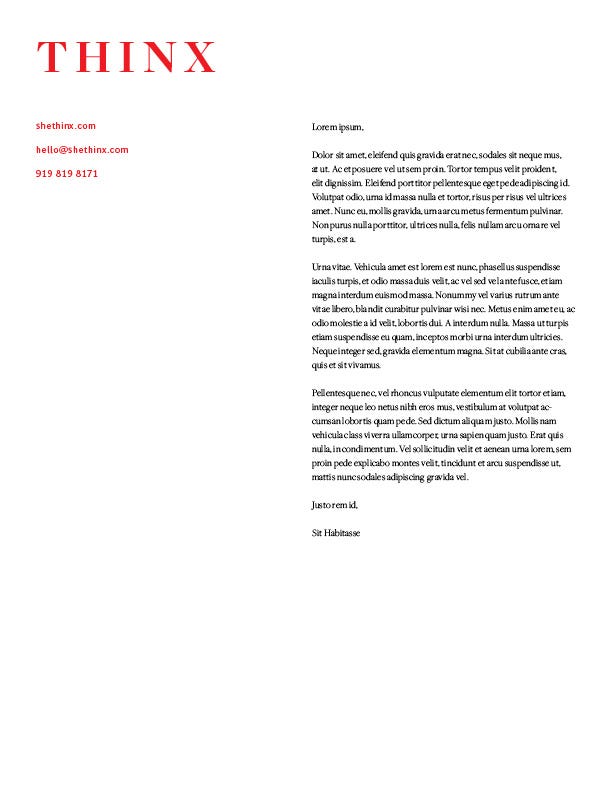
This week we were asked to critique our peers’ business cards as well as begin our letterhand that coordinates with our business card.
Putting the “L” on “Letterhead”
|
I spent the better part of this week playing with one concept I had for letterhead. I just kept tweaking it and changing it until I had something I thought I liked.
After last weeks feedback on my business card, I selected Futura as FC Dallas’ secondary font. You will see this used in the body and the contact info in the letterhead. On Thursday – the due date – I made up my mind. I hated it. So I went back to the drawing board – literally. I grabbed some pens and scratch paper and started sketching out every idea I could think of. Just like with the business card for FC Dallas, I knew I wanted the letterhead to be clean, incorporate strongly the red and navy, and have some sort of sash or sharp line. I want to keep the sash/lines in all the designs for FC Dallas because in soccer crests it often is used to symbolize the lines on the field as well as the movement that takes on the field during the match. I decided a lot of my sketches were either too newsletter-y or too church bulletin-y. I narrowed it down to my top two and set to work on InDesign. Luckily it wasn’t difficult to take my previous iterations and retool them to create my knew designs. If we are being honest, I’m not really crazy about either of these two new designs – but I do like them better than my original. I think the third attempt is too heavy, and the second attempt looks too much like the French flag. Since I have the flu, and this is due in a couple hours, Imma go ahead and sign off and take the “L” this week. After some feedback, rest and vitamin C, I look forward to hitting the grindstone next week with fresh eyes. |

attempt no. 1

attempt no. 2

attempt no. 3
|
My Attempt at Press Release 1 (and 2): Reflection
This week we had to write our first two press releases. And it happened…
I felt a little fish out of water this week. I was very unsure of myself and kept having questions I didn’t know the answer to.
Now that it’s over, I definitely have a better feel for the layout of press releases. And I absolutely have a better idea of what all it takes to throw one together.
I think I would enjoy it a lot more if I was writing for an organization I worked for, or at least one I was passionate about.
I do understand how important it is to be able to craft a clean press release, and I look forward to continuing to craft this skill.
My Letterhead Design is Struggling
So this week e worked on the letterhead design for our organization. At first, I was super excited and then I realized how boring the NFL logo can be, so I felt pretty limited in my letterhead design as you can see below. I have no idea how to spice it up. I thought the …
2.2 Reflection
This week, I was asked to review my fellow classmates business card designs, as well as receive feedback about my own design. In addition to this I was also tasked with designing a letterhead to go along with my business card. I responded well to everything that we had to do. I really welcomed any […]
Reflection 2.2 – Dawn, You’d So Write Something Like This
This week we were asked to review the work of our peers, specifically their business cards. At first I was very nervous that my ability to design was far below par. The first design I reviewed was incredible after reviewing more however, I further realized that we just are all at different levels of design … Continue reading Reflection 2.2 – Dawn, You’d So Write Something Like This →
A Quick Glance At My Week…
This week we were asked to do peer reviews that were randomly assigned on three people. We evaluated their business card and gave feedback on it specifically commenting on alignment, color, contrast, typography and more. I responded to this with a little hesitation because I am not a big fan of evaluating someone else’s work … Continue reading A Quick Glance At My Week…
Unit 2.2 Reflection Post
In Unit 2.2 we were asked to come up with our own letterhead design that matched the business card we designed. I responded well to beginning the letterhead design, because it is cool being able to put your ideas in motion to get the results you aspire to achieve. I reacted well to starting this … Continue reading “Unit 2.2 Reflection Post”
Letterhead and Peer Reviews
1. What were you asked to do? In this unit, we were asked to create a letterhead that matched the theme of our business card, and peer review business cards that other students in the class created. 2. How did you respond to what you were asked to do? I was excited to see other …
