Annoyed, About To Bust

Posted by & filed under JMC 3343-002.

Picture

This week has been okay I suppose. I missed class on Tuesday but I went to class Thursday and it was so boring. In my religions class we were talking about cults and what they are. The teacher showed a video that immediately reminded me of the mathematical equations of cults. This teacher is a brand new teacher and just graduated himself so naturally he is a hot headed, disagree with literally everything you say, bad teacher. Anytime he would ask me a question he would answer it himself and I of course would show my thoughts on my face. He asked “What is the difference between brainwashing and education? Not much I would say.” I looked up the definitions and showed them to a nearby student and they literally laughed out loud. My PR Pubs class was okay too. we had a guest speaker who was funny and quirky. She was teaching us about what her job is like for OU. I forgot her title but basically she designs mail, cards, shirts and other stuff to get students interested and keep them engaged. Our professor was trying to teach us the value of direct mail- which he did. 


A Week in Review

Posted by & filed under JMC 3343-002.

This week was filled with the acquisition of a diverse range of information. I began to wrap my mind around the creative mammoth that is Photoshop and began to think about the logistics and planning that go into design. For this week in review, I feel it is best summarized by two major themes:
1.Photoshop, much like anything else in life, is not learned all at once; rather, it is learned in stages, over time, with experience.

27ba13_0b01e925fd384caaba48a117fb9f5988~

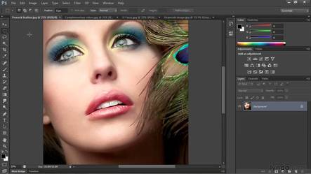
On Tuesday, I sat down to listen to an hour’s worth of videos about how to work within photoshop. To my surprise, the first 20 minutes weren’t news to me and I knew what was going on. (small victories, small victories)
Thanks to my previous dabbles in InDesign, I realized the basics of Photoshop are rather similar. However, after working through the final hours worth of videos, I discovered there was still much to learn.
And by “much to learn,” I believe “much” can be quantified in about..mmm…26 hours worth of videos. Which, arguably, would only still scratch the surface of the enigmatic Adobe Creative Suite application.
To my slight dismay, I don’t have 26 hours to dedicate to video watching. But even if I did, I’m not sure it is the most efficient way to learn my way around Photoshop. I think the best way to learn will be to experience and to allow time and practice to work their magic.
Practice makes progress, right?
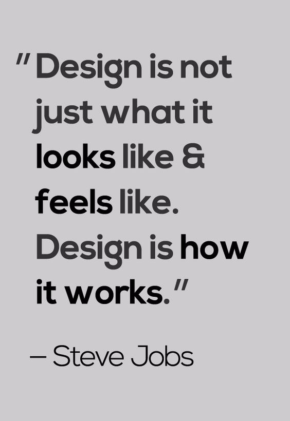
2.Strategic design is the best kind of design
I’m going to be honest: I favor the strategy of design over actual design itself. Not that I don’t enjoy designing, but my brain truly enjoys the problem-solving, research and strategic planning element of PR publications.

27ba13_d28444d8b31b46d6b2909a524004f63b~

The inter-workings of how a publication will work and who the publication will reach are 90% of the battle. For instance, let’s say I designed an amazing postcard for my sorority. Let’s imagine the design of this sorority postcard is so stellar that it puts the designs of all design the world’s gurus to shame. This design is absolutely perfect. (I know there is no such a thing, but just for toots and giggles, suspend your disbelief with me for a minute)
If I sent this perfect postcard to, say, middle-aged, single fraternity alumnae, it would, at best, be admired for a few seconds before making its way to the bottom of trashcan to become friends with empty beer cans and greasy pizza boxes.
The only way to make design effective is to leverage its audience.
A person projects meaning onto a piece; and trust me, I know this from my years as a fine arts student, writer and generally artistically-inclined individual. It’s a basic truth in the art world. Shakespeare could write the most beautiful sonnet, but it is going to mean something entirely different to a child than it would to his lover. Audience is everything. Perception is everything. Reception is everything.
Such is design, such is life. As I said before, picking the target audience is 90% of the battle. The other 10% (designing with said audience in mind) will carry a publication to the finish line.
“Good things take time”:Pinterest
Design Quote:Pinterest

Shopping For Photos

Posted by & filed under JMC 3343-002.

Picture

This week in PR pubs we began learning about Adobe Photoshop. I had significant experience with this program in the past but hadn’t worked with it in a while so I was excited to jump back in again. 

On Tuesday, we began with watching Lynda videos to learn the in’s and out’s of Photoshop. Starting back at the beginning to learn the program was interesting because I knew how most of it worked but there were a couple things that I had forgotten. The videos were very informational and help remind me about things I had forgotten before.

On Thursday, Tiffany, from the admissions and recruitment office, came to talk to the class. She talked about the planning that goes into designing a piece for such large audiences. She explained how expensive it is to print pieces but also that when the number of pieces you print goes up, the price to print goes down as well as the price to mail. She said that different students receive different mailers, not everyone gets the same one. 

She began to explain that students with different levels of interest receive different mailers. There is also a program called slate that is used to identify different audiences. The program can identify people by race, age, location and several other factors. 

I’m excited to begin working on the direct mailers for the new residential colleges. I don’t know a lot about them but I’m excited to learn. 


Photoshop Tutorials and Internship Inspiration

Posted by & filed under JMC 3343-002.

This week was exciting primarily because on Thursday, Croom brought in a special guest speaker: Tiffany Haendel from Recruitment Services.

She discussed the basic principles of graphic design as they pertain to her work in university marketing. She also gave us a peek at how the office’s communications work, explaining that potential students on OU’s mailing list can receive emails, snail mail, and texts, if they sign up for the service. Slate, the program she used to achieve this form of hands-on marketing, is something I’d heard about but hadn’t yet seen for myself.

She also passed around two examples of design work she’d done during her time here at OU, the first of which was harder to read despite its larger font size. Tiffany explained that higher leading improves readability even if the font size is smaller. She then proved her point with a second piece, which was meant to serve the same purpose as the former, that had those better traits.

Thursday’s excitement didn’t invalidate Tuesday’s work, though. We watched videos on lynda.com to learn the basics of Adobe Photoshop. More of it was familiar to me than I thought it might be – GIMP is a similar program, albeit much less sophisticated – though I was amazed at the lesson on making selections.

In GIMP, you’d have to zoom in and spend hours making a very precise cutout to achieve anything remotely close to the same thing (I know because I’ve done it far too many times).

My other favorite lesson was the one about changing the color of an object within an image. 

I re-watched the video twice to get a better feel for the tools he used and the steps he took to achieve that final effect. I’ll probably practice this technique on some mini project of my own soon so I don’t forget how it works.

Overall, this was a good week for PR Pubs, and I’m excited to see what we do next.

Putting the Photo in Shop

Posted by & filed under Uncategorized.

Hi guys, Stella Mae here, designer extraordinaire alter ego of Kate Stanke, back with another blog post about the wonders of creative PR Publications. This week in my PR Pubs course, we started a new track course: working with Photoshop. The last time I had worked with Photoshop was in my Yearbook class at McKamy […]

Photoshopping vs Googling vs Hula Hooping

Posted by & filed under Uncategorized.

As we progress further along with PR Publications, we continue to add new skills to see what else I am bad at. We started using Photoshop, and I think this is the most difficult one yet.I feel like Photoshop has integrated itself as the go to picture editing software. It’s one of those products that’s so good at its job that it can be used as its own verb (like Google and Hula Hoop). I have been eager to get my hands on it, but when you first open the program up, it’s very intimidating. Just

Week 6 Reflection

Posted by & filed under JMC 3343-002.

This week in class we were assigned to write 2 media advisories and 2 media pitches. I read the online lectures and formatting about media advisories and media pitches and was ready to jump in. Writing the media advisories wasn’t too bad I just struggl…

Widening my Adobe Application Horizons

Posted by & filed under JMC 3343-002.

PictureImage of OU acceptance box Tiffany (guest speaker) worked on. Image from: http://okcaddyawards.com/wp-content/themes/addys-theme/dist/images/peoples-choice-awards/xou-admissions-and-recruitment.jpg.pagespeed.ic.fJ4imtEs8F.jpg

This Tuesday in Croom’s class we began to tackle another Adobe application which was Photoshop. I watched some tutorials on Lynda on the basic tools and how-to use Photoshop. Some of the differences between Adobe In Design and Adobe Photoshop threw me off such as how there are layers on the canvas in photoshop but there are no layers in In Design. With any new application comes uneasiness and uncertainty but by the end of class, Photoshop did not seem like such a foreign application to me. On Thursday we had a guest speaker, and her name was Tiffany. She spoke to us about the essential elements to think about when designing projects in Photoshop as well as where her inspirations came from when designing for OU Admissions. Her take on typography and how important leading was when designing something to be printed showed me that little things could make a huge difference in a design’s look. Also, I found it interesting how she looked at big corporations such as Stitch Fix for inspiration and not just universities so that OU would stand out and be different from other colleges. Having her come speak was beneficial and helpful because it helped me realize some things I needed to take into account when starting our photoshop design project next week. I am excited to see if I can create pieces that appeal to a particular age group/public and keep all design elements in mind as well within the next few classes to come. 

Picture
Some of the inspiration for the admissions box pictured above came from this Stitch Fix box. Image from: http://www.thedustyrosestyle.com/wp-content/uploads/2015/01/DSC_0798.jpg

Photoshop Time

Posted by & filed under JMC 3343-002.

​PR Pubs is picking up the pace and really testing our digital and creative skills. This week we dipped our toes in the water and tested ourselves in Photoshop. Yes, the miracle software. The one that makes everyone look gorgeous and not real. But we aren’t touching up model photos or anything… we are designing from scratch. Our class is still beginning to learn the lay of the land but we have been watching a lot of videos before creating our own direct mailer. Surprise that’s what is to come in my PR pubs class. Next week we begin to design our own personalized direct mailer for the residential colleges opening on campus. 
Today, we had a speaker from the admissions and recruitment office at OU; her name was Tiffany. Tiffany enlightened us on what really goes on being the advertising and media at OU. She described their software they use for emailing, texting and mailing out information. They target their markets specifically so they don’t waste OU funds on pointless postcards and to get the most out of their audience. She explained how OU personalized each postcard once so it felt unique to the new recruit. Tiffany not only spoke about the design aspect but also gave us future tips if we are interested in going into design or even just applying for an internship at OU. These were the five tips or ideas I took away from Tiffany’s presentation.

  1. Tiffany prefers her interns to have very minimal design experience so she can truly train and influence them. This was interesting to me because as I have been applying for internships, I have been rejected because I do not have 3-4 years of experience. Well what is the point of an internship?? If I am applying of course I don’t have experience. It’s a tough world out there guys!!
  2. Tiffany gets bored always creating a red postcard or using the same colors over and over again. She does this because this is the OU brand and changing it would mean the audience would not connect their advertising with OU. Would Apple change their logo just because they got bored always slapping an apple on their products? Nope!
  3. Tiffany starting out was not perfect at designing. She passed around a pamphlet that she created when first starting out that she said was awful and then showed us one she made three years later. Her design skills advanced through working at her job. This displays how you are constantly growing and learning in a design job. The game is always updating and changing.
  4. Tiffany has created many protocols for her staff and herself when designing for OU. I noticed in a lot of her slides there were always three points or strategies her office uses for everything. Everything goes through a process and a heavy editing cycle.
  5. Lastly, Tiffany’s presentation overall was not the most exciting, but you could tell she was passionate about OU, her job and trying to reach our class positively about the admissions and recruitment office. She really knew her stuff.

 
Overall, Tiffany enlightened our class more about what goes on being closed doors at OU and about the design background OU has. I am looking forward to working with Photoshop next week in class and listening to our next guest speaker. Stay tuned to preview my Photoshop work!
 
P:S: Tiffany described the new admissions box when you get accepted to OU. Apparently it’s a cute box not a folder like I got four years ago. How do I get my hands on one of those?
 
Always with Love,
            Heather Gilbert