

2.3 Reflection
So, I am finally done with our first project, the business card and letterhead. It feels really good to have completed a project and to have utilized all of the skills we learned in bootcamp. overall, I am pretty apply with the way they turned out. My goal from the beginning was to create something that represented the history and tradition of the chapter, while keeping it modern, clean and interesting.
I used the crest on both the card and letterhead because I felt that it was a great representation of the history and because it looks official and clean. On the letterhead, I kept things very simple, drawing attention to the most important part, the letter itself.
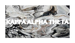
The business card has a similar design tot he letterhead, but i added a more modern and aesthetic element with the marbled pattern on the front. I think it draws attention to the card and makes it more interesting, while incorporating the sorority colors of gold and black.


Comments