

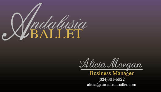
Andalusia Ballet: Business Card Rough Draft
Ahh, finally. Time to create.
Scratch that, time to relearn InDesign.
I finally got to the point of drafting a business card for Andalusia, the organization that I have been researching for my PR pubs class.
And, without further ado, here is what I made!

Now, I’m not totally in love with it yet, but that’s the point of a draft, right?
side note: I had to recreate the logo because the file that I received was not high enough resolution for me to use. It took me a bit of time to find “English Script” online, and I even feel like the original logo used “English Script Italic,” which I couldn’t find.
I’d like to answer a few questions about what I did this past week.
1. What were you asked to do?
I was asked to find an organization that I had a connection with and research the business and its competitors. This enabled me to establish a clear missive that I was then to execute through designing a business card and eventually a letterhead.
2. How did you respond to what you were asked to do?
It was hard to do research on Andalusia Ballet’s competitors because many of them do not have much of an online presence. However, I have firsthand experience with some of those companies so that made it a bit easier.
3. How did you react to what you actually did?
I feel good about the front of my card; I’m less enthusiastic about the back side. I do feel that purple/gold/silver/black is a good color scheme for Andalusia Ballet’s mission and theme.
4. Now go one level deeper: Why do you think your reaction was what it was?
Organizationally, I felt that the front side of the card balances well. Whereas, the back side is merely a block of text. Also, I was kind of lost as to what information to put on the back of the card. I believe that the cards that the Ballet uses currently have a photo of the outside of the studio on it. However, I felt that a picture did not fit the theme I was looking for. I think maybe a silver silhouette of dancers on the back of the card could work well, in addition to cutting down the company tagline.
All in all, this week was a good exercise in design with a purpose, and if all goes well, at the end of this assignment my mother will have a new business card!


Comments