

Andalusia Ballet: Final Product Reflection
We did it. We’ve come to the end of the first design project for my PR Pubs class.
Now that the celebratory Gatorade bath has dried off, let’s reflect on all the hard work and revel in a job well done. #hopefully
Before we analyze the documents I created, let’s have a recap of what Andalusia Ballet is and what my goals were for this project.
Andalusia Ballet is a dance studio located in southeast Alabama. They have been in operation for over 30 years. It is one of the only studios in the state that still offers a pure training in classical ballet while also offering other forms of dance. I felt that Andalusia Ballet’s image and message should represent the history and tradition of excellence that the organization has long held. I wanted to create a sense of classic timelessness, without feeling outdated or cheap.
And now to my finished products: the business card and letterhead.
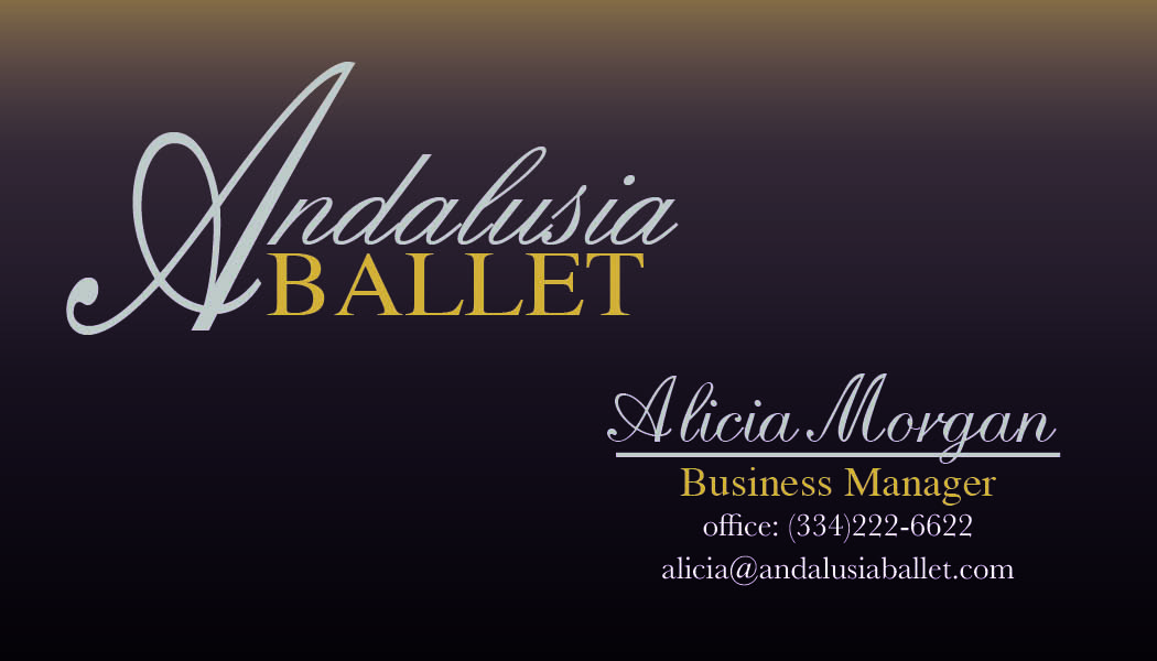
Here we have the front of the business card for Andalusia Ballet:
I took the advice of Professor Croom and brought the text and logo farther in from the sides (within the 1/4 inch margin) in an attempt to eliminate any possibility of the text being cut off when printed. Also, another change I made was to change the order of the color gradient. By changing the colors so that the gold was on the top and the purple was in the middle, I felt that the gradient had the effect of getting lighter towards the top and being more visually attractive. In terms of printing, I would love to see my design printed on a thick matte paper – both for the addition of grain and texture to the touch. Additionally, if the metallic silver and gold had a bit of glitter or shine to them, that would be amazing.
Moving on to the back of the card:

Again, Professor Croom noted that the original silhouette appeared stretched and distorted. With that in mind I went back and shrunk the image, duplicated it, reflected in horizontally and aligned them mirroring each other. Also, by doing this, I was able to fit all of the design elements inside the 1/4 inch margin. I really liked the fact that the legs of the dancers framed the website, which draws the eye down to the text.
And now, the letterhead:

I felt that I followed a very classical design for the letterhead. I adjusted the alignment of the logo with the text in the top right corner so that the tops and bottoms were in the same plane. Also, I added a bit more text to the document, which filled up more negative space and linked the top of the document better with the bottom. In the same way that I changed the order of the colors in the gradient for the business card, I placed the gold stroke above the purple stroke in the footer of the document.
And that’s what I did. Tadah!
Now, how does that make me feel? Let’s address the following questions and maybe we can flesh out how I felt I did. (I feel like I’m my own shrink right now)
1. What were you asked to do?
I was asked to find a company – to analyze and synthesize it. I strove to find its mission, its competitors, its dominant attitudes and its core values. Then I further researched design concepts and inspirations until I had formed a general idea for a business card and letterhead design.
2. How did you respond to what you were asked to do?
The biggest thing I tried to respond to was the communication strategy that I developed through my research. I especially wanted to reflect the timelessness and classical branding that Andalusia Ballet represents, but to do so in way that would not be perceived as stale or boring.
3. How did react to what you actually did?
All in all, I was quite pleased with my final product. I do wish that I had access to better clip art for the silhouettes. In retrospect, as I gain more familiarity with the Adobe Creative Suite, I hope to be able to create my own art and not have to rely on internet downloads for things like that.
4. Now go one level deeper: Why do you think your reaction was what it was?
I felt that my greatest achievement was the color scheme. I felt that the repetition of the colors helped the document remain cohesive. Also, the fonts reflected a sense of classic timelessness while remaining legible. The repetition of fonts really helped as well. In the logo as well as the names, I used variations of the English script. In the logo, I tilted the letters much more than in the text I used for the name, but the repetition combined with the slight change resonated well without being overpowering or boring. Also, the brand elements were very strong throughout the documents. The flow of the English script contrasted with the sharpness of the Times New Roman echoed the brand values set forth by Andalusia Ballet. Finally, in terms of alignment of the business card, staying within the 1/4 inch margin was tough, but for the purposes of printing, it was necessary. If I were designing for the web, I would have more likely left the margins narrower in an attempt to create more negative space.
- Any long term goals for this design? Do you have any interest in actually pitching this to the organization?
Interestingly enough, my mother actually is the business manager for Andalusia Ballet. Perhaps she might like to use the business cards! I do not think that my design would be adopted by Andalusia Ballet at this moment, but that is because they recently rebranded and just switched to new material. However, in a few years, I might polish up my design and create additional material and pitch it to them.
- Do you or do you not feel yourself becoming more confident with the tools you are being asked to used?
I definitely feel that my skills in InDesign have greatly improved!
- Is there anything you would do differently if you were to start over?
I would love to create a completely minimalistic, abstract approach for Andalusia Ballet. At this point in time, I don’t feel like a minimalistic design would quite fit the organization, but perhaps in 5-10 years that sort of feel might resonate better with Andalusia Ballet.
- Do you have any recommendations for future students doing this project?
There is really no such thing as spending too much time on designing. Nearly every time I opened my document, I changed something. Something would stand out, and as a result of simply spending time with my eyes on my creation, I would see things and fix them and make the design better.
Thanks so much for reading! Any questions? Feel free to leave feedback in the comments section.
Until next time.
Was two gifs too much for one post? Oops! #NoRagrets


Comments