

Andalusia Ballet: Letterhead draft
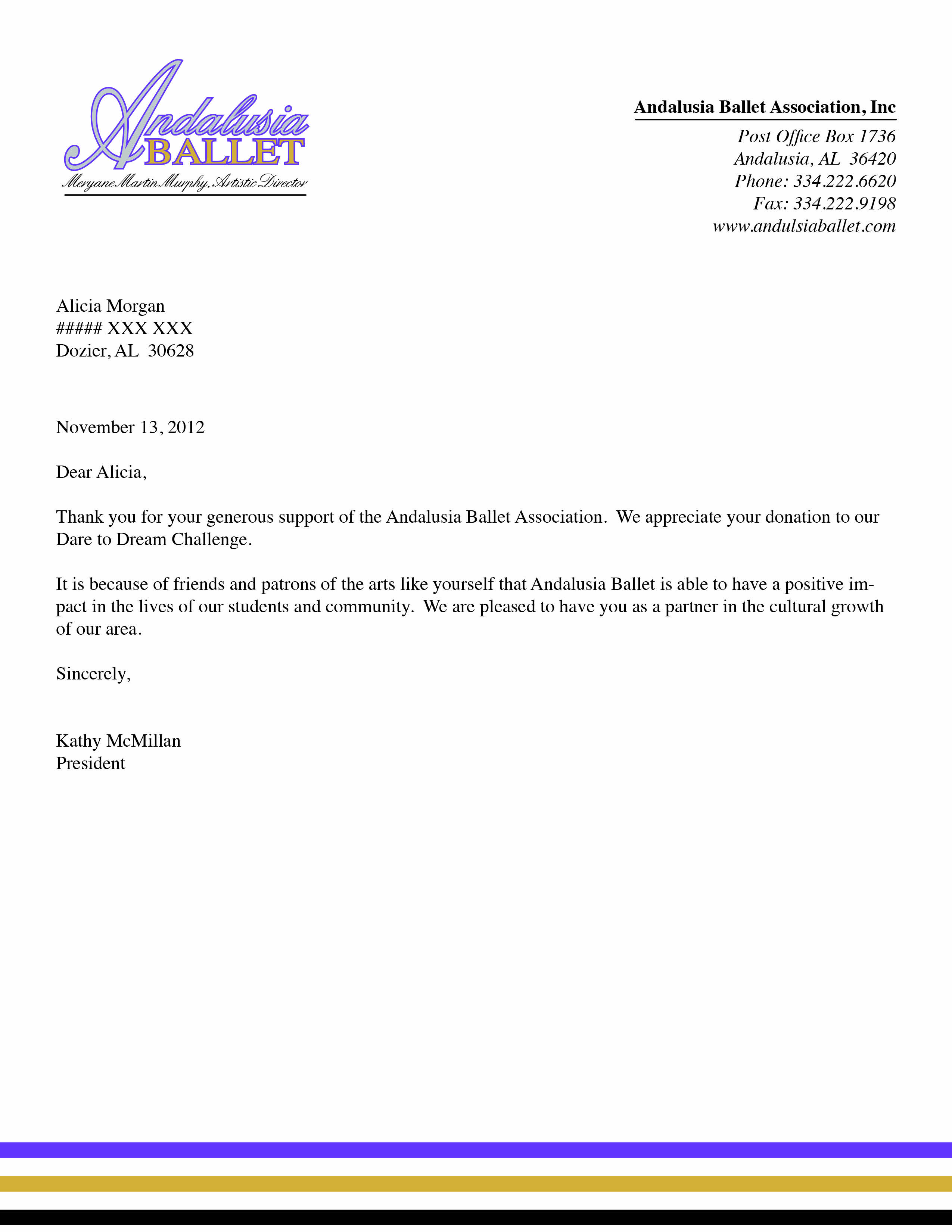
This week in my publications class, we were asked to create a letterhead for an organization of our choice. In continuation of my business card, I chose to design a letterhead for Andalusia Ballet. Here it is:
I felt that this assignment was not quite as difficult as the business card assignment. I almost feel that my draft product turned out a bit formulaic though. It seems that this letterhead has little creativity: logo in the top left, info in the top right.
I do think that the design benefits the overall theme of the organization. The classic timelessness of the design combined with the freshness of the colors combine well. I felt that the bottom of the page was very bland, so I put the lines of color there to help cure the boredom of blankness.
I like the colors. I like the logo. But, I’m afraid it is quite boring. What do you think?
I have edited my business card a bit more. I like the idea of what I’ve done with the back of the card, however I was disappointed that I could not obtain a higher resolution silhouette of a dancer. That’s why the edges of the dancers are so messy. However, for the purposes of this assignment, I was not about to spend money to download a higher quality vector graphic.

So that’s what I’ve done so far this week. Until next time!


Comments