

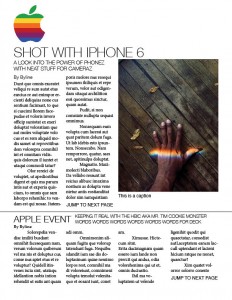
Apple Newsletter: Take One


This week in my PR Publications class, I was asked to begin designing a newsletter for a Fortune 500 company. I chose Apple as my company because I always like how simple their campaigns can be. I wanted to stick with the theme.
For my nameplate, I thought about using the black Apple logo png, but opted to go for the retro Apple logo to add some color and contrast the black text. I need to add a title and volume and issue number still, but I’m still brainstorming what I would like it to look at. I am contemplating not using a title; the logo serves its purpose.
I looked at a lot of Apple’s designs on their website and they seem to mainly stick with sans serif fonts. I chose to do the same and might even opt to use strictly variations of Helvetica for my typefaces. I chose stories that were prevalent on the Apple website, so I figure I can find press releases or articles for them easily.
Overall, I am very happy with what I got accomplished next week. Already having ideas for stories and pictures will put me ahead of the game. Hopefully I won’t have to change too much.


Comments