

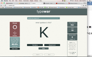
Aubrey vs. TypeWar
This K is definitely Verdana. No doubt in my mind.
So, I may have dedicated about an hour of my evening to this game but now I am beyond confident in my ability to distinguish certain fonts. I love this game but still couldn’t help but mumble some unflattering words under my breath when I ruined my longest streak of 44!! It was the Baskerville versus Times New Roman “O’s” and “E’s”, honestly, those aren’t even fair questions.
When I began the first game, Shoot the Serif, I was a little speculative about the importance of these games. I thought Professor Croom just wanted to give us an easy homework day but now I realize I was wrong. The games are fun, yes, but they are so informative! Shoot the Serif became difficult as the fields grew and the allotted time decreased. You felt the pressure and saw how certain fonts can appear to have tails if bolded or using specific letters.
Most importantly, I learned “kerning” is a thing. To kern is “to adjust the spacing between letters or characters in a piece of text to be printed” and it might be one of my hobbies now. Receiving two 100 percents in the kerning game brought me the purest form of happiness. Until I saw my final score of 76/100, the 26 I made one round really dragged down my average.
Maybe if I had played typography games growing up instead of “The Impossible Game” or “Lilo & Stitch’s Sandwich Shop” I would be a design genius. These games were fun, educational and in a way, confidence boosters.


Comments