

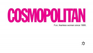
Business Card
For this assignment in publications, we were asked to create a business card using a logo from a company we are interested in. Immediately, I was excited because this gave us some freedom to use creativity. However after actually getting started I realized it was going to be harder than expected because I wanted to do the company justice.
When creating the business card I found myself struggling to remember everything in terms of placing outside objects, but once I got in the hang of it I felt better. Because I wanted to do my company justice I kept my design simple and clean, with a black, white and pink color scheme-a color scheme I’m fond of.
I think I enjoyed this assignment more because it was up to the creators discretion to come up with a design, as opposed to copying files like past assignments. I really liked having creative freedom and choosing a company that interests me as well. While my design isn’t extreme or using tons of elements, I think it sticks true to Cosmopolitan’s brand by being slick and clean. It also has their logo “fun, fearless women” included as well as the Chinese symbol for strength on the bottom, a subtle emphasis on the strong woman.


Comments