

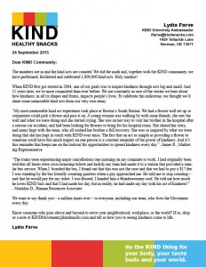
Business Card and Letterhead Final Design
This week in PR Publications we were asked to put the finishing touches on both of our designs. During our “speed dating” session, many of them said that the front of my design needed more color, which I definitely agreed on. So I went back and made an edit to the design to collaborate better with my Letterhead design. I added the blocks of color from the logo and that are on the bottom of my letterhead design to the front of the business card. One thing that has been super time-consuming this week has been matching up the colors to the colors on the logo. I also changed the color of the text to white to completely coordinate with the letterhead.
On my letterhead, the only real change I made to it was adding a little space after the header of the design. After making that change I was really pleased with how both of these designs turned out. I think after starting this design and making improvements I am starting to feel much more comfortable with using InDesign.
Since I work for KIND Snacks and it is a close-knitted company, I think I will go ahead and pitch it to my boss. Whether they use it or not, they like to see that they’re employees, especially college-level, have taken an interest in the company.
For future students doing this project, I would recommend taking the speed critics part and really applying what your peers have to say or suggest to your designs. It gives you another chance to brainstorm and also apply elements that you may never thought or on your own.
Here are my final designs:


Comments