

“Choose your words wisely; Your typeface even more so.”
Justin Seeley describes typeface as the “glue that holds design together” during his introduction video, What is Typography, on Lynda.com (from which I’ve also taken the title of this post). Furthermore, he says that type is all around us and it permeates our visual communication in almost every aspect on a daily basis. Because typography is so essential to design, many programs are now available to help designers understand which types to choose, how to use them and how to appreciate the differences between all of the options.
Seeley also talks about the “4P Formula” in another video, Principles of Layout and Composition. I saw this fitting with typography as well and how designers should approach it. Practice, participate, pick apart and play. These are all important in finding the right type and using it in the best way possible. Practice through trial and error, participate through your daily routine by criticising or praising the types used around you, pick apart other designers’ type to figure out what worked so well (or didn’t) and finally, play. The internet offers so many programs and sites to help you practice without actually designing a publication for someone. Take advantage of these to get some warm-ups in before the big leagues.
Here’s how my experience went when I tried Type Connection, Type War and Kern Type:
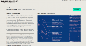
Type Connection allowed me to pick out types that were appealing or attractive and then pair them with other types. Not all of the types work together, so it takes careful consideration to decide which ones could potentially match. The website will let you know if you’ve chosen a pair that probably wouldn’t go on a second date. This exercise is great because it gives short descriptions of the text to let you know what ideas it was created around and the personality of each type. I’ve never really thought of a type having a certain characteristic or personal appeal. Thinking of it in this way could help me consider which type works when designing publications. Type can impact how my message affects my audience. Choosing the right type to convey a certain emotion can make my message even more successful.

Type War focuses more on recognition. Doing this exercise really opened my eyes to how much a small change in the design of the type is noticeable. Being able to consider and recognize types on an individual level is very important. Not only is this important when designing large scale publications where one letter could really stand out, but also in copies and paragraphs, where collectively they could change the look of the publication.

Kern Type was a very tedious exercise, but it made me realize how important spacing and layout are when working with type. Because type is such a central focus in design, it must be placed and spaced with thoughtful consideration. Seeley discusses this and also recommends taking advantage of the grids available in design applications. Even millimetre differences are huge in digital and visual design. Kern Type made me realise how accurate the spacing of the type must be. Even if I was just a little off, it would highlight the space I should have been in – sometimes it was a big difference! This practice was very helpful in showing me that even if I choose the right type to use, all the hard work could be wasted if I can’t place it well within the design.


Comments