

Color & Space
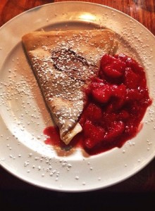
A friend and I decided to go to this really cool restaurant that happened to serve one of my favorite dishes… crepes! After learning about the many different design concepts in my Public Relations Publications class, I decided to take this photo to emphasize the use of color. It may not be a picture of a sign or a building, but the color in the photo draws people in. When it comes to savory foods like crepes for example, the use of color can ultimately make people want to know more or in this case, eat more! Also, what is very important about this picture is the use of space. I feel that this picture uses the right amount of space to show the crepe. If it were taken too far away, the effectiveness of the photo would decrease and if it were too close it would be difficult to understand. I don’t know about you, but this picture would sell me on a crepe restaurant any day.


Comments