

Competitor Analysis
I created a Pinterest board that shows some of Alpha Chi Omega’s promotional materials. Mostly these are created for social media but there are other formats where these patterns and graphics are located.
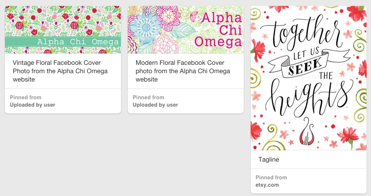
Alpha Chi Omega does a great job of incorporating symbols and the symphony into the promotional materials. It shows non-members how important ritual is in the sisterhood. I like these three images below a lot because they are feminine and would catch someone’s eye when browsing social media.
I feel that a key strategy to differ from competitors is to add a unique item into the pieces. In this case, putting some of the Alpha Chi Omega symbols into the graphics offer a more personalized connection to the viewer. In the screenshot below, the carnation and symphony are both featured. The carnation is in the picture on the left and the symphony is in the background of the picture on the right.

I have never really analyzed my own sorority’s graphics before, so this provided a different perspective on something I am very familiar with. I would probably change some parts of the graphics that I featured on the Pinterest board, but they serve the brand well overall!


Comments