

Concepts in everyday design
As we’ve established, design is everywhere around us. From a simple ad, to a hanging calendar, to a landscape design in a villa overlooking Lake Como. Once we recognize the design, it is helpful in our own work to be able to pick apart and interpret which concepts make a certain design effective or dull – drawing in the audience or loosing them. Here are some design concepts I’ve found at home or in my travels.
Minimalism
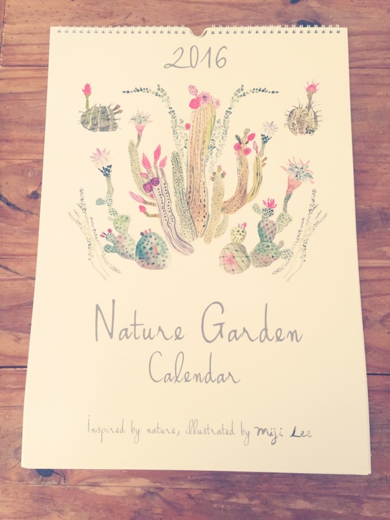
This wall calendar I picked up from Anthropologie caught my eye because of its use of white space and minimalistic design. Were it not for the use of white space, this design may not have appeared so minimal due to the complexity of the colors and detailed illustration, but I think the designer wanted to achieve a sense of complexity within minimalism. It’s a very calming color palate and the typography creates an even more relaxed feeling.
Typography
The typography chosen for this candle really draws out the story and location of the product and its company. The typewriter font gives an old feeling to the design – fitting for the candle’s recycled container (an old wine glass) and the location where it was made. Charleston, S.C. is a very old-fashioned city, full of history and preservation of that history. Anyone who has travelled there would feel a sense of recognition and connection to the city when reading this design. Adding curved lines and different sizes to the typography also helped to create a contrast that brings focus to the brand logo. [Going a bit off-topic from typography, the button on the side also gives the candle another dimension, making this somewhat simplistic design pop and, I think, drawing our eyes back to the words ].

Balance
This is a picture I took at Villa Carlotta on Lake Como in Italy. After walking to the top of the stairs of the villa, I turned back around only to have my attention not drawn to the beautiful lake stretching out before me, but instead to this garden design, which I think shows how well done the landscape was! I wanted to discuss the concept of balance for this design (even though many concepts are working here) because I felt that the even lines and right to left balance helped to draw attention to the bottom of the landscape – the fountain. The dimensions of the stairs and straight lines used in the handrails also balance the picture while drawing the attention to the centre and then down.

Color
I used another calendar to show how different concepts and designs can impact everything around us. This is a smaller calendar, currently sitting on my desk. I could have used concepts such as balance, rhythm and others here, but the color is what really stood out to me in this design. The contrast that the black background creates when bordered with the white is really captivating. It also makes the other colors in the design stand out and draws our attention immediately to what those colors are framing: the Eiffel Tower and the “Travel the World” phrase. Choice of color can really change the overall effect of a design. I think a white background would not have made this calendar cover so interesting and attention-grabbing. The colors chosen to fill in the images in the design must also be carefully chosen. The color palette here is very unique: dark pastels and overlapping variation of similar colors as on the sun and flowers really make this design stand out.

Rhythm
I wanted to use another photo taken on Lake Como, but this is from the breakfast room at Grand Hotel Villa Serbelloni (yes, a breakfast room and very Jane Austen-esque). The concept that immediately came to mind in this design was the rhythm it created through repetition. The windows and the ceilings seem to flow together as they are carefully repeating in exact size and shape. It also involved repetition of color and curved elements such as the floral pieces and curtains that soften the design while making the sharper pieces stand out such as the windows, mirrors and ceiling cut outs. I definitely would not mind having breakfast here everyday.


Comments