

D E S I G N blitz
I was challenged with undertaking a “Design Blitz” where I utilized five different design concepts and found examples of each around OU’s campus. The concepts are illustrated through advertisements, flyers, sidewalk chalk etc. This assignment challenged me to take the literal meaning of various design concepts and apply them to the “real world”. The concepts I will be discussing include: Color, Typography, Metaphor/Symbols, Minimalism and Use of Space and Dominance.
It is amazing how p l a c e m e n t and the elimination of words can’t portray a message. I have never truly noticed how important design concept are until this exercise.
1. Color
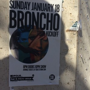
This flyer is black and white except for the circle of colored illustration balanced on the left. This pop of color attracts the eye. Yes, color was utilized here, but I think that the text font and layout of the brochure take away from the effect the color is trying to achieve. Color evokes emotions and creates meaning. Colors matter in every PR publication.
2. Typography

The author of this illustration used the typical “cartoon” typography to get his message across. The “thought bubble” and cartoon font help create the message and enhances why proper typography is needed.
3. Metaphor/Symbols

In this example, a symbol is utilized so that words are not even needed. The handicapped symbol is a universal sign that many recognize.
4. Minimalism and Use of Space

If you look at this chunk of the sidewalk like it is an individual frame, the placement of ‘@OUCAC’ is at the top of the frame and immediately attracts the eye. Although the illustrators intention was probably not to strategically place this message here, I thought this was a good example of utilizing space and also remembering that “less is more” when it comes to filling a frame.
5. Dominance

The word ‘caution’ immediately attracts the eye due to its centered placement, capitalized font and coloring. These factors allow for the word ‘caution’ to dominate the message.


Comments