

Design Blitz
In addition to studying public relations here at OU, I am also majoring in ballet performance. As a part of my ballet studies, I had the opportunity to perform in the 2015 Young Choreographers’ Showcase January 22 – 25. As a result, I was able to see a variety of graphic design and publication material that the OU School of Dance used to promote YCS.
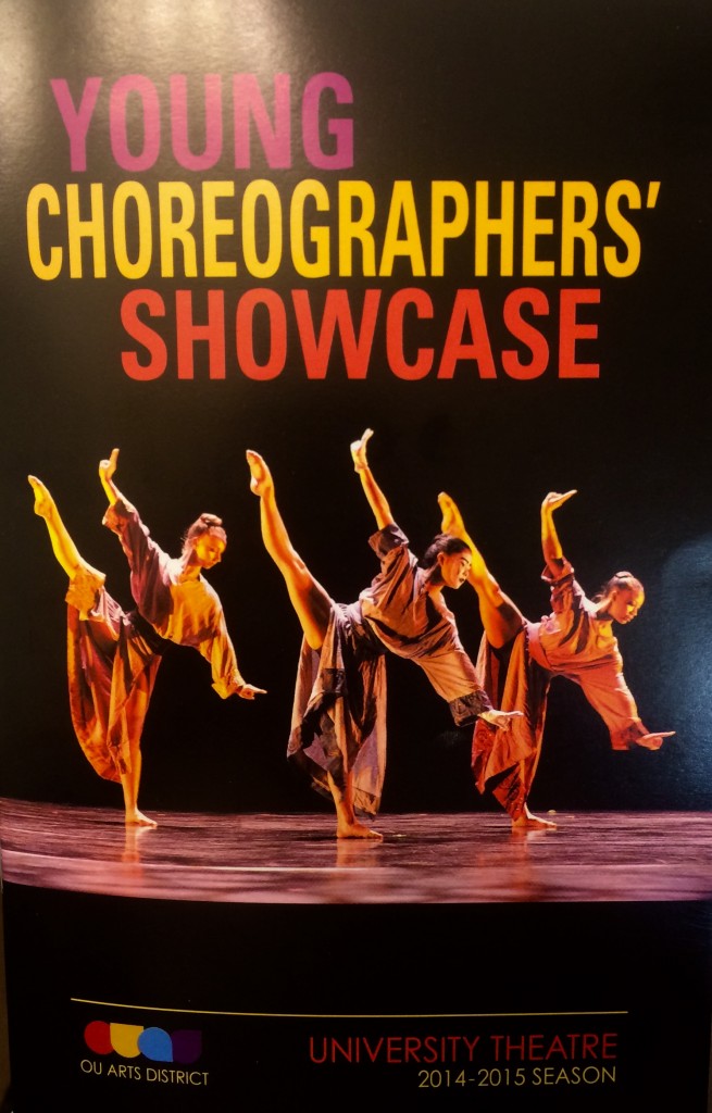
In dance as well as design, rhythm and balance and unity are important aspects. This photo was on the kiosk outside of the theater and was also on the front cover of the audience program. I feel that it brilliantly illustrates these three characteristics.
The colors in the lighting and the dancers’ costumes are very deftly replicated in the text. The dark background contrasts well with the dancers as well as the text. (the light yellow in the upper left corner is a result of my flash, sorry!) Also, if I remember correctly from playing “Typewar,” the font is Futura, which works well with the concept of the performance – all brand new works choreographed by OU School of Dance students on their peers. Proportionally, I feel that the image of the three dancers works well with this design. Three words, three dancers. Finally, from a trained dancer’s technical perspective, the position that the dancers were captured in is a clean line that flatters each dancer.
Here is another example of publicity design that the OU School of Dance created to be published in the OU Daily.

The typography of this image works well to attract the eye. Offsetting the bright pink text on top of a dimmer orange layer created a sort of three-dimensional text effect. The dominance of the single dancer leaping in the center of the image grabs the eye and it helps to explain what the text means without using a single word.
I observed many other form of design throughout the past week, but I have to give Matt Woods credit because he submitted his observations about the many posters and designs that are around the OU Fine Arts District before I did!


Comments