

Design Blitz
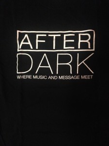
During my design blitz, I found this t-shirt promoting an event called AFTERDARK. I thought it was a great representation of dominance and contrast. The large, white writing on a black background dominates the t-shirt and really makes it stand out. It’s definitely effective in getting people’s attention.
The OU flags displayed all over campus are great representations of minimalism. Everyone is familiar with the OU logo, so the large logo placed on a crimson background is recognizable to everyone. Plain and simple. The OKC Thunder logo is a great example of color design. It features vibrant blues, oranges, and yellows. These bright colors make the logo appealing and recognizable to the audience.
 I love the use of typography on this High Brew coffee sticker. Multiple fonts are used, but all of the fonts compliment each other very well. They use a different font on the word ‘brew’, which makes it stand out against the other words on the sticker. They also use different font sizes, highlighting the importance of specific words.
 This sticker represents a store called Fayettechill. It’s known for it’s clothing and outdoor gear in Fayetteville, Arkansas. The use of the bear as part of the FC logo is symbolic to the company and gives an insight into what the store is all about.


Comments