

DESIGN BLITZ
TYPOGRAPHY
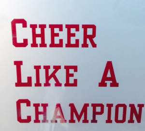
Typography is the arrangement of type. Typography is an artistic component of design that arranges type into a visually pleasing and legible layout. This is a sign near the football stadium and the clear, bold type draws fans’s attention to it.
COLOR
This particular logo is bombarded with different aesthetically pleasing colors. It just so happens to be the art shop in the union’s logo. It definitely catches the eye and attention of passerby’s and consumers.

SYMBOLS
This is obviously the University of Oklahoma’s symbol. The University of Oklahoma and the letters OU are interchangeable due to the University’s OU symbol. It is attention grabbing and easily recognizable by consumers, fans, and the general public. Symbols are used in design to grasp the public’s attention and for easy recognition.

ALIGNMENT
Alignment is a design concept used to help make a layout visually appealing and easily legible. Tis particular excerpt is a good example of alignment because it has all the words spaced in one column on the left hand side and the corresponding pictures in a column on the right hand side next to the text.

CONTRAST
This is a good example of contrast because red and green are on opposite side of the color wheel. This is a photo a bush outside of Gould Hall on the South Oval and it depicts the contrasting colors in nature. Contrast is used in design to depict contrasting ideas or to draw a viewers attention to a particular aspect of the layout/design.


Comments