

Design Blitz
For this assignment, I was asked to go on a scavenger hunt in order to find print publications that illustrated effective design principles of visual communication. The principles that were emphasized in class included the following:
- Color
- Typography
- Metaphors/symbols
- Minimalism & use of space
- Form/function/message
- Balance
- Rhythm
- Proportion
- Dominance
- Unity
After meandering the halls of several buildings as well as the courtyards of the south oval, I chose the following five images. Each image prominently portrays at least one of the design elements above. Furthermore, a description of how each element is represented in the image follows each photo.
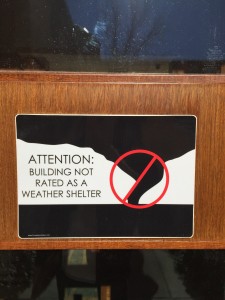
Form/Function/Message – Instead of repeating the black banner from the bottom of the image at the top, the top of the message was utilized to create a landscape of a tornado. The addition of a cancel sign indicates that this area is not good for tornados. The text to the left reiterates this message.

Balance – The concert image and bands are center aligned. The supporting text information regarding location in the upper left hand corner is mirrored on the right hand side with text information detailing the date and price of the event. Looking at the message as a whole, it appears mirrored along the center of the publication. Additionally, the image appears rather minimalistic in design due to the large amounts of blank space.

Color – This poster uses color to convey dynamism and excitement about band performances. Furthermore, the typography portrays an element of whimsy.

Contrast – In this flyer, there is contrast with font size as well as contrast with color evidenced by strictly black and white text paired with a color image. Moreover, the use of color conveys a punk rock theme or idea.

Symbolism – A heart encasing a dog and cat takes the place of the letter “O” on this sticker, thereby conveying compassion for animals.


Comments