

Design Blitz
Design elements are all around us. As I’ve begun learning about the various elements such as color, typography, dominance, minimalism, balance, proportion and rhythm I have also begun to notice these more in everyday life. My Public Relations Publications class was asked to complete a “Design Blitz” in which we took pictures around the University of Oklahoma’s campus. The pictures had to incorporate at least one design element.
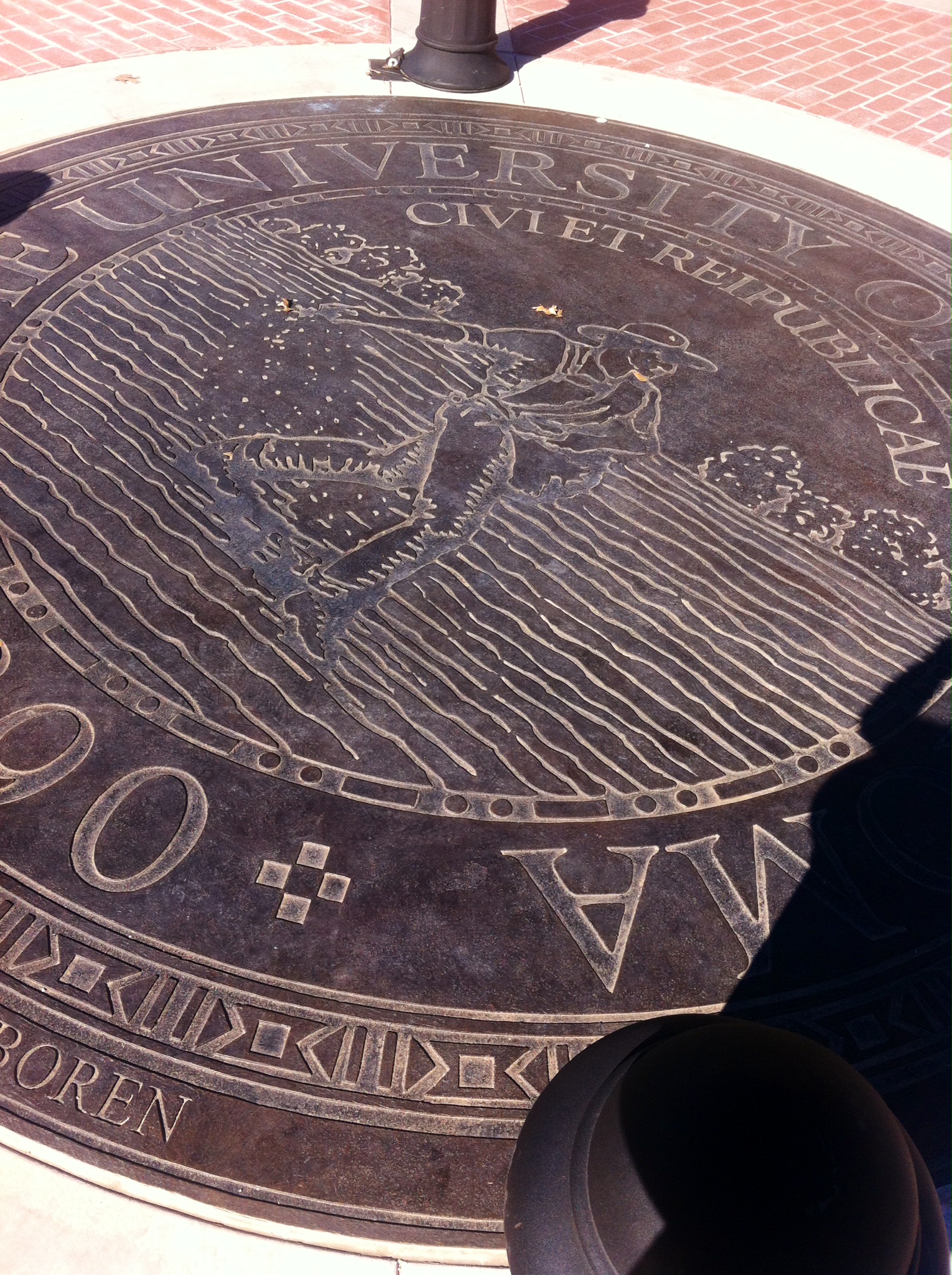
The first picture I took shows use of good typography. It’s the new seal that the university placed on the South Oval in front of the Bizzell Memorial Library. The font used is a serif font. The way in which the font is formatted also shows good use of form. Both of these elements are effective because the font chosen is easy to read and is a good font for the size of the text. In addition, the image in the center of the seal is a symbol. The “Seed Sower” is a representation of the university’s first president, David Ross Boyd, and symbolizes OU planting seeds of knowledge, opportunity, history and tradition.
The second picture I took was of The Stacks in the library. The design element represented here is color. In the picture below the books are various colors. I think when someone sees this picture the red and blue books draw their attention first.

The OU flag in the picture below shows dominance because the letters take up nearly the entire flag. It is effective because it draws attention to what is really important – the university – and does not distract the viewer with other elements. The simplicity of the design is also important since there are so many of these flags across campus. If it were more intricate it would be less effective.

The design elements featured in the following photo are proportion and balance. There are two benches on each side of the door, which shows proportion. I think that’s effective because people generally like things to be even and proportional. The tree stump, known as the PE-ET, shows balance. Rather than being centered in front of the door, it is slightly to the left. In the photo I believe that it is effective because it draws the viewer’s eye immediately to the PE-ET, which is an important symbol of OU students who have been honored for their achievements.

The last photo that I took shows rhythm. The circular structure flows as well as the design on the structure. It’s effective because it is intricate, but not cluttered. The space between the lines and the inner circle show good use of space because rather than trying to fill that space with something, it was left empty.
 There are so many good (and bad) uses of design elements everywhere. After this lesson I will continue to notice them all around.

Comments