


Design Blitz
It is week one of class, woo! In week one, we have learned about the fundamental principles of design. Some examples of these principles are balance, unity, typography, and color. Each of these elements are used in one way or another when designing.
For this weeks assignment, we are doing a Design Blitz. Our Design Blitz was to capture pictures of ads, objects, and signs that demonstrate the fundamental elements of design.
In my Design Blitz, I wanted to take pictures of objects and ads that exist in my home. I did this because you don’t have to travel far to capture the essence of design. We are surrounded by it constantly in our everyday lives. The pictures below are examples of some of the many concepts of design I found in my house.
The first object that I thought to take a picture of was a bottle of Voss water. I have always liked the sleek and simplistic design of the bottle. The most prominent design concept shown by the Voss bottle (to me) is minimalism and use of space. The only thing on the bottle is plain white font. The letters of the text are spaced out nicely and aligned vertically. The use of those design concepts gives the bottle an overall sense of cleanliness and style.
The next concept of design that I came across  of the use of color. Color can be used in many different ways but my favorite use of color is when it takes the ordinary to extraordinary. In this picture that I found of Chris Pratt in Men’s Health Magazine, the color in the swimming cap adds so much to the picture. The colors alone soften up what would be a rather “rough and tough” picture. It also draws in the eye in a way that would be much more difficult without the color. Overall, color can be a great way to add fun and personality to a design.
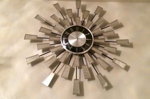 Balance is an concept of design that visible in all aspect of design. In this clock, you can see that it is perfectly balanced from the full 360 turn. If you cut the clock in half and folded it, it would match. That’s called being symmetrical. Now, if the the clock had mirrors on one side and not the other. That would not be a balanced design.
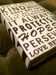
The next concept of design that I found interesting from this weeks lesson is the use of typography. You can use typography in many different ways to create intriguing design. For example, on this book typography is utilized to give contrast. Not only are the colors contrasting by so are the font types. This kind of contrast and use of typography makes an ordinary book into an eye-catching piece of decor.
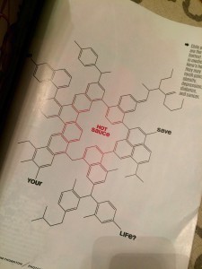
The last design concept that I am going to give an example of is rhythm. Rhythm is the continuous use of a element to give impression of visual harmony. I chose this page from an editorial piece from Men’s Health Magazine because the use of repetition allows the cells to flow effortlessly across the page. Rhythm is one of my favorite concepts of design.
I hope you liked my examples for the different concepts of design. The Design Blitz assignment allowed me to open my eyes to just how many concepts can go into one design; moreover, even the most visually simplistic designs can be complex in nature.


Comments