


Design Blitz
This week I have been on the lookout for design examples that incorporate the concepts that have been covered in my publications class. This post is the results of mindfully observing the designs around me–something that I have not always thought to do.
I began thinking about logos and designs that I had seen often or that really stuck out in my mind. I began looking through the Ad Council’s website when I realized the logo was a great example of color and contrast. This design effectively uses this element with the background on the top half dark and the bottom half light, contrasting from the color of the text.
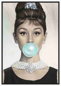
Another design concept that was covered in the lesson was the use of color. I found this picture of Audrey Hepburn as a good example of this concept. The main color theme of the picture is a neutral palette. The pop of Tiffany’s blue adds more visual interest. In addition, this links the photo to the movie it was inspired by, “Breakfast at Tiffany’s.”

Sometimes less is more. This is the common theme when using the concept of minimalism and use of space in a design. The add here is encouraging viewers to decrease their carbon footprint–a message that is evident even before reading the copy on the bottom. The use of blank space in this publication signifies the impact one person could have on the environment.

The design of this poster marries the ideas of several concepts. The copy is large and dominating and the background provides a rhythm for the design. There is the use of symbols with the map as a means of “going your own way.” The color of the text stands out and provides good visual for the design.

Typography is one of the best design concepts to utilize. The eye is drawn to copy that flows easily. Choosing the right fonts can make or break a design, especially when that design relies heavily on the typography, as in the example here. This design does a great job of using multiple fonts and typefaces to add visual interest. There is also a use of contrast and blank space in this design.


Comments