

Design Blitz!
At first, I thought this task would be much more difficult than it actually was. I imagined it would take me a long time to find five examples to use for this post. But actually, it only took me about five minutes looking around my apartment to find these design examples. Design is everywhere–who knew?!?
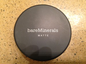
Bare Minerals could have been used as an example for either typography or minimalism. Their simple white typeface on a black matte background makes their products recognizable from a distance. I especially like the contrast of the tightly spaced, mostly lowercase letters on the top line with the all caps, widely spaced letters on the bottom line.

For any Target-lovers out there, you probably immediately recognize Target’s Room Essentials brand anywhere. Although the logo is not always white and black, it is always two-tone in the same font with the same spacing. That’s why I chose it as my minimalism example. The simplicity of the design makes it easy to pick out when scanning the aisles.

Credit to Target for the awesome sign above. I’m using this sign as an example of balance, more specifically symmetrical balance. The top, bottom, right, and left are all perfectly weighted.

I’m not sure if this is a good or bad example of color in design. When I was younger I would always beg my mom to buy Aussie products for me because of the bright and vibrant colors (and I’m still buying them now so maybe it does work?).

I chose this beer label to represent unity because it combines many of the elements above to achieve a cohesive overall feel. I love that the designer chose to stick to just two colors for the whole label. I also like the old-western feeling type face and the symmetry of the design.


Comments