

Design Blitz
I am currently in the process of moving, so finding some objects around my apartment was a little tricky, but I was able to find some that work!
1. My first was my business card from work. I think it does a great job of balance to present the information. I does a good job of drawing your attention to the logo, and using different bold and regular fonts to emphasize the important information. It also appears to make great use of the rather small space that is provided without appearing too cluttered.
2. Next was my Apple Watch box. I found it fascinating how much white space Apple used for the packaging. In fact, the only visuals were the small photo of the watch on the side, and the white printed logo on top of the box. This gives it a smooth, classy look that has always embodied Apple’s work for the past few decades.
3. Third is literally the last food/drink item I have left in my apartment because of the move, and that is a Minute Maid carton. They have always done a fantastic job using color to help draw in their customers. Their bright, vibrant design helps them stand out and forces me to purchase it. A lot.
4. Fourth was my sound bar packaging. I thought it was a great example of dominance. Your eyes are quickly drawn to the actual product on the front, which then leads you to read the description afterwards.
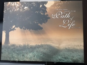
5. Last was a beautiful picture that I have hanging in my home. I found the typography on the art work to be great, and very appropriate for the message being delivered.


Comments