

Design Blitz
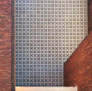
Rhythm, or the repetition of elements, can be used to establish pattern and texture. I think rhythm was used successfully in this example. The white tile pattern adds interest to an otherwise generic brick building.
 Color can be used in many ways. Neon colors (like those used in caution tape and traffic cones or markers) stand out and alert people to stay away from an area or construction zone. In this way, color can be powerful.
 While this bench may not be the most attractive thing ever, it provides adequate seating for people. Its form is not necessarily anything special, but it is successful in the fact that it’s adhering to its function and serving its purpose.
 Many different types of typography can be observed on this globe. The serif font gives a classic look to the border, shown here. There are varying sizes, thicknesses, and spacings of the fonts on this globe. The fonts were probably selected to be easy to read but also semi-classy looking.
 These shrubs outside of Price were cut to make them more interesting-looking, but in doing so their proportions were altered. While nature is often very symmetrical, these shrubs are not symmetrical or proportional. They’re kind of all over the place and they look like they belong in a Dr. Seuss book.


Comments