

Design Blitz
C O L O R
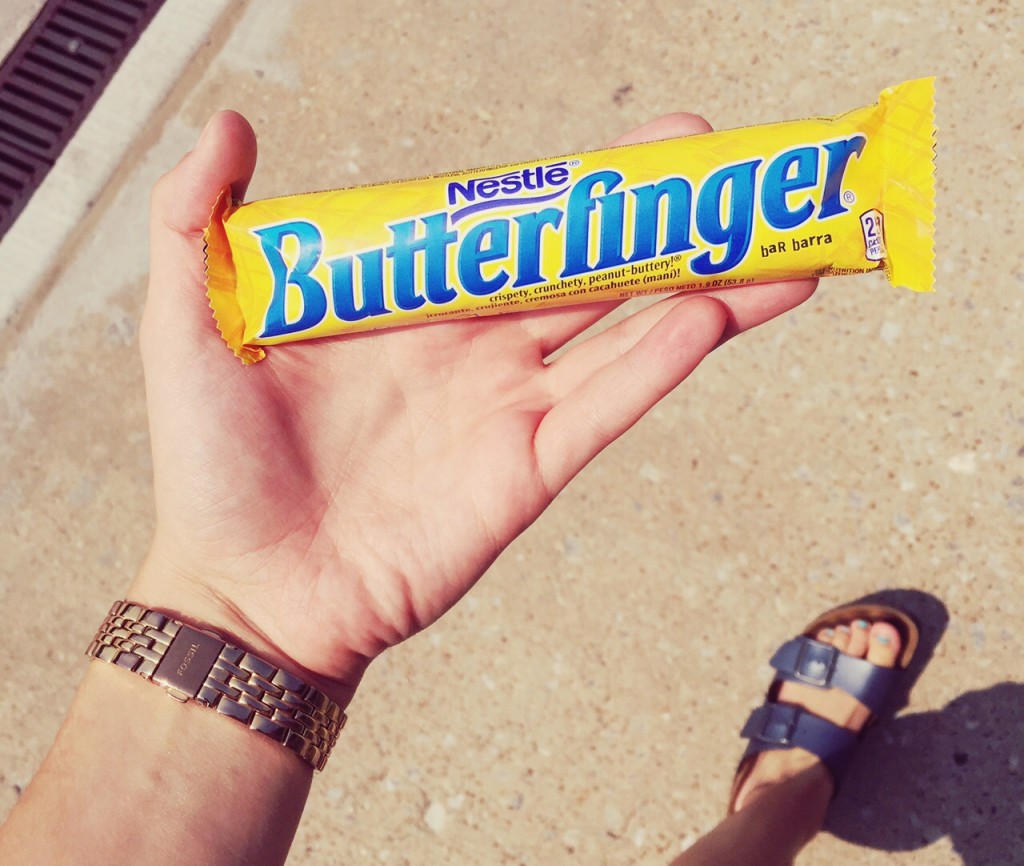
Like I mentioned in my first blog, I have a serious sweet tooth. So today, I was leaving Gaylord and walked past a vending machine. I have this reputation of being “the most indecisive person ever”, but something about my decision today was relatively easy. I proceeded to walk outdoors, holding this Butterfinger in my hand and I realized the color of this candy bar was actually extremely powerful. I think the contrast of the yellow of the the blue (especially against the bland colors in the background of this photo) are really effective and have the ability to appeal to a consumer, at least I know it appealed to me. This object also incorporates a great use of space and the writing is BIG! I think every person I walked past was able to tell I was holding a Butterfinger bar, simply because the name is kind of hard to miss, making this design effective.
T Y P O G R A P H Y

Typography gives a message character, meaning and value. To me, the typography used on this devotional is very effective because the word “women” is used in a frilly, cursive font that just screams “this book was made for a female!” I think it’s very clever for the creator of this message to make that one word a different font because it sets this devotional apart from a gender neutral one. When looking at this photo, you don’t even have to open the pages to know that the messages inside will be geared towards women. I also think the space on the cover of this book is organized efficiently so the reader can easily understand the information.
M E T A P H O R / S Y M B O L S

I came across this bad boy while walking through the South Oval my sophomore year at OU. This flag, and now photo I will forever have on my phone, might be one of my favorite images of all time just because of the depth it entails. I chose this photo for “metaphor/symbols”, because as you see, it’s filled with them. First, if you’re having a hard time identifying what those little things sticking up off of the flag are (like I did the first time I saw this), they’re cowboy and Indian toy figures. How fitting is that for the state of Oklahoma? Beyond that, the cowboys are facing the center as if they’re “attacking” and the Indians are facing outwards as if they’re “protecting” this state. The beauty and thought in this flag still blows my mind, and I believe every aspect of it is effective. Without having any words at all, this photo speaks volumes to a multitude of audiences. The symbolism even has the ability to make one feel emotion such as a sense of pride from a Native Oklahoman, a sense of respect from an outsider or even a sense of sadness from someone who remembers specific events very well.
F O R M / F U N C T I O N / M E S S A G E

I know this seems like such a generic piece of artwork that some girls threw a couple sunflowers on (because some girls may or may not have actually just added those sunflowers on to this last night), but the function and message in this “hello” are surprisingly efficient. My roommates and I decided to hang this on the wall you see as soon as you enter our house. This wall art is functional because it not only serves as a decoration for our home that is simple yet cute, it automatically greets guests as soon as they walk in the door! Killing two birds with one stone here, we are very proud of this addition to our home to say the least. I also think the sunflowers being asymmetrical add something to this wall art that was missing in the first place, and although simplicity is good, they also add character and reflect the happy mood we constantly have in our home.
D O M I N A N C E

This photo might be a little overwhelming to someone who doesn’t appreciate loud images or glitter (hints as to why I chose it for dominance), but for my roommate Caroline, it’s perfect. Before I begin my analysis, the picture says, “Eat sunshine for breakfast & shine all day.” I chose to take a picture of this piece of art for the many elements it entails including: use of blank space, bleeding off the edges, being asymmetrical, large and small fonts, very bold, contrast, color scheme… the list just goes on. One could say there’s too much going on or that the typography doesn’t flow, while someone else could say the use of space is great and the photo really gets the point across. Personally, I appreciate images that are more soft and dainty so I would consider this ineffective. Either way, there’s no denying the dominance it holds. I think for the most part a photo is either effective or ineffective, but there are circumstances such as this photo where it’s up to the viewers digression. Does this photo work for you, or is it a complete wash?


Comments