

Design Blitz
Minimalism and Use of Space
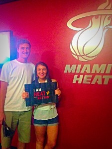
This is a picture taken when I went to a Miami Heat game in March. Not only was this a Miami Heat game, but a Miami vs. Cavs game! AKA I got to see Lebron play! Of course we paid $40 each and sat in the nose bleeds, BUT I can still say that I’ve been to one of his games!
Anyways, I chose this picture to represent “minimalism and use of space.” The background in this picture is completely red besides the Miami Heat logo. Since the logo stands on its own with a lot of blank space, this makes the “minimalism and use of space” design effective.
Rhythm

Okay, so I’m embarrassing and decided to make a flag out of bananas, watermelon, strawberries and blueberries for the Fourth of July. I found this idea on Pinterest and thought I should give it a whirl.
I chose this picture because it represents rhythm. This design is effective because each line of fruit matches the other (with the exception of the blueberries) and follows a rhythm set for it, making this the perfect design to represent rhythm.
Typography

So at the end of May, my boyfriend and I decided to take a four-day trip to Las Vegas. After eating nothing but pizza and McDonald’s, we decided to be extra fancy one night and eat at the top of the Eiffel Tower at Paris! It was honestly the fanciest I’ve ever been!
I chose this picture to represent typography because of the three different styles of fonts on this menu.bThis design is effective because the I can imagine that the words “Eiffel Tower” are tall and skinny just to match the actual Eiffel Tower, which can also be described as tall and skinny.
Dominance

Another fun thing I did in Vegas was take a helicopter ride across the Strip! It was definitely a once-in-a-lifetime experience and I had so much fun.
I chose this picture to represent dominance because of the MGM Grand hotel. This design is effective because the green lights coming off the MGM and size of the hotel definitely stands out to me in comparison to everything else in the picture.
Proportion

I also took this picture in Miami last March from the hotel room. Man, I wish I could go back!
Anyways, I chose this picture to represent proportions due to the different sizes of the buildings. My idea of proportion is when something similar is bigger or smaller than the other, which makes this picture an accurate representation of proportion. I think this design was effective because the bigger building stands out more than the smaller one, which was probably the main focus of the designer.

Comments