

Design Blitz
There are many aspects to design and layout that determines the viewer’s opinion of the object or piece. Each concept is crucial to the sensory appeal of the viewer. I chose to focus on five different concepts using items in my apartment because I wanted practical examples to help myself understand the principles better. Below is a short description of each and how the object relates to the concept.
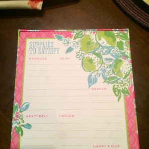
- Typography: After playing the typography games, I felt pretty confident in identifying objects that use typography. This grocery list pad uses both serif and sans serif fonts and I felt accomplished knowing the difference. I like how it utilized the serif font for the title and the sans serif font for categories underneath.
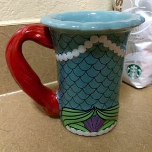
- Metaphors/Symbols: One of my roommates has a coffee mug that is supposed to be like Ariel from The Little Mermaid (she loves Disney) so this was the perfect example for me to use! The colors and design made it obvious that it was supposed to be Ariel so I would say it was a pretty effective design.
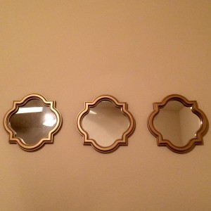
- Minimalism: The three mirrors represent balance because instead of taking up more space with one large mirror, the smaller mirrors do the same job without all of the space. If I wanted to check my outfit in the mirror, it would be unpractical, but the mirrors are good for decoration.
- Unity: This piece of art is unique because it’s sixteen squares inside one big square. Each square has a different color combination and design but they all make up one big design together. I like it because it’s eye-catching and really ties together the piece.


- Function: For a multiple-course dinner, the dining set is very functional. The plates and bowl are stacked in an order that would resonate with that of a formal meal.


Comments