

Design Blitz
There are many different aspects of design that influence the viewers opinion of an ad, object or a sign. I chose to focus on color and proportion when looking at photos of food that I have taken in the past couple of months. I wanted to use pictures that I have taken and pictures that I am proud of to help me better understand the different aspects of design. Below is a short description of how color and proportion is represented in each photo.
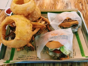
The above photo of a burger, fries and onion rings has a variety of colors that contrast each other. There are hints of green that pop out around the burger and on the tray. There are also pops of red that compliment the browns and the yellows that are prominent in this photo. The proportion of this photo is out of frame. When I take photos of my food I really try to be artsy so I play around with the proportion and how things are arranged in the photo. This photo would be appealing to any burger lover. I think that the high contrast and the pops of the lettuce and the tomato make the picture more appealing to a consumer.
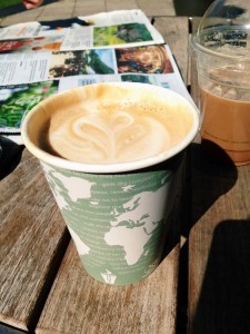 This next photo is a picture of a latte that I took in Vail, Colorado. This photo has similar colors to the photo above. It has high contrasts in green and blue. Those are th
e prominent colors. The proportion of this photo is also similar with the latte being the main focus of the photo, therefore it is also the largest object in the photo. The shadows also show the the top of the coffee cup is closer to the camera lens therefore it appears bigger. As in the photo above I like to take my pictures from different angles so the angle and arrangement of this photo are not perfectly. This photo shows the artistic side to the local coffee shop that could appeal to a more artsy crowd of consumers.
The final photo that I have chosen to examine the color and proportion of is of frozen yogurt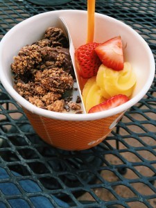 . This photo has higher shadow and appears to be less blue and has a stronger contrast on the bright colors such as the red from the strawberries and the pineapple flavored frozen yogurt stick o
ut when placed next to the chocolate color palette. The proportion in this photo is the best of all three. I think that this photo was also taken from above to give a more artsy feel when I originally took the photo. The pops of bright color next to the high contrast darker colors gives this photo more dimension. There is also a hint of minimalism in this photo as well because the frozen yogurt really takes the center stage. Every other aspect of this photo is minimal and not too over the top with design and colorful. There are no distractions from the frozen yogurt. I think the contrast has the ability to appeal to the consumer and show that frozen yogurt comes in many different colors and flavors.


Comments