


Design Blitz
In the following blog I will discuss some important design concepts and tie them to things I came across while living my everyday life.
TYPOGRAPHY
While strong pictures capture the eye, a creative way to give attention to the most important words in a message is by playing with its typography. I ran across this book cover while I read a magazine. What captivated me the most was the contrast in the black foreground and the bright background and red letters. The letters clearly pointed out the most important words the author wanted me, as the reader to see, “Last,” “soldiers,” and “cold war.” The last important information was at the bottom in smaller text and in black. I think this author’s cover was great because it used typography to give its most important elements extra attention. He also let his edges bleed, giving a perspective that something continued in the foreground.
The saying,” a picture speaks more than a thousand words,” was very true with this
picture. I came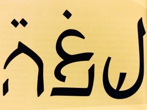 across this image as I read a story about the difficult life of an Arab Jew. The first two symbols are Arabic character symbols
and the last one is a Hebrew character
symbol. This picture brings to attention the difference between culture and religion. Although many of us ignore the existence of Arab Jews, those who identify as such have had to renounce their culture or seen as outsiders to both sides. Many people automatically link the Arabic culture with Islam, a religion. However, before the “European Jews” arrived to Israel, the Jews living in Palestine had never seen the cultural aspect of their identity. They were entitled to their religious preference (Judaism) and to their cultural aspects (Middle Eastern roots).
MINIMALISM 
When we see open space our first thought might be to make our design have the least amount of white space possible. Last year, I attended a net working activity at Gaylord College. Like you would expect from this events, I gathered many business cards. As I look past the ones I kept, I realize the simpler the design the more eye-catching it is. The business card above is an example of the use of minimalism. It says everything and yet almost nothing. The yellow color used in “GO” is very well contrasting with the black background. It also serves to shine through the crowd as if to say, “I’m here! Look at me!”
COLOR
Another element that is highly important in any type of design is colo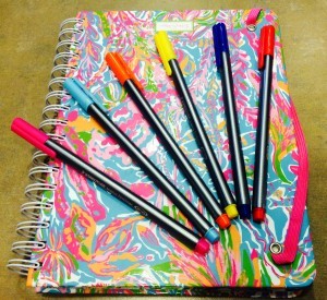 r. It carries the power to touch the human soul. We can build up confidence with a vivid red, brighten the spirit with a yellow, meditate with a soft blue, and add elegance and mystery with a black.
As my friend and I planned our weekly schedules, I was captivated with the array of colors in her planner. Her planner was almost inviting me to open it and see what was inside. The combination of bright colors was a tactic to keep the owner engaged. I don’t know how most people my age work with schedules, but I know myself. I know that ton top of classes I have equal the amount and often times more meetings. It is easy to forget the things. This colorful design is a way for the planner to cut through the clutter of any student backpack and make it the essential element for organization. It is also really cheerful, so it makes one feel excited.
RHYTHM
My last design concept is rhythm. The word “rhythm” is often associated with music. However, the art of design is also able to harmonize it’s work and make rhythm, often with patterns. The picture above is part of my favorite scarf. As a semi-scarf addict, I know when I see a unique scarf. The thing that made this scarf in particular stand out from the rack at one of the busiest shopping squares in Ankara, Turkey, was it’s rhythm. I loved the interaction between the colors. The well-balanced design could easily say elegance with a black coat or casual with a warm cardigan.


Comments