

Design Blitz
These 5 design concepts were interesting to learn about because I honestly haven’t put much thought into them until this unit. I was sitting at home thinking about what pictures I would find and honestly thought it might be tough. I decided to go on a walk and I immediately found things that matched each of these design concepts.
First, Proportion
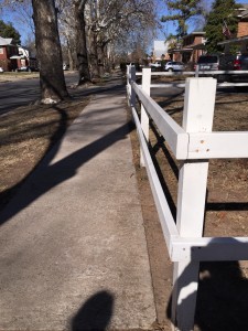
This is actually a white fence right outside of my house that I feel is a perfect example of proportion. The wood lies perfecting proportional to one another, giving this house a little character!
Second, Symbol

I think most everyone knows, this is a recycle bin. The reason you know that, however is because of the symbol of these arrows that is so distinct. If there recycling didn’t have this exact symbol, people could mistake this bin for a regular trash bin, bucket, etc.
Third, Color

Let’s be honest, if it wasn’t for this bright orange color I don’t think people would pay much attention to this sign. It grabs your attention because it is so bright and makes you cautious of your surroundings.
Fourth, Form & Function

This little bench has a form of its own! It is such a unique antique (poet and didn’t know it) and is made for seating. However, I think it’s mainly for decoration considering the different swirls and designs.
Lastly, Topography

Everyone knows the STOP sign. I’ve never thought about the text and font until this activity. Why does every stop sign have that font? I wish I knew exactly what it was, definitely not serif (thank you Shoot The Serif). Obviously they use it cause its very easy to read, but still.. There have to be other fonts out there they could use.


Comments