

Design Blitz!
Seeing that we were going to take pictures this week of design elements in our everyday life made me really excited. Seldom do you think about how or why everything is deigned the way they are, but as you begin to look you begin to see that ‘design’ is literally everywhere.
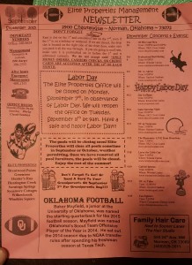
The first thing that caught my eye was my apartment’s monthly newsletter.
There is a lot going on with this newsletter but when you take it piece by piece you can see how it portioning information into three columns. The one on the left is small, the middle is larger and the right side is another column. The form of the newsletter makes it easier to understand where the information is and makes it pleasing to the eye. The typography in the newsletter also makes it fun and exciting to read, because this is not meant to be a serious piece of work.
Unfortunately I had to go to Wal-Mart this past week to get some supplies but I was able to find some excellent examples of design while I was there.

This Wally World sign is an excellent example of white space that we learned about in the video on Lynda.com. The non-use of the blue space draws your eye to the text which reminds you that it is cheap. It is clean, simple and effective in getting the message across.
Another really cool design I saw at Wal-Mart was from the Band-Aid brand.

Thinking about different ways to get your audience’s attention sometimes you have to think outside the box, or in this case change the box completely. What draws your eyes to this display is not the words but the way the message is created. I know they want me to buy Band-Aids but I also know they are selling them with Star Wars designs just because of the display.
Before heading home, I stopped at the mall so I could pick up a game I reserved and yet another piece of design caught my attention.

This display for Metal Gear Solid 5 has many different design elements all working to achieve it’s goal of appealing to the consumer. The main character dominates the display but is layered with a roman numeral V to emphasize which number it is in the series. Likewise the game’s title and sub-title are layered on top of each other to form a unique heading. Finally, the stark contrast of white for the release dates makes sure you know when it is arriving.
The final piece of design I saw this week was the Oklahoma Gazette I got while leaving a restaurant.

The first thing that made me grab this paper was the colors. Bold and bright colors really help things stand out. What is nice about this cover is the repetition that is used with Pac-Man and the bubbles. It helps focus attention to the main subject of the gazette, which was finding the best spots for everything you need in OKC. What I also liked was the typography at the bottom which is pixelated. This font change helps keep a theme and makes the whole cover very concise.

Comments