

Design Blitz
As a public relations student, I have come to realize that the way a message is structured can determine how effective it is. Now as I learn about design techniques, I have discovered that the way a publication is created will also cause how the viewer perceives it. There are many different principles that can affect the end result, but here are five that I have found in every day things.
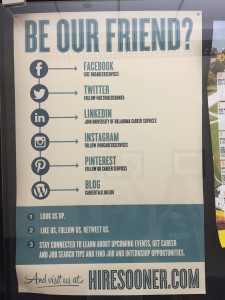
The design concept of repetition strengthens the message being given by creating a pleasing visual image to the viewer. The repetitive flow of information easily informs the reader of what is being said. This poster is a good example of how repetition can look in an every day setting, for it is listing the social media sites for OU Career Services in a simple and easy to read way.
Color

This image is a perfect example of color because the yellow fish stands out against the blue background. It causes the eye to focus on that particular object, and therefore makes a good design element when trying to showcase a particular idea. Bright colors will more likely attract the eye quicker than dull colors, and combining contrasting colors will be more pleasing to the eye than similar colors.
 Dominance
Most of the time when someone is creating a design, there is a reason for it. While walking down the hall at my internship, Box Talent Agency, something on the wall caught my eye. This flyer for the company immediately tells the viewer what its all about. The bright red guitar stands out against the black and white background, showcasing that they will help brides find the perfect music for their wedding.

Balance
This photo of Notre Dame was taken on my trip to Paris a few years ago, and as I scrolled through my photos reminiscing, this picture immediately stood out to me. I noticed that if you could fold the building in half, both sides would match up evenly. To me, this is an architectural use of balance. All of the windows, railings and columns are even on each side, creating perfect equilibrium.
 Use of Space
The way that a design uses space is crucial to creating an attractive image. The layout needs to be well thought out so that it does not look cluttered or empty. This poster uses most of the paper to convey its message, and even though the text is only on part of the design, the graphic stands out to the viewer by bleeding off the page. It gives the illusion that there is more to be seen, and therefore makes the viewer pay closer attention to what is being said.


Comments