

Design Blitz
This week in PR Publications we have been learning about the importance of design and typography. The assignment was to look at the world around us and take pictures of the use of different elements of design in our every day life.
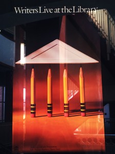
On this poster that says “Writers Live at the Library,” four pencils are standing upright and holding what looks like a rooftop. As I passed it I immediately recognized the element balance which creates a visually appealing and unique photo. Also, I know a few OCD friends who would be very satisfied by looking at this.

Color
I liked this poster I saw in the Student Union because it makes use of just one color. If you walk around campus, you’ll see any number of fliers and signs that can just get lost in the clutter. But this one stood out to me in particular because of it’s contrast of purple and white colors.

Dominance
When I look at this stationary, the thing that strikes me almost immediately is the big “HELLO” right in the center. The gold wrapped around it and the black and white stripes shown behind it only aid in the way that the greeting stands out.
Typography
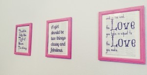
On these three almost identical prints, there is little difference except for the use of typography. They all read a different quote but other than the quote, there is little else on the print. The simplicity of these shows just how important typography can be. The fonts (and the quotes themselves) are one of the only reasons why I liked them.
 Symbol
The symbol on this pillow is the state of Oklahoma. With big bold letters spelling out the word “HOME”, there is a dead giveaway of what the symbol means. But even if that word wasn’t written, I would still understand what that symbol of Oklahoma meant to me, which is not only the home of my university, but is also my home as well.


Comments