

Design Blitz
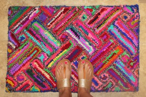
Color: The Colors on this rug are so bright that they are almost distracting, but with the design aspect in mind, it is able to tie together any colors that might be used in other areas or objects. I am a fan of this use of color, but it must be used wisely depending on what else is incorporated in the design.
Typography: I think the use of typography in this  logo is really well done. I think it’s creative but also clear and easy to read. It makes sense with the words that are used because the font is actually a little bit crooked. It’s fun and creative which I really enjoy while also possessing some form of symbolism and literal meaning.
 Unity: I chose this fabric from my curtain as unity because I feel like the repeating pattern creates a sense of unity among the design. Even with the strong color contrast, I think the design flows easily and simply. It almost is hard to really see the separation of the pattern as a whole.
Balance: I chose this arrangement because I feel it has some sort of balance. It’s not necessarily radial or symmetrical balance, but I feel like one area is not weighted heavier than another within the arrangement of pieces. Each piece is evenly spaced out among the others but doesn’t possess a complete structured look.
 Dominance: This piece clearly dominates the room it is within. It’s size and color distract from other aspects of the room and provide for a central focal point. It has dominance without being completely overbearing and overwhelming because the rest of the room accentuates it well.


Comments