

Design Blitz
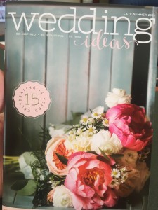
I love this magazine cover because of the way the designers used the space. I chose this to represent minimalism and use of space because they did not try to fill every inch of the cover. The minimal amount of wording and images. This also could represent dominance because your eyes immediately are drawn to the floral bouquet.

This bag represents a good use of color. The colors used are cohesive, and the cool colors and warm colors blend well together.

I took a picture of this flag in the window of a business on Main Street to represent symbol.

This Route 66 sign represents typography. From what I learned in one of the font matching games, this a good font combination because the two are very different. The fonts have different heights, widths and styles. They work well together.

I chose this catalog for proportion. I was immediately intrigued by the objects on the front of the catalog. They represent proportion both in relation to the whole page and to each other.

Comments