

Design Blitz
Dominance
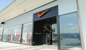
My first design example comes from a Nike outlet store. Obviously the Nike symbol is one of the most iconic symbols in the world, but just how did it become so famous? It is largely due, I believe, to the genius of the Nike swoosh itself. The dominance the logo expresses gives off a feeling of power to any product it is attached to – which is then translated into how customers feel while wearing the Nike brand. Customers feel empowered using and wearing Nike products, and therefore success has continued to come to the retail giant.
Rhythm
In the University of Oregon PRSSA blogpost below, the design concept of rhythm is being used very harmoniously. The images used to make up the entire design fills the design with motion giving it a life-like quality. I love this concept and really appreciate how the designer tied in the concept of rhythm with the overall message of the flier (a.k.a. to showcase Portland, OR as a very active and “motion-filled” area).

Metaphor
This next example may not be the most original, but it was such a perfect example! Looking between the “E” and the “x” we can see a white arrow formed by the negative space of the white background. However, the “x” has a deeper meaning than just a letter. The “x”, as most people know, symbolizes the constant motion of the FedEx trucks. In other words, the trucks are always moving forward to deliver all sorts of mail and packaging just as the arrow points forward on each FedEx logo.

Minimalism & Use of Space
Pulling from the University of Oregon’s PRSSA website again, I came across this blogpost imagery which illustrated the concept of minimalism and use of space. I think it works perfectly with their purpose as well (recapping their recent meeting) because the minimalisit design reflects what a recap should be: short and sweet!

Form / Function / Message
The last example I chose also came from the University of Oregon’s PRSSA website (can you tell I like it yet?). Their PRSSA blog, named “Impress”, boasts a very cool logo which showcases the overall message of their blog. Since the entire PRSSA (Public Relations Student Society of America) chapter is obviously about PR, the letters “P” and “R” are therefore colored yellow in contrast to the surrounding green letter to highlight and capture the message of the organization’s overall function.

Typography Games
Learning about typography and different design concepts this unit has been so much fun – especially the games! Playing Type War and Poster Letters was pretty entertaining (though I wasn’t nearly sharp enough for identifying all those letters), but I really thought Shoot the Serif was the absolute best. It was both fun and so clever – it would make a great t-shirt!


Comments