

Design Blitz
When asked to look at objects, ads, and signs I began seeing the potential in just about everything around me. So I limited myself to three objects and three ads.
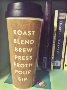
When I first read our assignment I was sitting in my room and instinctively looked to see what was around me. My roommate’s coffee cup was perched on the bookshelf and seemed like a perfect example of typography. There is nothing on the cup expect for the seven words listed down the middle, so of course typography is very important. The big bold lettering and simplistic design is very appealing aesthetically and works effectively.
Minimalism and Use of Space:
 I was having trouble finding advertisements in my everyday life, so I took to the internet. All I did was type advertisements in to Google and this Lego advertisement popped up. I was immediately drawn to it because the only real objects in the advertisement are two Lego blocks, but the two blocks speak volumes. It reminds viewers of a child’s imagination and the creativity that can come from something as simple as Lego blocks, and is very effective in communicating a lot, with little.
Color:

Again, when I was looking around the room I noticed a lot of color used in a variety of ways. It didn’t take long to come to the realization that it is very easy to go overboard with color, but when used the right way it can be very effective. The top picture is taken for my roommate’s motivational calendar (I promise I don’t steal her stuff all of the time). I am aware that the point of the quote is using color to brighten your day, but honestly it just gives me a headache looking at it. There are too many colors used in such a small space and it is too busy to draw attention to anything other than the horrifying amount of color. The record in the picture below it on the other hand, is very effective in drawing the eye exactly to where it is supposed to be. I honestly didn’t even realize there is a town behind the man until I was examining the cover closer to write about it. Your main focus is the man and the cigarette in his hand because the colorful smoke coming from it is the only source of color on the entire album cover.
Form:

I love guerrilla advertising. It is always done in new and creative ways, and a lot of the time for cheaper than other forms of advertisement. There are quite a few guerrilla advertisement campaigns centered around bus stops, but I chose this one because of its simplicity. The foggy glass draws in passerby’s attention and they think about Windex without ever hearing or seeing anything about the actual product and I think that can be very effective.
Rhythm:
 Although rhythm is not used in this particular advertisement, the use of the animated polar bears have become an icon of Coca Cola. This kind of repetition and rhythm keeps the consumers interested and waiting to see what will come next. This kind of consistency creates a brand, and a sense of comfort and familiarity for the consumer as most of them have grown up with the Coca Cola polar bears.


Comments